


Perhaps this analogy can be applied to supermarkets. (Read this site enough, you'd think any analogy would, right?) The “original” in this case was a unit of the Ralphs Grocery Company, a major Southern California supermarket chain with 47 stores at the time, that opened in 1959 in Granada Hills, California. The “sequel” was a very significant remodeling of the store six years later. The store was featured on this post a year and a half back, and for our own “sequel” here, we’ve switched to color! (When all else fails.) These photos were taken circa June 1965 for a Progressive Grocer magazine article that appeared the following year.
From a retail history standpoint, it’s hard to envision a more exciting, dynamic time and place than Southern California in the 1960’s. This was the era of the California Dream, as extolled in the movies and pop music of the day, and people responded by moving there in droves, or so it seemed at least. To accommodate the transplanted throngs (to say nothing of the area’s impressive homegrown baby-boom output), new malls and shopping centers were opening at a rapid rate – well outpacing every other major market in the country. Among the hottest of SoCal retail hotspots was the San Fernando Valley, home in 1965 to a brand-spanking new mall, Topanga Plaza, and to the still shiny-and-new Fallbrook Center, along with a host of smaller strip shopping centers.
Continuing to do its part was the Ralphs supermarket in the Valley’s Granada Hills, its funky 60–foot tall sign standing proudly at the corner of Chatsworth and Balboa since the store’s 1959 opening. The sign and the building’s red and white diamond-patterned Arizona rock roof had stood the test of time – a bulwark for those (like the fine readers of this site) who valued good taste. The apple-hued interior, however, was definitely showing its age by this time. A major revamp was in order.
Ralphs’ management realized that a run-of-the-mill redo wouldn’t cut it, as noted in the Progressive Grocer article - “...we were faced with a fiendishly competitive situation (in Granada Hills). On three sides of our unit there, and within a two-block area, are big shopping centers, each with a super market exerting the fullest pressure on the trading area.” It was determined that this particular remodeling would have to be something special. On top of that, Ralphs would use the Granada Hills makeover as an opportunity to address a longstanding problem.
“Surveys show that the woman shopping in the super market is often a woman totally confused”, said Ralphs’ general manager. (Lots of responses to that comment are reeling through my head at this point. I think that’s where they’ll stay.) “Yet the same woman who retraces her steps back and forth across our stores seeking out merchandising owes her confusion not to a lack of wit on her part…” (Uh-oh.) “…but to a lack of logic on ours.” (Whew! Glad you put that in context there, my friend.) “She may feel that vanilla extract might surely be located by going to the flour gondola – how is she to know that it is with spices strung out over one of the freezers – or in a separate spice cabinet of its own on the end of table 14? She has little logic to guide her, only memory, and all stores lay out their dry groceries according to their own ideas – and those ideas are constantly changing.” (Let’s try to stay away from the thin ice there, guy. Ok?)
And so was born the “shop-at-a-glance” concept. In essence, the standard supermarket layout was scrapped in favor of “family groupings” – or “centers”, to use Ralphs’ terminology. The “Breakfast Center”, for example, featured cereals, juices and coffee, three categories of product that are normally found in very different locations. “Like shopping in your own kitchen!”, Ralphs’ ads proclaimed. (Provided one kept the cereals, juices and coffee in the same location.) The traditional perimeter departments – meats, dairy and produce – remained in those locations. The “centers” were identified by large, colorful three or four-sided signs hung above their respective areas. To give customers a clear line of sight around the store, the shelving units, known as “gondolas” in the business, were cut down to a maximum height of 5 feet, which also had the curious effect of reducing inventory capacity by as much as 25% in some departments - not a minor issue.
The store’s “grand reopening” took place over three days in early June 1965, with ads proclaiming the specially-crafted promotional tagline: “America’s First Completely Departmentalized Supermarket!” That claim is debatable, of course – Grand Union, for example, had been experimenting with departmentalized merchandising formulas for a good ten years by then, most notably in their East Paterson, New Jersey flagship store. Perhaps it was the first of its kind on the West Coast, however.
Beyond the new layout itself, a big part of the remodeled Granada Hills store’s appeal was its striking new decor. The colorful, classy new look was the work of Brand-Worth and Associates, a Los Angeles-based firm that specialized in retail interior design. The new and remodeled Ralphs supermarkets of the 1960’s were among the most elegant of the era (Or any previous era, in my opinion. Or any subsequent one.), largely owing to Brand-Worth’s stunning designs and meticulous attention to detail.
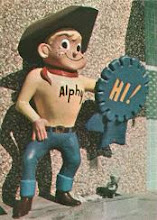
For the departmental signs, they developed a set of cartoon drawings to be used as identifiers “without a line of copy, not a word”–the frozen foods section, for example, featured an Eskimo. Interestingly, the colors Brand-Worth used for these signs actually corresponded to the “color wheel” – in sequence! (I love 50’s and 60’s advertising psychology!)The meat, dairy and liquor departments featured colorful, wonderfully stylized cutout signs, again with unmistakable symbols in lieu of text. In this respect, Ralphs was definitely ahead of its time. There was one exception to this – the store directory sign above the checkout area, but even this featured the added twist of color coding.
As appropriate as their company moniker sounded, “Brand-Worth” was actually a conjunction of its owners’ last names, Bill Brand and Freddie Worth, who founded the firm in 1954. Among their clients were The May Co. (the gourmet food sections of May’s Southern California department stores were a precursor to Brand-Worth’s work for Ralphs), and regional department store chains such as Phoenix-based Goldwater’s and Omaha’s Brandeis.
Undoubtedly the new decor was a hit, but history is silent (i.e.: I couldn’t find any more articles) as to whether or not the Granada Hills store’s new departmentalized layout was a success. I’d have to think that in the grand scheme of things, it probably wasn’t. One thing is evident – it didn’t end up starting a trend. The average supermarket of today is laid out pretty much like those of fifty years ago – standard end-of-aisle signs, and nothing but lighting overhead.
Which is to say “totally confusing”, I guess!
The photos are pretty much self-explanatory (just follow the symbols on the overhead signs!), but a couple of things are worth pointing out – in the produce department, note the sombrero-ed Fred Flintstone, star of TV’s first prime-time animated cartoon show, standing guard over the cantaloupes. One would have to have been there in the early and mid-1960’s to appreciate the huge cultural phenomenon the Flintstones were at the time, a fact that has been largely forgotten. In those years they were everywhere, and not only on “kids stuff” - lunch boxes, clothes, a syndicated comic strip and all manner of toys and games – but in commercials (Welch’s Grape Juice, Alka-Seltzer and *gulp* Winston Cigarettes), unusual store appearances (a woman costumed as Wilma Flintstone, handing out promotional brochures at the downtown Chicago Wieboldt’s department store), and occasional references on other popular TV shows of the day. A few months after this photo was taken, “The Flintstones” would begin its sixth and final prime-time season on ABC, later showing up on local TV stations, then cable, and finally on DVD.
Lastly, notice the cartons of cigarettes in the liquor department and near the checkstands. It’s a sharp contrast to today, when cigarettes are almost handled like a controlled substance. At that time they were more or less treated like any other product, except for the age restriction, of course. Well into the 1980’s, individual cigarette packs were routinely displayed at each checkout lane, within easy reach, right next to the Rolaids and Dentyne. In the 60’s and early 70’s, things were even more lax, to the point that in some instances parents, if so inclined, could send their grade-school aged children to the store to buy cigarettes with a note: “Dear (insert name of complicit supermarket) Checkout Lady: Please sell Rocco two packs of Marlboros. Thank you. Signed, Rocco’s Dad”
Thankfully that doesn’t happen anymore. But then, neither does sending one’s kids alone to the supermarket.


