The pages of retail history are filled with the names of companies that no longer exist. Many of them were the picture of success for decades on end. They were leaders in their field - patronized, respected and loved by millions of customers. Household names. For one reason or another, these companies failed to adapt to conditions, and consequently they’re gone – sold out to a competitor, or just shuttered altogether.
It can be said that “adapting to conditions” is the one thing at which the 109-year-old J.C. Penney Company has excelled at above all else through the years. Rarely at the cutting edge of fashion – or anything else, for that matter, “the Penney Company”, as its founder always referred to it, has nonetheless continually managed to stay in step with the times, reinventing itself periodically to appeal to ever-evolving American shopping tastes. In the process they’ve amassed a track record that, despite occasional missteps, other retailers could aspire to only in their dreams.
In the mining town of Kemmerer, Wyoming in 1902, conditions were hard. Mr. Penney, in a letter to E.C. Sams, who would turn out be his most significant hire, described it as “a barren country, very little vegetation, and unless a man and his wife as well are strictly business, they might not like it.” The nearest water source, for example, was from a creek a half mile away from town. And for three months out of the year, the average low temperature was 6 degrees Fahrenheit or below. (“Might not make it” was probably more accurate.) Such was the unlikely setting for the birth of a retailing legend.
James Cash Penney (yes, that was his real middle name, he would assert on innumerable occasions) was born on September 16, 1875 in Hamilton, Missouri, a rural town some 65 miles northeast of Kansas City. Penney’s parents, in particular his father, a farmer and unpaid Baptist minister, instilled in him a strong sense of faith, hard work and ethics.
An early lesson in ethics came in his teens, when he was given a small parcel of the family land to raise watermelons. When the local county fair rolled around, Penney loaded up a wagonful of melons, parking just outside the fair’s gates where he began to do a “brisk business”, according to authors Tom Mahoney and Leonard Sloane in their book The Great Merchants. The elder Penney was not pleased when he discovered this, admonishing the young man for competing with the fair merchants “without paying for the privilege”. He ordered his son to take the wagon home, despite “Young Jim’s” technicality defense that he was actually selling outside the gates, albeit by only a few feet. It was a lesson Penney “never forgot”, the authors state.
Although he would maintain a lifelong interest in agriculture, Penney’s destiny lay elsewhere. “I am not cut out to be a farmer”, he told his father in a deathbed conversation related in the 1947 history of Penneys by Norman Beasley entitled Main Street Merchant, “I want to be a storekeeper”. In early 1895, at the age of 19, Penney was given his first job in retail as a junior clerk at J.M. Hale & Brother, a well-known local store in Hamilton. Penney was an eager pupil, and with Mr. Hale as “professor”, he learned the myriad aspects of store operations, from serving customers, to stocking, to sweeping the sidewalks out front. He drove himself extremely hard, earning promotions along the way, and over two years his salary increased from an initial $2.27 per month to $25 a month. But he nearly wrecked his health in the process. Things became so bad midway through his third year there that Penney’s doctor told him he was a prime candidate for “consumption” (an age-old synonym for tuberculosis) and that he needed to “get out of this Missouri climate” and move to Denver “right away.”
“Go West, young man, go West. There is health in the country, and room away from our crowds of idlers and imbeciles” is a phrase widely attributed to Horace Greeley, a famous 19th century newspaper editor and politician. Penney took his doctor’s (and Greeley’s) advice and boarded a train for Denver in June, 1897. To be sure, his health improved, but he did run into his fair share of “idlers and imbeciles” in his early work experiences there. Taking a job at the Joslin Dry Goods Company, the 5’8”, 135-pound Penney was subjected to endless hazing by the other clerks, so he left as soon as he could line up another job. A stint with a second area retailer came to an abrupt end when Penney discovered the store owner’s dishonest pricing practices. Disgusted, Penney demanded his earned wages on the spot and resigned.
Penney’s search for new employment led him 40 miles north to Longmont, Colorado, in the heart of cattle country, where a butcher shop was for sale. Penney decided he liked the town, and had his mother send him his savings of $300, enough to buy the shop and keep the butcher on the payroll. As it turned out, this particular butcher shop was heavily dependent on the business of one hotel, whose cook expected a bottle of whiskey each week on the side as a requirement for trade. (In researching this, I learned that most of Longmont’s early settlers came from Chicago. That explains that.) Penney complied for one week, and then refused to buy the cook off thereafter as a matter of conscience. So went the hotel’s business, and not long afterward, the butcher shop itself.
Eager to resume his career as a “dry goods man” after the butcher shop debacle, Penney applied for a job at a local store owned by T.M. Callahan, a dry goods and clothing operation similar to Hale’s, where Penney had worked back in his hometown. Callahan didn’t have any regular positions available, but informed Penney that he could fill in for one of his clerks who was ill and not likely to get back to work over the holidays – “so if you want to come in until he does come back,” he was quoted in Beasley’s Main Street Merchant, “I can put you on.” (And there you have it, dear readers - one of retailing’s towering figures started out as a “holiday temp”!)
Instead of letting him go upon the regular clerk’s return to work, Callahan, who was most impressed with Penney’s intuition and work ethic, made him an offer. Callahan’s business partner, Guy Johnson, whom he had set up with a dry goods store some 400 miles east in Evanston, Wyoming, needed some help. To help convince Penney to go for it, Callahan laid out his master plan to open a number of stores throughout Colorado and Wyoming, “the first time Penney had ever heard of chain stores”, Beasley states in his book. Penney eagerly accepted the challenge.
Not long afterward, Johnson offered Penney a partnership stake in a new store he and Callahan planned to open in Ogden, Utah, a town that at 35,000 in population was much larger than anyplace they’d opened their doors before. Upon making a visit to Ogden, Penney decided the city was “too big”, and while he liked the partnership idea, he preferred to operate in a smaller town. He expressed a desire to go to Diamondville, a ranching and mining town not far from Evanston. He liked the people he’d dealt with from there. Callahan suggested Kemmerer, Wyoming as an alternative, a “lively little (mining town)… between Diamondville and Frontier.” Penney agreed to move to Kemmerer, sight unseen. When Callahan and Johnson offered to finance Penney’s $1,500 stake at 8 percent interest, Penney opted to go with a bank in his hometown of Hamilton, Missouri instead, which had offered 6 percent terms, an early indicator of Penney’s independence and shrewdness.
In addition to the rustic conditions cited earlier, there was another major challenge facing anyone who cared to open up a “cash-only” store (which would be Penney’s rock-solid policy for more than 50 years) in a mining town like Kemmerer. There was very little cash in the town. Beasley quotes a banker describing the grim circumstance to Penney upon his arrival there: “Most of our people are miners. They are paid once a month. Most of them are clean out of money before the month is half over, and some of them seldom see any money.” In those days, mining companies often paid their workers in “scrip”, a form of coupon, in lieu of cash, and many goods were purchased at the mine-owned “company store” at unconscionable markups. The line in the song “Sixteen Tons”, a monster hit for Tennessee Ernie Ford in 1955, rang true for many mine workers in the early 20th century – “I owe my soul to the company store”. But rather than accept scrip, as other merchants (and saloons) in town did, Penney pressed on with his plans to open on a cash-only basis.
On Monday, April 14, 1902, the firm of Johnson, Callahan and Penney opened their first “Golden Rule Store” in Kemmerer, a one room building of wood-frame construction with “an attic, with the joists and rafters standing exposed”. In the days preceding the store’s opening, Penney had mailed out announcement fliers to 500 local mining families, and just before the store’s opening day, handbills – with a list of items for sale and their cash prices – were passed out on the streets of the town. The first business day, which didn’t end until nearly midnight, netted sales of $466.29.
Penney “considered it a sin if anyone came into the store without being waited on”, Beasley wrote, “(and) a greater sin if anyone went our without making a purchase”, so he and his wife Berta worked fastidiously, and demanded the same of their hired help. Another requirement, rooted in Penney’s religious upbringing, was that employees neither drank nor smoked. The first year’s results were far beyond any reasonable expectation, with total sales of $28,898.11 at a nice profit. Penney was able to pay off his loan and now owned his share of the store outright.
So impressed was Callahan with Penney’s performance in Kemmerer that he offered him complete rein over a fifty-store chain he was planning. Penney turned the offer down, though, citing he “was not ready for the responsibility.” Not yet, at least. The prospect soon took root in his thinking, however, and the idea of maybe three or four or six stores across “these mountain states” began to appeal to him, even though it would be “shooting at the moon”, as Penney said to his wife. She convinced him he was up to the task. Before long, Penney acquired partnership interests with Callahan and Johnson in two more stores, in Rock Springs (where he took over from a failing manager) and in Cumberland, Wyoming, a new venture.
In 1907, to Penney’s surprise, his partners informed him of their desire to sell out their shares in the three stores they co-owned with him. The agreed-upon price was $30,000, in a one-year note at 8 percent interest and Penney’s signature as the only security. Now he was on his own. Wisely, he chose not to stay that way for long.
Penney sought to emulate Callahan and Johnson’s “partnership” approach, where clerks were groomed for management and an eventual ownership stake in a store, but he would exercise more care in determining just who would be selected for these opportunities and when the time was right. “He felt…that the worst thing that could happen was to promote men before they were ready; when this was done, it meant defeat for both the giver and the receiver”, Beasley states.
Surprisingly, the man who would ultimately be the most important partner of Penney’s entire career showed up that same year, 1907. Earl Corder Sams was an ambitious 23–year old native of Simpson, Kansas. Having tried his hand at several trades and discovering he liked storekeeping the best, he engaged an employment agency to boost his prospects of finding a “dry goods” opening in the west, where he sought to make his future. The ensuing string of mail correspondence from Penney to Sams is presented in great detail in both the Main Street Merchant book and in Penney’s autobiography entitled Fifty Years with the Golden Rule, and makes for intriguing reading. In the typical ever-so-polite style of early 20th century correspondence, Penney expounds at length on his highly demanding requirements for the position, while cautioning Sams in detail about the pitfalls of merchant life on the frontier. You’d think he was interviewing for the most important position in the world. To Penney, it was. Sams made the trip to Kemmerer and then returned home, job offer accepted. After a month he returned, family and possessions in tow. Sams did so well as a clerk at Kemmerer that within months Penney put him in charge of the Cumberland store. A year later, Penney offered him part ownership in a new store in Eureka, Utah.
Penney continued to refine his partnership idea, devising a system whereby a successful store manager who had saved his money could buy a one-third stake in a new store, “provided he had trained a new man capable of opening and managing the new link in the chain.” Thus every “new man” sent out to open a store had been fully mentored as a chief clerk in his previous store, and would be able to buy an ownership stake in his next one. This was Penney’s vision for the growth of his company, and over time he gained the nickname “the man with a thousand partners.”
And he wasted no time in carrying that vision out. Penney, who just a few years before considered fifty stores a daunting number, began to set his sights far beyond that. By 1908 there were 4 total stores, two years later there were 14, and two years after that, 1912, there were 34, including locations in Wyoming, Utah, Idaho, Colorado, Nevada, Montana, Washington and Oregon. By this time, Penney himself had relocated to Salt Lake City, where he set up a central buying office and warehouse for the company.
But amidst all of this came a personal tragedy, when Penney’s beloved wife, who was in no small part responsible for his success, passed away suddenly just prior to a planned European vacation trip. He “plunged himself into work, open(ing) stores in rapid succession”, Beasley wrote, and took an extended buying trip to New York. Instead of returning to Salt Lake City afterwards he sailed for Europe, alone.
Upon his return, Penney dealt with some pressing issues facing the business. One was a need to revisit the name of his stores as the chain rapidly grew. Unfortunately, the name “Golden Rule Stores” was not at all unique to Penney’s organization. His former partners, Johnson and Callahan, were still using it on a number of stores they owned (separately, as the partnership between those two men had since been dissolved), and a host of other unrelated stores in the West used the moniker as well. On top of that, the use of the name “Golden Rule”, based on the Biblical principle “Do unto others as you would have them do unto you”, was considered suspect by many customers who feared that less-than-scrupulous operations were using the name as a cover for shoddy (and shady) business practices. Penney decided to replace the Golden Rule name with his own.
A major dilemma was the need for increased financing to handle expansion. Penney “had reached the limit of his personal borrowing (ability)”, Beasley wrote, and now the only real option was to incorporate and sell stock. This forced a change to the partnership structure as Penney originally conceived it, where the partners’ ownership stakes in the stores were converted to preferred stock in the new “J.C. Penney Stores Company”, a Utah corporation, incorporated on January 17, 1913.
Soon afterward, Penney began the long process of moving the nerve center of the company to New York City, starting with a central buying office there. The move was initially met with protest by many of Penney’s partners, virtually all of whom were “small-town Westerners (who) knew the ways of the West” and “wanted no part of New York.” (I’m picturing those old Pace picante sauce commercials, but I’m sure it was more dignified than that. Dub Taylor would have made a good storekeeper, though!) The fact was that most of the partners were resistant to the idea of any centralized buying office, which in part spurred Penney’s decision to close the Salt Lake City buying operation not long after it opened. (Penney blamed himself for the failure, for bringing in an outside person to run it instead of one of their own.) Even Sams was skeptical of the idea at first, but Penney’s logic was rock solid – at the time, a huge percentage of clothing and other “soft goods” was designed and manufactured in New York’s storied “Garment District”, a roughly 40-block area of Manhattan. Penney, who for all his gifts as a developer of management talent was also a consummately skilled buyer, saw the advantages of being close to the action.
The ethical aspects of business were always topmost in Penney’s mind, and in 1914 he authored a famous document which would become known as “The Original Body of Doctrine” (later “The Penney Principles”) that has been quoted multitudes of times over the years in nearly every forum imaginable. They were: “1.) To serve the public, as nearly as we can, to its complete satisfaction. 2.) To offer the best possible dollar’s worth of quality and value. 3.) To strive constantly for a high level of intelligent and helpful service. 4.) To charge a fair profit for what we offer – and not all the traffic will bear. 5.) To apply this test to everything we do: ‘Does it square with what is right and just?’” Timeless principles from a “mission statement” issued nearly a century ago, long before they became obligatory.
At the end of 1916, Penney stepped down as president of his namesake company, turning the operation over to the very capable hands of E.C. Sams, while Penney assumed the title of chairman. Penney chose instead to concentrate on leadership development and philanthropy, and years later in his eighties and nineties was the smiling, grandfatherly public face of the organization. With the exception of a very brief period following Sams’ sudden passing in 1950, however, Penney would never really run the company again, although his input was sought in major decisions and he remained the subject of great affection and respect.
The 1920’s saw some key acquisitions for the J.C. Penney Company, but one stood out as most significant, if only for sentimental reasons. In 1923, Penney got wind that J.M. Hale, the owner of the store where Penney started out in his hometown of Hamilton, Missouri, was planning to retire and sell his business. A delighted Penney bought out his former boss (years earlier he had privately decided not to open a store in Hamilton until such time as Hale was ready to sell), and the reopening of the Hamilton store as a J.C. Penney unit was symbolically timed to make it the 500th in the chain. When the location was closed years later in 1981, the story made the New York Times.
In the next few years, two more old friends sold out to Penney as well. Tom Callahan had continued to operate 12 stores, years after he, Guy Johnson and Penney split up their three-store partnership, and in 1926 he sold those stores to Penney. Johnson had remained in the dry goods business as well, with 20 stores of his own which he sold to Penney two years later. True to form, the company paid cash in both deals, which put the chain at nearly 750 total stores.
The company had grown to a point where it was time to make some major changes to its structure. Penney’s “manager/partner” concept had led to a somewhat haphazard growth pattern with “scarcely little central planning”, as Beasley put it. And while allowing a manager to open a new store provided a good opportunity, it was also a burden that took time away from the needs of the store he was actually running. To replace a manager’s lost income potential from opening new stores, Penney instituted a plan which “guaranteed by contract a share of the net profits of the store he managed,” (One-third of the store’s after-tax net, according to a 1950 Fortune magazine article. I’ll put the Kleenex away now.), and the manager could fully concentrate on operating his store. Market planning, store locations and real estate deals would now be handled by centralized departments. With these changes made, the stage was set for even faster growth and the establishment of Penney as a truly “national” company. At the end of 1928, with over 1,000 stores and $176 million in annual sales, the company’s renown was rapidly spreading beyond its still primarily Western base.
Among the J.C. Penney Company’s growing legion of admirers were some of the top retailers of the day. Over a lunch meeting with Mr. Penney near his New York offices late in 1928, a prominent Chicago businessman floated the idea that Penney should consider a merger with Montgomery Ward & Company, America’s second largest mail order firm, which was just starting to open retail stores of its own. The would-be matchmaker was Marshall Field III, scion of the legendary Chicago retailing family and president of the company that bore his name. The idea piqued Penney’s interest, and that very afternoon he called a meeting of his board of directors, and within days Ward president George B. Everett traveled to New York to meet with E.C. Sams and other Penney executives to discuss a possible merger.
Unclear after the meeting as to what Ward’s intentions were, Sams wrote Mr. Everitt to see whether he thought Montgomery Ward & Company should acquire Penney, or the other way around. Were Penney to be the suitor, they would need to ascertain the value of three key aspects: Ward’s corporate goodwill, their “organization and experience in buying and distributing lines of merchandise” that Penney didn’t handle, and the mail order operation, Ward’s greatest asset and a business with which Penney had no experience whatsoever. Everitt, in response, assured Sams that his company wasn’t for sale nor did he presume that J.C. Penney was. Any combination of the two companies would be a merger of equals that would form a completely new company. Committees were put together on both sides and much correspondence ensued, but the idea was soon dropped.
No sooner had the talks with Montgomery Ward ended that another overture came Penney’s way, once again from Chicago. General Robert E. Wood, president of Sears, Roebuck & Company, wrote a letter to Sams. Sears was underway with a rapidly-growing program to open retail stores as an adjunct to its massive catalog business, and Wood wanted to gauge Penney’s interest in a possible merger, as Penney’s store network was already sizable and becoming more well-developed by the month. The idea was too intriguing not to consider, and plans were laid for Sams to meet with “The General” in his Chicago offices. Wood proposed an idea (that Sears would ultimately adopt for itself in modified form) that the combined business “would have three segments: ‘a mail-order division; an A store division, which would include stores in the large cities; and a B store division, which would include stores in the smaller cities and towns.’” Under this arrangement, “Sears-trained executives” would continue to run the catalog business, while the “B” stores would be under the control of “Penney-trained merchants”. The larger “A” stores would presumably be run on a consortium basis, although some of Penney’s big-city units were impressive in scale by that time. Buying responsibilities would be split along advantageous lines, with Sears’ buyers continuing to handle hard goods, including appliances, farm equipment and automotive, while all apparel lines and other soft goods would become the responsibility of Penney people.
The merger would provide some advantages based on sheer size – the possibility of having the “dominating store” in town, the ability to split the country up into manageable districts “such as A&P and Woolworth now provide” and the ability to “attract outstanding personnel”. The talks heated up to the point to where the New York Times pulled the trigger on the story – “Penney Chain To Go To Sears-Roebuck”, the headline read in a December 3, 1929 article, based on “circumstantial” confirmation (insert choice remark here) by Sears Chairman Julius Rosenwald, who deferred to Wood on the details. (Rosenwald was Sears’ chairman, but Wood unequivocally ran the company.). Ultimately, Sams and the other Penney execs decided against it, out of concern that “our younger executives would have lessened rather than greater opportunities” in a situation where Sears would have clearly been the dominant entity. Beyond that, at the time Penney simply didn’t have the management manpower the deal would have required.
“The Penney Company” would go it alone, in a decision that was made for practical considerations. In light of history, of course, it turned out to be incredibly wise.
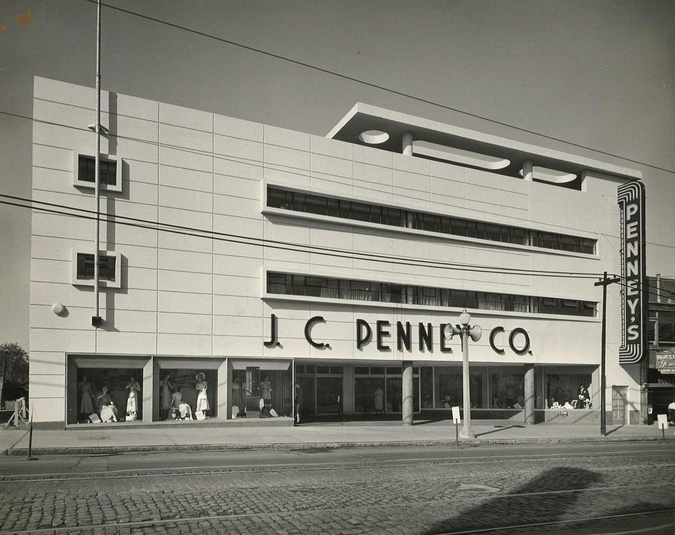
Shown above are various Penney stores from the 1920’s and 30’s, although some of the photos themselves postdate that era. Top to bottom, first up is the massive Oakland, California location, then a 1930’s Inglewood, California store followed by the small 1920’s store it replaced, a 1950’s view of a much older store in Cortland, New York (check out the shining details on that great porcelain sign), and a can’t miss “white goods sale” in Pasadena, California, with fine Spanish style architecture. These photos appear here courtesy of the J.C. Penney Archives at the DeGolyer Library at Southern Methodist University. My very special thanks to Joan Gosnell, archivist extraordinaire, for her extensive help and her sense of humor.
Pictured below is James Cash Penney’s second store in Kemmerer, in what is probably the earliest known photo of a Penney store. (Engravings and paintings of the first store exist, but no photos to my knowledge.) Something tells me the establishment next door was much more “saloon” than “opera house”.