 One of my all-time favorite movie sequences is only a few seconds long. It’s a scene from the 1985 movie “Back to the Future”, where a dazed Marty McFly (Michael J. Fox) has just been unwittingly transported back thirty years in time, to 1955. Eyes wide and mouth agape, he walks the downtown square of his hometown, the fictional Hill Valley, California. In place of the familiar blighted streets and decrepit storefronts is the pristine, vibrant Hill Valley of 1955, buzzing with activity. The Chordettes’ “Mr. Sandman”, a number-one hit song the previous year, plays in the background.
The camera cuts to a gleaming corner Texaco station. A car pulls up to the pumps, and immediately a group of four nattily-uniformed attendants descend on it like a SWAT team – checking the oil, washing the windows, checking the tires, pumping the gas. A perfect evocation of the Golden Age of Service Stations.
Being born in the early 60’s, I caught the tail end of this classic era. By that time, roughly 1968 to ’73, the “team” of attendants usually consisted of one person, who may or may not have been in uniform. Certainly, they pumped your gas (six bucks to fill up my Dad’s 4-door, 3700-pound Chevy Impala), usually they washed the windshield, and most of the time they were happy to check the oil and tires as well, though they would ask first about those. When all was said and done, they’d disappear for a minute or two and show back up with a little plastic clipboard, my Dad’s credit card sticking up out of a little slot, receipts (in carbon triplicate) ready for signing.
I thought it might be fun to relive that long past era when gas stations were truly “service stations” with a look at some of the major gasoline brands as seen through some of their old marketing photos. Gas station architecture is a fascinating genre unto itself, ranging from crude, early stations with curbside pumps to the elaborate mini-Roman temples of the 1930’s. Our focus here will be on stations from the 1960’s, for two reasons – first, a decent number of them still exist, albeit with heavy modifications and rarely under their original brands, and secondly, I’m sure that some of you remember these great stations in their heyday. This post isn’t intended to be a comprehensive history in any sense of the word - there are many fine websites and excellent books exclusively devoted to the subject. Two books in particular were tremendously helpful to me – The Gas Station In America, a fascinating study by University of Illinois professors John A. Jakle & Keith A. Sculle, covering the industry’s earliest years through roughly 1990, and Gas Stations, a pictorial book that I’ve owned and loved for years, by oil company historians/collectors Wayne Henderson and Scott Benjamin.
We’ll start off with a nice night shot, featuring a Sunoco station, circa 1960. The impeccably dressed lady tosses a sly glance back at…the Sunoco pump, undoubtedly on her way to a major civic event, or maybe the local premiere of the latest Hollywood blockbuster - in Technicolor and Super Panavision.
Sunoco was a bit different from its competitors, as it offered (as the pump says) “custom blending” of its gasolines, allowing customers to select, via a dial, from a variety of octane levels. Today, multiple grades of gas at one pump are the industry, but at the time it was a major advance. (Even now, six grades of gas at one pump is virtually unheard of.) A model of this pump now sits in the Smithsonian Institution.
The Sun Oil Company was founded in 1890 in Ohio, and opened its first gas station 30 years later. By 1940, according to authors Jakle and Sculle, there were 9,000 Sunoco stations. In the 50’s, the company slumped a bit until the advent of custom blending, a perfectly-timed innovation for an era when automotive performance was the name of the game. In 1968, Sun purchased Tulsa-based Sunray DX Oil Company, and for years operated stations under both the Sunoco and DX brands. Eventually, Sunoco withdrew from the West and much of the South, but they remain a major player in many Eastern markets.
 Remember when the price of petroleum was $3.01? Ok, now some of you are probably thinking “That was the price of gas down the street last month, before things went nuts. Really informative post so far!” I’m not referring to the price per gallon of gas, however – I mean per barrel of crude oil. $3.01 was the price of the standard 42 gallon barrel of crude oil on October 17, 1973, state Jakle and Sculle in their book. (Each barrel typically produces 19 gallons of gasoline, plus 9 gallons of diesel, plus 4 gallons of jet fuel, plus small amounts of lots of other stuff. Now you’re guaranteed to win that next science fair! You can thank me later.) The following day, October 18, the Organization of Petroleum Exporting Countries raised the price to $5.12 per barrel. By the end of 1973, it was $11.65 per barrel, and the rest is history, as they say.
Needless to say, these developments shook the American economy to its very core. At the very least, it signaled the end of an era in gasoline marketing – before long, stations split their pump islands into “Full Serve” and slightly cheaper “Self Serve” categories. Before that time the average American, unless they’d worked at a service station, had never touched a gas pump in their life. Now elderly ladies in their church dresses were filling up their own cars. Within a few years, the “Full Serve” category largely disappeared altogether, except in two states that were notable exceptions by law. Gas station owners, desperate to maintain profits, sold off their tow trucks and converted their service bays to retail space. They quickly learned that selling Cokes and Snickers bars was more lucrative than changing oil or rotating tires.
Now to the station pictured above, the modernized DX sign is looking sharp on this sunny 1962 day. According to Jakle and Sculle, the Sunray Mid-Continent Oil Company engaged branding experts Lippincott and Margulies (still a vital player in that business today) to update the somewhat prosaic D-X image, dropping the apostrophe and jazzing up the colors and lettering style.
Even sharper and more modern is the station itself, a special prototype called “the circle”. (A space-age marvel - or are those light fixtures meant to suggest tennis rackets? Oh, the mystery of it all!) I’m not sure how many of these were built, but suffice it to say that most stations sporting the snazzy new DX signs were of far more conventional design.
Founded in 1929 as the Sunray Oil Company, the firm “became a fully integrated petroleum company”, according to Jakle and Sculle, 24 years later upon merging with the Mid-Continent Petroleum Company, with DX (previously Diamond-X, then D-X) stations spread throughout the plains states and the Midwest, followed by a push into the mid-south in the 1960’s.
In 1972, the company was acquired by Sun Oil Company, and for a number of years following, the DX brand prevailed in the west and the Sunoco brand in the east, generally speaking. (The OPEC crisis, as the authors point out, would force Sun to dump a great many stations of both brands.) Beginning in the early 1980’s, Sun began a gradual phase-out of the DX brand, replacing it with the Sunoco nameplate in some cases and vacating selected markets altogether in others.
 Looking back at 20th century gas marketing, it helps to know a little bit about the history of the Standard Oil Trust. Originally founded by John D. Rockefeller, Standard Oil consisted of 20 operating companies by 1900, producing a third of America’s crude oil but refining an overwhelming 80 percent of it at the time, according to authors Jakle and Sculle. Little wonder, of course, that Rockefeller and his far-flung enterprise were considered Public Enemy Number One by the U.S Government’s storied “trust-busters”. Years of legal wrangling finally led to a decision in 1911 that would split Standard Oil into 34 separate companies.
Ten of those companies were assigned territory rights to use the Standard Oil name in a specific marketing area. They included Standard Oil(s) of New Jersey (Esso), of New York (Mobil), of Indiana (Amoco), of Ohio (Sohio), of Kentucky, of California (Chevron), of Louisiana and of Nebraska. Three of the ten chose to go with other names instead of “Standard” - Continental Oil Company (Conoco) in the Rocky Mountain area, Philadelphia-based Atlantic Refining Company and Missouri-based Waters-Pierce Oil Company. Other notable companies spun off from the Trust included The Ohio Oil Company (Marathon) and Chesebrough Manufacturing Co., makers of Vaseline petroleum jelly (later merged with cold cream manufacturer Pond’s Extract Co., to form Chesebrough –Pond’s).
Before long, the eight firms that used the “Standard Oil” trademark sought to expand beyond their court-assigned territories, spurring frequent, exasperating litigation over the use of the name. To avoid this, the development of secondary trademarks became necessary. Standard Oil of California, for example, used the “Chevron” name outside of their assigned area. Over the decades, as the companies realized the distinctiveness and growing brand equity of these secondary trademarks, most ultimately discontinued the use of “Standard” and went with the secondary trademark across the board, save for the odd Standard station here and there to maintain legal trademark rights.
Standard Oil of Ohio, operator of the station pictured above in 1964, traced its roots way back to 1870, making it the oldest of the Standard Oil companies. The “Sohio” brand (a contraction of the company’s full name), the market leader in its namesake state through much of the 20th century, debuted in 1928.
Unable to use their brand name beyond Ohio borders (because of the “So” portion – S.O. meaning Standard Oil, of course) under legal pressure from neighboring Standard Oil of Indiana and Standard Oil of Kentucky, the company was compelled to come up with another trademark for expansion purposes. In 1956 the “Boron” nameplate was introduced for the purpose of “invad(ing) markets in Michigan, Kentucky and Pennsylvania conveniently served by the company’s refineries”, per Jakle and Sculle. Boron, “the element of tomorrow” as Time magazine described it in 1957, was adapted for use as a mileage-enhancing gasoline additive by Standard Oil of Ohio, who also sold it to Richfield Oil and DX. The Boron stations’ logotype and identity matched that of the Sohio stations.
Sohio was one of the most effective operators of interstate highway locations, with classier-than-average truckstops (with names like "Stop 250", depending on the exit number) and several locations with integral Stouffer’s restaurants. Now much better-known for frozen foods, Cleveland-based Stouffer’s was a respected restaurant operator for decades. In the Chicago area, for example, they operated a restaurant at Oakbrook Center (Stouffer’s Oakbrook) and one at Woodfield Mall (The Rusty Scupper), among several others.
“Land-locked” and “crude-short”, as Jakle and Sculle put it, Sohio entered into a unique agreement with BP Oil in 1968, where BP assumed 25 percent ownership of the company in return for giving Sohio access to its Alaskan crude oil reserves. The “unique” aspect was the part of the agreement that gave BP majority ownership once the Alaskan operation began to produce 600,000 barrels per day, which occurred in 1984. Three years later, BP acquired the rest of Sohio, including 5,600 recently-purchased Gulf stations in the southeast. The Pennsylvania-based Boron stations and some 1,000 Sohio stations were divested by government order. In 1991, all the company’s stations assumed the BP name.
 Even after the Standard Oil breakup, its largest component piece - Standard Oil of New Jersey - remained a colossus. Indeed it was (and is) still the world’s largest oil company. The company known simply as “Jersey” to insiders began its post-breakup existence with a six-state area, consisting of New Jersey (obviously), Maryland, Virginia, West Virginia and the Carolinas, plus Washington DC. The primary brand name for decades on end was “Esso”, meaning S.O., the initials for Standard Oil.
Jakle and Sculle point out, interestingly, that neither Standard Oil of New York (Mobil) or the Atlantic Refining Company tried to stop Jersey’s use of the Esso brand as the company eagerly expanded into their territories. This most certainly wasn’t the case with Standard Oil of Indiana or Standard Oil of Kentucky, who were anything but placid on the matter, vehemently contesting any use of the Esso name in their markets in court. While Arkansas and Louisiana were ultimately opened to the Esso brand, Jersey was forced to market under different names nearly everywhere else they chose to go. (Note: I’m not referring to Jersey’s non-U.S. operations here. Esso was a very well-known international brand, and to this day ExxonMobil uses the name in selected markets, including Canada and the UK.)
As it turned out, they chose to go almost everywhere else. For this purpose, Jersey opened stations under the names of subsidiaries, some of which were companies they had bought out through the years. In 1960, for example, per Jakle and Sculle, they operated under the following names: Humble (Texas, Arizona, New Mexico and Ohio), Carter (the Plains states and the Pacific Northwest), Oklahoma and Pate (Wisconsin, Illinois, Indiana and Kentucky) and of course, Esso (the original six Atlantic coast region states, plus Pennsylvania, New York, all of New England, Arkansas and Louisiana).
In the late fifties, Jersey consolidated its U.S. marketing operations under the Humble Oil and Refining Company division, signified eventually by the addition of the name “Humble” on the face of the gas stations, a secondary brand of sorts. For the stations’ main brands (i.e.: the name on the tower signs and on the pumps), it remained Esso where permissible, but the Carter, Pate and Humble brands were discarded in favor of a new brand called “Enco” (except in Ohio, where Humble was still used), rendered in the familiar Esso font, enveloped with the familiar blue oval. “Enco” was shorthand for “World’s Largest ENergy COmpany”.
Enco is the brand I remember as a young kid in the Chicago area, and it’s the brand Jersey was forced to use for its expansion into California in the 1960’s. Curiously, when the company later began to expand into the Southeast, they were frequently able to use the Esso name. Despite the name difference, by the early 1960’s the company had a fairly unified marketing “look” for the first time, from station appearance to TV advertising, starring their extremely popular tiger mascot in the long-running “Put a Tiger in Your Tank” campaign.
As the 1970’s approached, however, it was clear that Jersey needed a uniform identity across the entire company, name included. As Jakle and Sculle point out, “The Enco brand created little excitement” among consumers (or as Gordon Gekko would say, “It put their feet to sleep”), and no expense was spared in developing and testing a new name to carry the company forward. This process was actually underway for a good many years before the debut of the company’s new name and Raymond Loewy-designed logo in December 1972, when the name “Exxon” was finally unveiled. In 1998, in the largest merger in history, the largest company in the world (at the time) was created when Exxon and Mobil merged to form…well, ExxonMobil. (Don’t you just love these conjoined names?) Some stations had to be sold off to satisfy antitrust regulators, but suffice it to say, they’re big. And as I understand, profitable.
The photo above depicts a great-looking Esso station circa 1961. The futuristic awning and canopy are definitely a step up from typical designs of the period. This is one of the few photos in this post where we might actually be able to nail down a location, if not from the station’s unique appearance, then maybe from the shopping center in the background. Let’s see…I can make out a W.T. Grant store and a Kroger…and maybe an Eckerd Drugs, but I’m not sure of that. Someone please help us out here!
 For many years, Standard Oil Company of New York, heir to the New England and New York State regions after the 1911 Standard Oil breakup, operated under its full name or under the acronym “Socony”. Not until 1931, when they bought out another ex-Standard Oil unit called Vacuum Oil Company, did they gain their most famous trademark – “Mobiloil”. The “Pegasus” brand name and famed trademark symbol came with the transaction as well. (Another Vacuum Oil brand was “Gargoyle”, which apparently was thought to have less potential.)
According to authors Jakle and Sculle, the combined Socony-Vacuum company “supplied some 37,000 branded outlets in twenty-nine states”, garnering a whopping 34 percent of the New York market and a (still highly respectable) 7 to 19 percent elsewhere in the territory. By 1960, “Mobilgas” and “Mobiloil”, products of what was now known as the Socony Mobil Oil Company, could be found for sale in 42 states. In 1966, the company name was officially changed to Mobil Oil Corporation.
(On a peripheral note, Mobil Chemical introduced the Hefty Bags product line that year, introducing the Mobil name to supermarkets everywhere, and setting the stage for the dreaded “Hefty-Hefty Cinch Sak!” commercials.)
That same year, Mobil introduced one of the most remarkable gas station designs in the history of the industry. “At a time when other companies were disguising their oblong-box stations with fake roofs and false stone, Mobil commissioned a purely modern design”, wrote Chester H. Liebs in his book Main Street to Miracle Mile: American Roadside Architecture. The man responsible for Mobil’s new look was Eliot Noyes, whom Business Week magazine described in 2007 as “the forgotten father of corporate design”. Three “experimental” stations were built in 1966, one of which is pictured above.
The new stations were “designed to be profitable places while contributing to the beautification of our highways” according to Mobil’s 1966 annual report, which described the design as following “a distinctive circular theme…established by the cylindrical pumps, the Flying Red Horse in its white disc, and the red “O” in the Mobil sign (designed by Ivan Chermayeff and Tom Geismar, under Noyes’ direction, and introduced the previous year), as well as by the circular canopies used at many locations. The new design was a smashing success – 55 additional units were slated for 1967, with hundreds to follow in the years after that. One wishes it would have started a modernist trend in the industry, but I don’t see where the evidence supports that. Many of the stations survive, albeit many of the circular canopies have been replaced with standard types, and virtually all of the magnificent cylindrical pumps bit the dust long ago, replaced by modern multi-grade pumps. At least they haven’t announced plans to change the “M” in Mobil to a lower case letter. Yet.
(On an even more peripheral note, a very cash-rich Mobil bought out retailing legend Montgomery Ward and Company in the early 1970’s. Sordid details on that here.)
By 1990, Jakle and Sculle point out in their book, Mobil trimmed their operating territory back to 30 states, heavily concentrated in their native Northeast, the Midwest, Florida, Texas and California . In 1999, Mobil and Exxon, the two largest ex-Standard Oil companies, merged (I was going to say “as part of an alarming trend” here, but decided to hold off on that kind of thing.) to form ExxonMobil, the largest oil company in the world and the third largest company overall in 2011. Both trade names remain very much active.
 Yes, Virginia, this is what scores of aging Chicago-area BP stations looked like in their prime. This is a nicer example of a “colonial” service station, a much-favored design by oil companies in the mid-1960’s, then under pressure by beautification groups to upgrade from the porcelain “eyesores” (their characterization, definitely not mine) that most stations were considered to be at that time. While many companies simply modified their standard “oblong box” by adding a gabled roofline and cupola, Standard Oil of Indiana’s version was definitely a cut above, with service bays set at an angle from a center showroom/office portion and quoined corners on the building.
When this photo was taken, in 1968, the famed “torch and oval” was a familiar sight across virtually the entire continental U.S., including the then recently-entered west coast market. (They didn’t stay there long, however.) At that time, the company marketed under the Standard nameplate in their original 14-state Midwest territory and as American east and west of there. Prior to 1960, stations in the “American” regions went under the nicknames of companies acquired over the years by Standard Oil of Indiana – Amoco (American Oil Company), Utoco (Utah Refining Company) or Pan-Am (Pan American Petroleum and Transport Company).
Starting out with one of the largest ‘post-Standard Oil breakup’ territories, Indiana Standard didn’t really become an industry power player until the 1960’s, under the no-nonsense leadership of John E. Swearingen, who referred to his new charge as “a second rate company in many respects” in an interview upon assuming the top job there. Swearingen pushed the company into offshore drilling and foreign sourcing, and also ramped up the company’s marketing efforts. Under his watch, Indiana Standard became “the envy of the industry”, according to the New York Times obituary published upon his 2007 passing. Swearingen was the oil industry’s most visible top executive during the turbulent energy crisis years of the 70’s, and arguably its staunchest defender.
In the mid-70’s, the company simplified things a bit, renaming all of its stations “Amoco”, a familiar name from their storied past. Amoco Corporation, as the company was later renamed, was bought by BP Oil in 1998, and within a couple of years stations everywhere assumed the BP name. Today at least one Amoco trademark survives – “Ultimate”, their 1980’s-era moniker for super-premium gasoline.
Thinking back, one advertising slogan stands out in my mind – “You expect more from Standard – and you get it!” (You non-Midwesterners can substitute “American” for “Standard”. Makes sense now, right?) This phrase was uttered in commercials over the years by everyone from gas station attendants to cartoon characters, but most famously by Johnny Cash in 1972 or so, near the height of his fame and decked out in his trademark black, guitar in hand. If it was good enough for the Man in Black, that’s good enough for me.
 “Conoco” stood for Continental Oil Company, which inherited a six-state portion of the Rocky Mountain region upon the Standard Oil breakup. Starting with this relatively small area (from a population rather a land mass perspective), Conoco “vigorously” expanded throughout the Rockies and into the Southwest and Midwest, according to Jakle and Sculle. The authors point out, interestingly, that Conoco through the years consciously positioned itself as a “Western company”, as exemplified by the memorable, long-running "Hottest Brand Going" campaign that encompassed all forms of company advertising in the 50’s and 60’s. Around 1970, the Conoco triangle “brand” logo gave way to the “capsule” logo, which is still in use today.
In 1981, Conoco became a division of chemical giant E. I. du Pont de Nemours and Company as part of a takeover defense against Seagram Company Ltd., the famed distillery firm, which was very active in the acquisitions game at the time. (Plans to rebrand their gasoline grades “Crown Royal” and “Seven-and-Seven” were discarded at this point.) At the end of the day, Seagram still ended up with a huge chunk of DuPont stock for their efforts. In 1998, DuPont spun Conoco off, and four years later the company merged with Phillips Petroleum Company to form ConocoPhillips. Conoco and Phillips stations continue to operate as separate brands.
The Denver-area station above dates from circa 1961, and is a fine example of the “oblong box” style of gas station design, as defined by Jakle and Sculle in their book. It was called the ‘oblong box’ because…well, look at the picture! The multi-colored glass panels are a particularly nice touch.
 A brand new sign is carefully lowered into place in this 1966 photo from “Signs of the Times” magazine. The Atlantic station pictured was probably several years old at the time, and it very much fits the company’s 1960’s prototype standard. The new logo, a nice piece of 1960’s “forward-looking” imagery (read: the logo is slanted), replaced an archaic one that could still be seen on porcelain signs at that late date. On January 3rd of that year, Philadelphia-based Atlantic Refining Company had merged with California’s Richfield Oil, forming the Atlantic Richfield Company. For a number of years, the new company opted to maintain the separate identities of their two main brands.
The Atlantic Refining Company, another original descendant of Standard Oil, was initially “restricted to Pennsylvania and Delaware where it had the right to use the Standard brand”, per Jakle and Sculle. Over time, the company became a true “Atlantic” operation, with stations spanning the coast, from the New England states to Florida and nearly everywhere in between. In 1969, three years after the Atlantic-Richfield merger, the company bought out Sinclair, adding 22,000 stations. This nearly bridged the geographical divide between the 8,300 Atlantic stations and the 4,400 Richfield stations, but also resulted in considerable overlap. Eventually, nearly half the Sinclair stations would be sold off to placate antitrust rulings, including a big chunk to BP (“giving BP a chain of stations all the way from Maine to Florida”, according to Jakle and Sculle), and oddly, all of the “midcontinent” Sinclair stations as well. A new Sinclair Oil Company, the authors point out, would emerge from the dust.
In June 1970, Atlantic Richfield introduced the “Arco” brand as a replacement for the Atlantic, Richfield and Sinclair nameplates. The new look centered around a common logo, a navy blue bar with the Arco name in white and the new Arco symbol, called “The Spark” in red. The company’s gasolines would now go by the “ARCO” and “ARCOSupreme” names. A year-long program was launched to update signage on 24,000 company stations, including (I’m sure) yet another sign for the station pictured above.
In the late 90’s the Atlantic brand reappeared briefly on the east coast, when Arco sold off a large number of stations to Sunoco, who operated them under the Atlantic nameplate. In 2000, Arco was bought out by BP, and today the Arco name exists mainly on the West Coast as a “no frills” operation. The “am/pm” mini-markets, introduced by Arco in the late ’70’s, continue to operate as a BP brand.
I well remember the transition from Atlantic to Arco, as one of my Dad’s childhood friends owned an Atlantic station literally around the corner from my grandparents in North Smithfield, Rhode Island. We’d visit there every summer for weeks (my grandparents’ house, not the gas station), and one year, the Atlantic signs disappeared and Arco signs, of course, had taken their places. It was a somewhat startling early lesson for an 8 year old in the way of the world (things change), and at least partly responsible for beginning my lifelong fascination with retail history. I guess you could say it “sparked” my interest. (Smiley face with tongue sticking out - can’t bring myself to use emoticons on this thing!)
 Marathon, originally known as The Ohio Oil Company, was a part of the Standard Oil Trust from 1889 until its 1911 breakup. The “Marathon” brand came through Ohio Oil’s 1936 merger with the Transcontinental Oil Company, who used the name for a chain of stations spanning “from Louisiana and Arkansas to Colorado and Wyoming”, according to Jakle and Sculle. These stations were eventually closed and the brand re-appropriated for expansion in the Midwest.
A big move came in 1959, when the company bought out the Detroit-based Aurora Gasoline Company. Not only did they pick up some 600 “Speedway 79” stations in the state of Michigan, bringing their companywide total to 3,300 units, but they gained a striking architectural image for their gas stations. The new Speedway 79 prototype, distinguished by a blue porcelain-glazed brick finish and an “illuminated plastic header” would be adapted as the “blue brick” Marathon design, several of which survived into the 1980’s. (The “Speedway” name was then retired, to be brought back years later.) This design can be seen on the highway-located station above, pictured in a circa 1965 photo, although natural brick was used on this particular unit. In 1962, the company name was officially changed to Marathon Oil Company.
Marathon endeared itself to me as a kid in the early 70’s with a promotional giveaway of “B.C.” comic character glasses (A huge favorite of mine. Their Fawcett paperback books were 50 cents each at the time, as were Peanuts books. They would spiral in price throughout the 70’s due to paper costs.) and Fire-King mugs. The giveaway motivated me to relentlessly bug my mom to fill up there, with occasional success.
As in Conoco’s case, an unfriendly takeover attempt spurred the sale of the company. The year was 1982, and the unwelcome suitor in this case was Mobil Corporation. The hero of the story was United States Steel Corporation, which acquired Marathon, folding it into a new corporate entity called USX four years later. As a testament to the enduring strength of the Marathon brand, when USX sold off its steel operations in 2001, the entire company was renamed Marathon Oil Corporation. Today, the company remains a major player in the Chicago area and far-flung other markets with the Marathon brand and a stable of Speedway superstations. As mentioned, the SuperAmerica brand was sold off last year.
I’m still waiting for them to come out with a new set of B.C. glasses. Or better still, to bring back the “illuminated plastic headers”.
In this case, the “Standard stations” I’m referring to are those sporting the familiar red, white and blue “Chevron” logo, the hallmark of Standard Oil of California. One of the “newer” divisions of the behemoth Standard Oil (having been founded in 1906, just five years before the big breakup), Standard Oil of California was initially denied permission to open gas stations in the City of Los Angeles, according to Jakle and Sculle, “on the grounds that they would be hazardous and unsightly and reduce property values in the city”. (I wish I could say I find this surprising, but I don’t.) Entry came in 1912, when the company bought National Supply Stations, Inc., which also gave them a presence in San Diego, San Francisco and Oakland. Growth was swift from that point, the authors point out, with 2,200 stations in California, Oregon and Washington by 1925, and “all stations sported the company’s distinctive Chevron logo”.
Like the other former Standard Oil companies, Standard of California was forced to use other trademarks when expanding outside their original court-assigned territory. Somehow, I think this task may have been easier for them than for the other ex-Standard Oil companies, given the aforementioned distinctiveness of the Chevron symbol and the suitability of the symbol’s name, “Chevron” for a brand. “Shell” would fit in the same category. By the mid 20th century, they were marketing under three brand names – on the West Coast (the original territory) under Standard, and in the Rockies, the Southwest and the Northeast under the Chevron and Calso (which stood for California Standard Oil – see, you’re figuring this out!) banners.
In 1961, Standard Oil of California bought out one of its brethren, Standard Oil of Kentucky or “Kyso”, which according to Jakle and Sculle had little production capability and was almost strictly “a marketing company” that bought 98 percent of its product from Standard Oil of New Jersey (Esso), who weren’t too thrilled about the merger for obvious reasons. In fact, it spurred an attempt by Jersey Standard to launch the Esso brand in California, which was defeated in court. What Kyso did have was Standard branding rights in several critical Southeastern markets, Florida included, and soon enough sleek “California-style” Standard stations began to pop up along southern interstate highways, whereas Kyso had concentrated on in-town locations previously.
In 1972, the company renamed itself Chevron Corporation, and over the next few years the Standard name was phased out in favor of the Chevron brand. Much has been made of the fact that a few stations here and there still bear the Standard name, all these years later, for the purpose of fulfilling the “use requirement” of trademark law. A return to the Standard brand name on any scale is highly doubtful, but it’s certainly a nice tribute.
In 1984, in what was supposedly the largest corporate merger at the time, Chevron acquired Gulf Oil, selling off many stations and converting the ones they retained to the Chevron brand. In 2001, another very famous brand came under their wing with the acquisition of Texaco. The corporate entity was renamed ChevronTexaco, but the “Texaco portion” was dropped in 2005. Both names are still used on the company’s stations.
Enough Standard Oil stuff, now back to the independents…
 Isn’t it iconic…don’t you think?* I’m talking about the famed “76 Ball”, of course, shown in this case on a beautiful Spanish-styled Union 76 station in this 1966 photo. The station was located at the corner of El Toro Rd. and Paseo de Valencia in Laguna Woods, California, adjacent to Rossmoor Leisure World, a pioneering upscale retirement community. In the background is the Rossmoor Corporation’s stately headquarters, which “combin(ed) the repose of a cathedral and the excitement of a Taj Mahal” as a PPG Glass ad so understatedly put it. This 76 station was directly across the street from a Chevron station featured in an earlier post (the Rossmoor building once again visible behind the featured Alpha Beta supermarket). The juxtaposition of both gas stations and the Alpha Beta is shown in this photo, courtesy of our friend Chris Jepsen and the Orange County Archives.
Los Angeles was the home turf of Union Oil Company of California, which was founded in 1890. Fifty years later, the company’s stations blanketed the Western states, to which they confined themselves until 1965 when they bought out Chicago-based Pure Oil Company, which had stores in the Upper Midwest, South and Atlantic states. Eventually, the 76 ball took the place of the Pure logo on these stations, and thus Chicago-area kids like myself looked forward to getting the mini styrofoam 76 “antenna balls” the stations occasionally gave away. (My Dad, fastidious about his cars, always took the darn things off his antenna the second we arrived home.) The 76 ball, which debuted at the Seattle World’s Fair in 1962, was redesigned the year after the above photo was taken, with the “Union” name removed and the “76” portion enlarged. Today “76” is a brand of ConocoPhillips, the color has shifted from orange to red, and the logo more often appears as a convex projectile on a standard sign than as a “ball”.
*Alanis Morissette reference, one per year allowed. Only 8 1/2 months to go until 2012!
 There’s little debate that the most famous gas station design of all time is the “Teague Texaco” – a strikingly simple white box (sometimes with a canopy, sometimes without) with dark green stripes and the company logo in red. Designed by Walter Dorwin Teague in the mid-1930’s, it’s a model of simplicity and cleanliness of design that transcends commercial architecture itself.
Some thirty years later, Texaco decided the time had finally come to shift away from the Teague design in favor of some newer approaches. Pictured above, in a 1964 photo, is the Matawan, New Jersey location that served as the prototype for hundreds to follow. Known today as the “Matawan Texaco”, these stations are easily recognizable by their unique “sideways” mansard roofs. Usually, they featured fieldstone veneers, a notable upgrade from the white porcelain panels or painted block of the Teague era.
Officially known as The Texas Company from not long after its 1902 founding until 1959, Texaco “was the nation’s leading gasoline marketer and the only company to operate in every state” from 1935 to 1977, according to authors Jakle and Sculle. As such, Texaco was able to take advantage of national broadcast advertising like none of their industry counterparts could. And that’s exactly what did – plugging their Fire Chief (regular) and Sky Chief (premium) gasoline on the Texaco Star Theater on radio and later on TV. Texaco sponsored some of the biggest stars of the day, including Ed Wynn, Milton Berle, Jack Benny and later on, Bob Hope, whose TV specials were sponsored by Texaco well into the 1980’s. (I wonder how many cue cards it took to film those Havoline commercials.)
In 2001, Texaco merged with Chevron Corporation, the former Standard Oil of California, to form ChevronTexaco (the parent company has since reverted to the Chevron name), adopting the “Techron” brand for its gasolines. Stations continue to operate under both names, however. Interestingly, the two companies have a long history of working together, jointly forming Caltex (California Texas Oil Company) way back in 1936 to serve Australia and other international markets.
Taking another glance at the Matawan photo, I wonder what would have happened if they’d tested the concept in Brick, New Jersey – today we’d say “Hey, check out the Brick Texaco!” (They rarely used brick in the design.) Or maybe some Jersey alliteration would’ve done the trick- then we’d have the “Teterboro Texaco” or the “Totowa Texaco”. The “Teaneck Texaco”?
 Had the Brady Bunch grown up in a gas station, it probably would have looked like the one pictured above. This station, circa 1967, is of the famous Shell “Ranch” design, another highly recognizable prototype, many of which still stand. On the “chimney” is the famous Shell logo as refined by famed industrial designer Raymond Loewy in the early 60’s, adding the red “controlled background” (some impressive sign business jargon for you there) and shifting the former “Shell yellow-orange” to canary yellow.
The story behind the entry of Shell, a Netherlands-based company, into the American market is interesting – formed in 1907 by the merger of a Dutch company, Royal Dutch Petroleum, and the British firm Shell Transport and Trading Ltd., Royal Dutch Shell, as its still known today, entered the United States five years later as a means of protecting its own markets at home. Concerned that Standard Oil would use the profits from its near-monopoly in the States to buy market share overseas, Shell determined the most effective way to combat the situation was to compete on Standard’s home turf by establishing an American presence, which they did in 1912. Shell’s initial foray into the U.S. market was on the West Coast, in the San Francisco, Portland and Seattle markets, head-to-head with Standard Oil of California.
By the end of the 1920’s, Shell had a substantial presence in the Midwestern and Eastern states as well. Forced to trim back their footprint in the depression years of the 1930’s, Shell’s growth exploded after World War II, reaching “9,300 outlets in some forty-one states” by 1990, according to Jakle and Sculle. Today, Shell is the world’s second-largest oil company, behind ExxonMobil.
Shell was also responsible for an iconic 1960’s product - the “No-Pest Strip”, shiny gold cardboard and beige plastic watchamacallits that hung from the ceilings of retirees’ kitchens everywhere. I don’t know how effective they were at repelling insects, but they certainly looked cool.
Back to the “ranch”, so to speak - it’s an inviting sight, don’t you agree? Almost makes you want to pull up an easy chair in front of the Sun Diagnostic Monitor and kick your feet up on the tire changer.
 The lone black-and-white photo in this set, but it’s a nice one. (Mountain backdrops always help, of course.) Pictured is a newly-remodeled Palm Springs, California Richfield station in 1963. It’s entirely conceivable that famous Palm Springs residents Crosby and Sinatra, or whoever maintained their cars, pulled up to this baby a time or two. (Hope was a Texaco man, as mentioned.)
Founded in 1905, Richfield had a major presence on both coasts but for much of the mid-20th century these were run as two separate operations, under separate control. The West Coast Richfield area, covering everywhere west of the Rockies by the 60’s, was jointly controlled by Consolidated Oil (Sinclair) and Cities Service (later Citgo). The East Coast Richfield stations, from Maine to South Carolina, were directly owned by Consolidated from 1935 on. Those stations were rebranded with the Sinclair name in 1964. They following year, the Richfield Oil Corporation (the West Coast) merged with the Atlantic Refining Company to form the Atlantic Richfield Company. After a few years of operating under their original names, all Atlantic and Richfield stations were converted to the Arco banner, starting in 1970.
Richfield’s notoriety extended well beyond its territorial borders because of a key sponsorship deal that was in place for years, earning the company an enduring spot in the pop culture pantheon. From 1955 until 1970, the Richfield eagle flew over the Autopia car rides at America’s land of dreams, Disneyland. Kids from all over America and beyond returned home from The Happiest Place on Earth with Richfield Autopia “driver’s licenses” in their wallets. I’ll bet more than a few can still can be found today in attics everywhere – in a shoebox with the Mickey Mouse ears.
 Arguably best known for its nationwide flagship oil brand, Valvoline, the Ashland Oil Company (named for its eastern Kentucky hometown) operated a chain of gas stations for many decades starting in the 1930’s. Predominantly located in the Ohio Valley region in their early years, Ashland’s footprint spread out to a 12-state territory (as far west as Illinois and Wisconsin and east as New York) by the mid-60’s. The station pictured above was typical of hundreds of Ashland units opened in the 1960’s, and according to authors Henderson and Benjamin, both the building design and the sign had a name – “The A Plus” and “The Flying Octanes”, respectively.
Further expansion in the Midwest came in 1970 when Ashland acquired the St. Paul, Minnesota-based Northwestern Refining Company, picking up nearly 400 gas stations in the transaction. Importantly, many of these were “SuperAmerica” units, the type of gasoline/convenience store superstation that would become the industry standard sooner than anyone realized at the time.
Growing up in the west suburbs of Chicago, I can remember a SuperAmerica station on Ogden Avenue in Brookfield. Right around our high school graduation in 1981, one of my friends bought a ten year old Chevy Nova. It was a beauty – a real hot rod, the kind you could smoke the tires on by just breathing on the gas pedal, or so it seemed. One summer day after filling up at the ol’ SuperAmerica, he did just that, leaving a cloud of smoke and a quarter inch of rubber on the gas station lot as he screeched back onto Ogden. Unfortunately, his (rather strict) father happened to pull up to the pumps there at the same instant. In short order, my friend was forced to sell the beloved Nova and buy a “more sensible” car. So sensible, in fact, that I can’t even remember what it was!
In 1998, Ashland pooled its retail gasoline unit with that of Marathon Oil in a joint venture called Marathon Ashland Oil Company, retaining just over one-third interest in the venture. The SuperAmerica operation was combined with Marathon’s Speedway superstation group. (The SuperAmerica name and 166 stations in Minnesota were sold to Northern Tier Energy in 2010.) In 2005, Marathon bought out Ashland’s share in the company, leaving Ashland to concentrate on its motor oil and plastics businesses.
Interestingly, one “plastics” business that Ashland had previously taken a long, hard look at buying was Foster Grant, the iconic manufacturer of sunglasses, a huge TV advertiser in the 1960’s and 70’s. Ashland even went so far as to mention it in their 1970 annual report, but the transaction fizzled. Too bad, because nothing made you look cooler on a summer day than a pair of Foster Grants – in a 1971 Nova, smoking your tires at the SuperAmerica.
 Most people have seen, at least in pictures or on TV, the gigantic Citgo sign in Boston’s Kenmore Square. For 45 years this landmark sign, with its blue Citgo lettering and “Trimark” logo, a convex triangle rendered in three shades of red, has been perched there - an elusive target for Red Sox sluggers through the years. Even for those who never get to Boston or watch baseball, the Trimark is certainly no stranger, adorning what seems like a zillion Citgo stations across the country.
A fading American memory is the original sign that sat on that very spot (and in smaller form on thousands of service stations throughout America) for decades prior to 1965. Here too was a triangle (actually a “Delta” symbol), green and framed by a shamrock-like outline. This was the symbol of Cities Service, the original identity of Citgo.
Cities Service, according to Jakle and Sculle, began as a “public service company that provided natural gas to customers in several northeastern metropolitan areas”. Oil was discovered as a byproduct of the company’s natural gas exploration, which ultimately led to a dedicated drilling and refining operation and of course, retail gasoline stations. Huge expansion followed, particularly in the southwest.
In 1965, Cities Service took a bold marketing step, scrapping their existing brand identity in favor of an “invented” word (ridiculously common in branding today, but a fairly novel idea at the time), “Citgo”, which Jakle and Sculle quote as standing for Cities Service (“Cit”), and “power, energy and progressive nature” (“go”). A massive ad campaign was undertaken, including the replacement of thousands of service station signs. The parent company would continue to use the Cities Service name and original logo for some years afterward.
That same year, the company bought out Boston-based Jenney Oil Company, gaining 450 New England-area stations in the deal. Some stations were sold off as well, according to Jakle and Sculle, including 2,300 Midwest-area stations to Gulf and a group of stations in western Pennsylvania, which would form the core of the Boron chain, owned by Standard Oil of Ohio.
In 1983 The Southland Corporation, parent of 7-Eleven, bought control of Citgo from Armand Hammer’s Occidental Petroleum Corporation, leading to a proliferation of Citgo pumps at 7-Eleven convenience stores all over, including many in the Chicago area that I don’t recall selling gas previously. (To this day the association continues in many locations.) Three years later, Southland sold half its interest to Petróleos de Venezuela, S.A., the state-owned Venezuelan oil company, who bought whole ownership of Citgo in 1990, leading to some exciting controversies that continue today.
 Naming their stations after that most famous (now most famously defunct, of course) highway of them all – Route 66, “The Mother Road”, Phillips Petroleum Company began to sell gasoline in 1927. From the company’s home base in Bartlesville, Oklahoma, Phillips 66 stations would soon cover a swath “from New Mexico on the southwest to Minnesota on the north to Indiana in the east”, according to Jakle and Sculle. Phillips bought one company in 1947, Wasatch Oil of Utah, expanding their reach as far as Washington State. Later they bought the western operations of Tidewater Oil, an acquisition that gained them a presence along the Pacific Coast. The company’s eastern expansion continued as well, with Phillips opening “some 3,000 stations a year” (!) by the early 1960’s, the authors state.
Phillips was forced to trim back its territory to defend against a takeover advance by T. Boone Pickens, of latent alternative energy fame, who tried to gain control of the company in 1984. Pickens, an oilman whose career actually started with Phillips in the 1950’s, grabbed a multitude of headlines as a corporate raider in the 1980’s. Through his company, Mesa Petroleum, Pickens made a run at Unocal (Union 76), Cities Service (Citgo) and Gulf, among others. (I guess we might call this the original “Pickens Plan”.) Unsuccessful in his takeover attempts, he nonetheless walked away well compensated in most cases. In 2002, Phillips merged with Continental Oil Company to form ConocoPhillips, and the Phillips 66 shield continues to be a fixture of the American roadside.
The photo above, of an Anchorage, Alaska location circa 1964, depicts the classic Phillips prototype, always a strong personal favorite of mine. This design has interestingly (and wrongly) been credited to no less than Frank Lloyd Wright over the years because of the ever-so-slight resemblance of some design features to the lone gas station designed by Mr. Wright, which coincidentally happened to be a Phillips 66 unit. (I’m guessing Wright passed on the job because he was too busy working on the design for the Guggenheim. Or harmonizing till dawn with Art Garfunkel.)
Despite the fact that most existing examples haven’t sported the Phillips 66 brand in years, the unique features of these stations render them instantly recognizable – the distinctive latticework of the sign towers above all. Oftentimes these towers remain standing, even when the adjacent gas station has been radically altered or replaced altogether. (I’ve seen more than a few these standing with no sign at all on top – well-designed, rusty monuments that no one is willing to tear down.) The sharp-angled “V” canopies are another trademark. In only the rarest of cases would the red and white “semaphore” paint pattern have survived. The totem pole is unique to this particular Alaska location, of course. (And no, I don’t think that’s Russia in the background…but you never know.)
 Looking sharp indeed is this Colorado Springs Skelly station, circa 1962. Skelly derived its name from its founder, William G. Skelly of Tulsa, Oklahoma, who started the company in 1919. Despite building “one of the nation’s best-integrated, best-run independents”, as Time magazine put it in 1948, Skelly lost control of his company to J. Paul Getty, in a convoluted, years-long struggle in which Getty ultimately wrested Skelly Oil, Tidewater Oil and Mission Corporation, their holding company, from Standard Oil of New Jersey (Esso), who controlled them at the time. In 1977, Skelly formally became part of Getty Oil, and eventually the stations were converted to the Getty name. Ultimately, many former Skelly stations became Texaco units.
My only personal recollection of Skelly had to do with a long-closed station. In the late 90’s, I had frequent occasion to visit a customer in Ardmore, Oklahoma. I would fly into Dallas-Fort Worth Airport, rent a car, and start the two-hour trek straight north on I-35 to Ardmore. I was always amazed at the roadside relics that lined the frontage roads along the interstate once you crossed over into Oklahoma. Restaurants, gas stations, you name it – all clearly abandoned, but in decent enough shape that you couldn’t help hoping someone would come along and fix the places up. I was familiar with the old Skelly logo from road maps and photos I’d seen, but one day (in a nearby town called Gene Autry, Oklahoma, I kid you not), I spied a porcelain Skelly sign hanging on a pole, next to a wreck of a station that had to have been abandoned for years. Two thoughts crossed my mind – “Wow, Oklahomans are really nice!” and “They’re not interested in petroleum collectibles”. The next time I traveled there the sign was gone, leaving me wishing I’d brought along a ladder and socket wrench on my earlier travels. You could bring anything on a plane in those days…
 Another company that ended up in the Getty fold was Tidewater Oil Company, owner of the Flying A brand, pictured here in a circa 1958 photo of what I believe is a West Coast location. Tidewater originated in 1887 with stations on the East Coast eventually operating under the “Tydol” name. During the Depression years, Tidewater came under the control of Standard Oil of New Jersey (Esso), who folded it into a newly-created holding company, the abovementioned Mission Corporation. J. Paul Getty, through a series of stock maneuvers, took control of Tidewater in 1937.
It’s interesting to contrast “richest men in the world” during my childhood - the reclusive, mysterious Jean Paul Getty (and his even more reclusive, mysterious fellow billionaire Howard Hughes, who apparently sat around all day in a hermetically-sealed room, eating Baskin-Robbins) with the wealthiest people of the current day. At least we have an idea of what Warren Buffett and Bill Gates do, and what their lives are like. The 70’s were strange in some ways, for sure.
The following year, Getty bought San Francisco-based Associated Oil Company, originators of the Flying A trademark, and merged it with Tidewater. For a time the firm was known as the Tidewater Associated Oil Company. Eventually the Flying A brand superseded the Tydol and Associated names.
Two attempts to sell the West Coast portion of the business were made in the 1960’s. First up was Humble Oil and Refining Company, the operating division of Standard Oil of New Jersey, who hoped to convert the stations to Enco units. The purchase was spiked on antitrust grounds in 1963. The Enco name would show up in California, but Jersey Standard/Humble would have to build it up largely from scratch. Phillips Petroleum successfully tried to buy the division in 1966, and in short order the Flying A stations there were converted to the Phillips 66 banner.
In 1970, the East Coast Flying A stations were converted to the Getty name, and these later became part of Texaco as a result of that company’s very controversial purchase of Getty in 1984.
 Well now, here’s an inviting sight if there ever was one – “Clean rest rooms”, “Cleanest windshields in town”, “Traveling? We will help you”…we see this kind of stuff all the time these days, right? If I bought gas there, I think my face muscles would become sore from smiling. And so it was back then, at least at your local Pure station in 1961.
The Pure Oil Company is another firm with Ohio roots, having started out, as Jakle and Sculle inform us, in 1920 as the “Ohio Cities Gas Company, the natural gas utility for Columbus, Springfield and Dayton.” Here again, as with Cities Service, crude was discovered as a result of drilling for natural gas, and the company found itself in the oil business. The “Pure” name came with the acquisition of a Minnesota-based company “with a chain of stations in Minnesota, North Dakota, and Wisconsin”. With operations in the Upper Midwest and in Ohio, Chicago became the logical location for the company’s headquarters, and in 1926 they moved into the magnificent Pure Oil Building at 35 East Wacker Drive, a landmark that still stands. In 1950, Pure opened a huge research and development center in Northwest suburban Crystal Lake, and in the early 60’s they moved from the downtown HQ to a sprawling new complex near what would become the site of Woodfield Mall. (Later on, this complex became the Midwest regional headquarters for Union Oil, which is how I remember it. I later learned it had a Palatine address, which struck me as strange.)
In the decades that followed, Pure moved heavily into the Southeast while at the same time, they departed the Pennsylvania and New York markets, selling them to Gulf. In 1952, Jakle and Sculle tell us, they bought out the Hickok Oil Corporation, picking up “1,300 Hi-Speed stations in Michigan and Ohio”.
Pure, whose gas pumps featured a sleek “Firebird” logo, was an innovative marketer, and one area in which they excelled was in their truck stop operation. A number of Pure stations and truckstops featured “Aunt Jemima Pancake House” restaurants, through a licensing agreement with the Quaker Oats Company.
In 1965, Union Oil Company of California and Pure Oil merged, operating stations under both names for some years, converting all to the 76 brand starting in 1969. In 1992, the Pure and Firebird names made a comeback when a group of independent southeastern oil marketers picked up the long defunct trademarks a formed a co-op to launch a new generation of Pure stations, with the presumed goal of a nationwide chain. Clean rest rooms, clean windshields and friendly travel advice may be the ticket!
 Okay, this 1958 photo pre-dates our chosen range by a couple of years, and in fact the famous Gulf “ice box” design goes all the way back to late 1930’s, but there were probably more of these built than any single one of the later Gulf designs. It’s a sentimental favorite of mine for a couple of reasons. In my early years of business travel (starting in 1987, which is getting to be way too long ago), Knoxville, Tennessee was one of my frequent stops, and I can remember a Gulf ice box station downtown – a charming relic, which I believe survived until the Gulf name was phased out altogether in 1991. Also, one of my great-grandfathers, who passed away in the early 40’s, nearly twenty years before I was born, was a gasoline delivery truck driver for the Gulf Oil dealer in Calhoun, Georgia. One day when we were visiting my great-grandmother in the early 70’s, she opened up an old truck full of family artifacts, and among other things were at least 20 Gulf “orange disc” patches, in brand new condition, of the exact design of the sign in the photo above (the orange disc was updated to the current design the early 60’s). She told me she constantly replaced the patches on his uniforms, so he always looked his best. She gave me one of them, but regretfully it’s long gone.
Gulf, which originated in 1901 in a Texas oilfield, was “financed by and ultimately controlled by” Pittsburgh-based industrialist and banker (and later U.S. Secretary of the Treasury for eleven years starting in 1921) Andrew W. Mellon, according to Jakle and Sculle. Over a roughly 40-year period the company steadily expanded its reach - from Texas through Florida, to the Midwest, the Northeast and the Rocky Mountain states, Gulf stations could be found in each of the “Lower 48” by 1970. A key component of this expansion was Gulf’s 1960 acquisition of L.A. based Wilshire Oil Company, giving Gulf a 4 percent share of the area market. Five years later, the Wilshire stations were converted to the Gulf brand. These stations are easily identified in photographs today by their unique rectangular signs, which Gulf retrofitted nicely. Even more unique were the great space-age canopies that a number of the Wilshire stations featured.
Those of us whose families traveled a bit in the 60’s and 70’s are likely to remember the multitude of Holiday Inn-Gulf combinations along the highways, a partnership that began in 1963 and ran for nearly twenty years. And yes, your Gulf Travel Card could be used to pay for your hotel room! I still have an old Holiday Inn directory of my grandfather’s from 1973. Twelve to fifteen bucks a night in all but the most exclusive locations, and gas (until that fateful October, that is) was 35-40 cents a gallon.
Pummeled by OPEC price increases, the authors say, Gulf began to retrench in the early 70’s, going from 31,000 stations in 1968 to less than half that 15 years later, exiting the Midwest and West Coast entirely. In 1984, as a means of escaping a takeover bid from T. Boone Pickens’ Mesa Petroleum, Gulf fled to the waiting arms of Chevron, the former Standard Oil of California. The Gulf stations in the mid-south and southwest were retained by Chevron and ultimately converted to the Chevron brand name.
As expected, a large number of Gulf stations were sold off to satisfy antitrust requirements, including the aforementioned 5,600 stations in the southeastern U.S., sold to BP-controlled Standard Oil of Ohio and converted in 1991 to the BP brand. Framingham, Massachusetts convenience store retailer Cumberland Farms bought 550 locations in the northeast in 1985, and in January 2010 a Cumberland Farms-controlled company, Gulf Oil Limited Partnership, obtained full North American rights to the Gulf name from Chevron. Their plans for Gulf are ambitious - in just a year, according to a recent Quincy, Mass. Patriot-Ledger article, the number of Gulf stations has increased by ten percent to 2,310, Gulf is “preparing to re-enter Florida and Texas” and the company has signed sponsorship deals with baseball’s Atlanta Braves and Baltimore orioles. The “Orange Disc” may soon be coming back to a neighborhood near you!
One quick note about the photo – a closer look reveals an unusual “purple pump” there among the standard Gulf orange and blue. This was “Gulf Crest” gasoline – a super-premium blend that Gulf marketed from 1956 to 1961 (the name would be reintroduced later on) under the premise that one’s engine would benefit from filling up with Gulf Crest every 1000 miles, whilst burning cheaper Gulf No-Nox or the modestly named “Good Gulf” as a rule. Gulf Crest’s successful ad campaign was the brainchild of the ad agency Young & Rubicam’s Roy Eaton, one of the first African-American creative executives in Madison Avenue history. Eaton went on to create what is arguably the most memorable oil company tagline in history for another Y&R client, Texaco, in 1962 – “You can trust your car to the man who wears the star”.
 Always one of my favorites as a kid, the Clark stations maintained a quaint “roadside” look well into the 1970’s. Billboards, small buildings with canted windows and globe-topped gas pumps (long after the competition had scrapped them) were part of the enduring Clark image. To my knowledge, Clark stations never featured auto service, another throwback to the earliest days of gasoline marketing. And until the advent of “lead-free” in the early 70’s, Clark sold only one grade of gas, called “Super 100”.
Despite all of this, their stations never seemed dated. As authors Henderson and Benjamin state, they “were quick to adopt modern marketing techniques and combine them with their traditional image”. This was manifested by prolific, clever TV advertising, and on the stations themselves with eye-catching signage on Clark buildings, and way cool tower signs with orbiting lights (seen in the photo above, circa 1962) that were known within the company as the “Circle of Service”. How can’t you love that?
The company’s beginnings were certainly humble. Starting out, according to Jakle and Sculle, with founder Emory T. Clark’s fourteen dollar investment in “a one-pump service station in Milwaukee”, there were 1,000 Clark stations blanketing the Midwest 30 years later. By this time Clark, had gained its own exploration and refining capabilities. In 1981, Emory Clark sold his interest in the company, the first of several ownership changes that would take place over the next couple of decades. For a while, Clark and the Chicago locations of White Hen Pantry, a former Jewel Companies brand, were under common ownership. The current corporate entity, Naperville, Illinois-based Clark Brands, was formed in 2003. The traditional Clark orange, black and white was long ago replaced with a two-toned blue color scheme with red and white accents.
One mid 70’s memory stands out for me - the price of cigarettes, of all things, at our local Clark station in Mount Prospect, where my Dad regularly stocked up on Trues or Kents, those fine exemplars of “better living through Lorillard research”. For the longest time it was 55 cents a pack, as the big orange sign attested. I think cigarettes are now 55 cents apiece in Cook County.

I know this last station isn’t much to look at. I mean, check it out – you got your garden variety outdoor display cases, you got your run-of-the-mill chrome-plated torpedo gas pumps, you got your standard-issue 30-foot-tall arachnocanopy and zig-zag awning. Heck, the average person probably passed five or six of these on the way to work in those days!
Not really, of course. This Sinclair station was a special edition, built for that great tribute to “The future that would never be”, the 1964-65 New York World’s Fair. This picture is from the wonderful 1966 book A Great Name in Oil : Sinclair Through Fifty Years. The Chicago-area Sinclair stations I remember were of much simpler design, but I really wasn’t paying much attention at that young age to the buildings, signs or pumps. What I was excited about was the promotional giveaway that Sinclair stations were known for at the time – a green styrofoam dinosaur, just like the famous one in their logo. Invariably, though, I would manage to snap the doggone head off of it within seconds of leaving the gas station (A sacrilege, I know. Like removing the “Ty” tag from a Beanie Baby.), and there was never any turning back. When Sinclair pulled out of Chicago, when I was six or so, these painful experiences came to an end.
Well, I hope you didn’t mind my changing the subject here, sorry it ran a bit long. To borrow a phrase from Andy Williams, “I can only hope those who (read this post) enjoyed themselves as much as those who didn’t.” Back to our regular retail subjects next time!
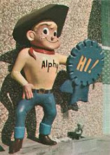