 I don’t know about you, but I find the gaudy retail signs of recent years to be a real turn-off. Today's four-foot tall wooden eyesores or stacked-stone monstrosities always leave me longing for a simpler time - when understatement was the word of the day.
Take the sign shown above, for example. Notice how the gentle earth tones, orange and green, blend seamlessly into the surrounding landscape. You can almost hear the conversations that must have taken place…”You know, I’ve been gazing at that hillside for the last ten minutes or so…did you realize there was a Sears there?”
 The main function of a sign is to inform, and this one does that beautifully. Its message is simple: “Everyone needs food, and most of us need something from the pharmacy now and then. Go no further. You can find these necessities right here.”
 The best signs are like négligées… you barely know they’re there…
 This well-known shopping center’s sign extends a warm invitation: “Welcome to Gulfgate. I’m safe - be at ease. Shop as long as you’d like - go home when you please.”
Now, a little background information on the photos, in the event you're curious: (1) Searstown Shopping Center, Winchester Road, Cumberland/La Vale, Maryland. Opened May 1, 1963. Height, 80 feet tall. From an advertisement for DuPont’s Lucite plastics. (2) Shoppers Square Shopping Center, South Virginia and East Plumb Lane, Reno, Nevada, opened November 5, 1964. The “Skaggs” portion of the sign featured blue lettering on a white background, the “Mayfair” portion, white on red. Height, 72 feet tall. From a 1965 Signs of the Times feature article. (3) Safeway, somewhere in Utah, mid-1960’s. Height, really really tall. From an ad for Dynapac rotating motors. (4) Gulfgate Shopping City, intersection of Interstates 45 (the "Gulf Freeway”) and 610 (“The Loop”), Houston, Texas. The shopping center was opened on September 20, 1956, but the earliest aerial photos I’ve seen do not show this sign. Later known as Gulfgate Mall, it was enclosed in 1967, then torn down and completely redeveloped starting in 2001. The sign still exists in modified form. Height, super mega tall. From an ad for another rotating motor firm, Specialty Engineering and Manufacturing Company.
All these signs are awesome. Unfortunately, with the way most sign ordinances are written along with the cost of maintenance, designs like these will never appear in suburbia again.
ReplyDeleteThanks for the cool images.
ReplyDeleteAlso for your recommendation of The Big Store by Donald Katz. Not really a dedicated student of retail or business in general. But thanks to Katz' ability to give the facts while telling a story, I'm 5/6ths of way through the book.
Very interesting span of American cultural history in that book.
Pacific Plaza (Pacific Beach - San Diego) used to have a large Newberry's with a disproportionately large sign. It was 3 sided. Newberry's lasted longer than the sign did, it caught fire in 1974 and was removed shortly after. Newberry's lasted for several more years.
ReplyDeleteSafeway should have stuck with the old "S" logo. It looks so much better than the current one.
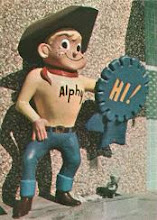
We also used to have a giant sign for a huge buffet, called the "Midway Chuck Wagon". Put in back in the 50's, it featured a huge cowboy with a couple of six shooters. That would not be allowed today!
Safeway still has that logo.
ReplyDeleteTom: Safeway's current logo is similar to, but not identical to, the circle logo seen here. They had switched from the circle to a rounded rectangle, and more recently they altered the rectangular logo to make it more rounded -- but it's not quite a perfect circle; it's still just slightly rectangular. (The colors are also reversed: the current logo is a white "S" on a red background, not a red "S" on white.)
ReplyDeleteUnfortunately, I can't find a good comparison showing all three logos right next to each other.
You can almost hear the conversations that must have taken place…”You know, I’ve been gazing at that hillside for the last ten minutes or so…did you realize there was a Sears there?”
ReplyDeleteNow things are more along the lines of "That sign is so small and unnoticeable is there a Sears there, really? Heading over to Walmart as we speak."
My favorite is the Safeway sign. those curves! Hubba hubba.
Amazing picture of the Cumberland Searstown sign. It remained standing until a few years ago, edited for Braddock Square once Sears moved to the Country Club Mall, which sits on the hill you can see in the background. I knew when I first saw it things looked pretty familiar to me. The new sign is shorter and very uninspiring for the Giant that occupies much of the space of Searstown.
ReplyDeleteI'd kill to see some more Searstown pictures here. Next to none of the original structure remains, just a few in-line tenant areas between the new and old Giant on the site.
Steve – That’s for sure. I’m sure there was some resistance among retail chains (and most certainly among sign companies!) to the “Keep America Beautiful” laws that precipitated these signs’ downfall, but even without the laws, the spiraling maintenance and operating costs would have brought about the eventual end anyway.
ReplyDeleteK.R. – You’re welcome, very glad that you liked the pics and are enjoying the excellent Katz book on Sears. It looks big at nearly 600 pages, but it’s a fast and fun read!
David – Newberry’s had some wonderful signs, both tower versions and on the buildings themselves. I wonder if you remember some of their other nameplates, the Holland House restaurants and their “upscale” department stores, Britts.
I agree that the first version of the Safeway “S” was the best. Timeless.
And that Midway Chuck Wagon sign sounded like a winner!
Tom – As Jim mentions and describes above, the current Safeway “S” is actually the third version they’ve had.
Jim – Just speaking personally, I would rank the current Safeway logo the second of the three in attractiveness, and much nicer than most retail logos out there.
Didi – And if someone said that to me in real life I’d say “Yes, there definitely is a Sears there. They have an optical center and you need to visit it.” ;)
In total agreement with you in the Safeway sign – it’s a work of art, and I don’t mean that ironically.
Daniel – I wish I had pictures of the Sears store itself. If I ever come across them, it’ll make a great sequel post. The tower sign would be a tough act to follow, though!
Dave, Newberry's in Mission Valley Center had the Holland House cafeteria, their store was just adjacent to Montgomery Ward that also had a restaurant. So did May Company at the other end of the center. The Pacific Beach Newberry's had to settle for a mere lunch counter, as a kid eating there was quite a rare treat.
ReplyDeleteThe Sears itself was not very impressive for its era. It was a minimalist store with 2 entrances, one on the side pointing toward that still-standing auto center, the other toward the front and that sign.
ReplyDeleteI never saw it as Sears, but I did see it as a short-lived Zayre. There was nothing but a brown siding facade over brown brick. It was bulldozed in 1993 for Wal-Mart, who since bulldozed almost half of the mall for a Supercenter in 2005.
What I'd love to see are pictures of the old Thrift Drug, Woolworth and Acme that were on site as well as the open-air enclosed mall I only saw in its dying days.
An former Acme Markets in Egg Harbor, NJ also had a nice signange that resembles the Sears Town signage shown
ReplyDeleteDoes anyone remember Venture?
ReplyDeleteSan Diego was also home to the tall signage for the Akron chain (a cross between a Big Lots and a Cost Plus)...three-sided curved rectangles. When "The Akron" went out of business in the early 80s, other retailers-primarily Target and Silo-picked up the sites and converted the Akron signs to their own signage
ReplyDeleteTom - I remember Venture well. I worked at the Venture in Glendale Heights IL in the early 80s.
ReplyDeleteDave - Looks like you have the makings for a number of blogs here. Some unique signage that comes to mind in the Chicago area: Cermak Plaza in Berwyn (which I think you already touched on) and Winston Park Plaza in Melrose Park. I also think that at one time Oakbrook Center in Oak Brook and Yorktown Mall in Lombard had some fancy signage as well.
Those are cool signs, sad thing they don't make them like that anymore. Due to height regulations signs have to be small and predictable. NUTS!
ReplyDeleteI am putting this comment here as it has to do with Mayfair Markets. I attended a session of Rifftrax Live...Rifftrax is a product of several of the people behind MYSTERY SCIENCE THEATER 3000. continuing that cult classic show's tradition of making clever, comic comments over movies and other film clips. In this case it's a closed circuit broadcast to movie theaters
ReplyDeleteof an in-person session of this wisecracking, i.e. "riffing".
The main feature was their take on the original Vincent Price starring version of HOUSE ON HAUNTED HILL. However, they always throw in a couple of short subjects.
One of them is titled MAGICAL DISAPPEARING MONEY, produced in 1972 by an organization which must be a learning extension entity. It was set in a supermarket, and features a witch like woman with amazing powers, which she uses to teach people how to save money grocery shopping in those inflationary times.
Her message is to avoid packaged and processed foods...a pre-sweetened cereal can cost twice what the regular type does (47 cents!), Cook it yourself oatmeal or pudding costs far less than individual instant packets or the ready to eat in a cup variety. And powdered milk is a far better value than the 30 cents a quart milk runs at the store. In short, serious penny-pinching--one of the more unattractive elements of the 1970's, far more so than even a mouse ear Afro or mutton chop sideburns merging into a mustache with no beard (both of which appear on people in this film).
The point is...this piece was filmed at a Mayfair Market, according to the plates mounted on the shopping carts.
Just throwing my "two cents" in here, but having worked for Safeway in the late `90's, I actually got to see items with the older logos on them.
ReplyDeleteThe current Safeway Logo is actuall the 4th, there the circular logo, then very briefly {for about a year or two} there was a circular logo with two S letters together (SS) sort of overlapping. Safeway got rid of that logo quickly due to the fact that it closely resembled an unplesant memory of World War 2. {I am not going to mention it here, but I you can look up SS and World War 2} Anyways, that was when Safeway changed to the 'Rounded Rectangle' shape.