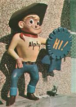
“Like, wow, Montgomery Ward!” read the headline in a March 1970 Business Week article. The article chronicled Wards’ quest for relevance with the coveted 18 to 34 age bracket, and by all appearances they were starting to break through. These efforts encompassed both of Wards’ main lines of business – the legendary catalog and the (now almost exclusively mall-based) stores.
On the catalog side, Wards’ management took a bold step, shoving aside their standard phone book-sized biannual catalog to issue a special 75-page fashion-only edition aimed at the young adult market. The company bypassed their staff copywriters in favor of an outside advertising agency (sparking a minor mutiny that unfortunately reached the press) and photography by Victor Skrebneski, the world famous Chicago-based fashion photographer. The catalog, with pages “crowded with flower-generation youths and pearly-toothed girls facing front and looking ‘now’”, featured the following opening text as quoted by Business Week: “There’s never been a generation like this one before…This generation wants something different out of life. And it’s going to get it.” (Looks like I’m not the only one who likes to begin sentences with “and.”) In Chicago, Wards took the expensive step of introducing the catalog in a 90-minute TV special that would feature “a lot of skin” according to a beaming Skrebneski. The catalog was an unprecedented success, with 50 percent of orders coming in to Wards via direct mail versus the normal 15 percent. “…about half the sales (were) in women’s fashions, predominantly sportswear.”
This was coupled with a hip new approach to store merchandising, perhaps nowhere more so than the “glossy new chrome-and-Day Glo boutique” Wards opened in Sandburg Village, “a multi-stewardessed, young-executived apartment complex on the Near North Side”. (I guess the proper term today would be “multi-flight attendanted.”) Sandburg Village, a set of nine massive, modern high-rise apartment buildings that opened in 1963, had a somewhat controversial origin. A high-profile urban renewal project for which blocks upon blocks of old buildings were leveled (the entire expanse between Clark, LaSalle and Division streets and North Avenue), the goal of Sandburg Village was to stem the flow of middle-class residents to the suburbs. Although many of the buildings demolished to make way for the complex would today be candidates for historic preservation, Sandburg Village is looked back upon as an important factor in the city’s “hoped-for revitalization”, as author J. Linn Allen put it. In the early 70’s Sandburg Village was the epitome of Chicago trendiness, and I can remember my parents taking us to their huge annual outdoor art fair on a couple of occasions. I’d like to think that I looked at the various art pieces and thought “Hmm, I wonder if these are Miró or Braque-inspired?”, though undoubtedly it was more along the lines of “When do we eat?” Veering back on topic, the Sandburg Wards unit, with its hot fashions and “psychedelic light displays” was another success.
The new look was not restricted to a handful of special units, but was soon rolled out nationwide. By 1972 many stores sported the Wards equivalent of rainbows, sunrises and smiley faces. These changes coincided with a new type of store construction that Wards termed the “modular” format. These stores, the first of which opened in Rockford, Illinois in 1970, were built using a special process of prestressed concrete (manufactured by a subsidiary of Wards) that cut the construction time of a typical Wards store in half, according to a November 1970 Business Week article. With somewhat smaller square footage than the huge stores the company had been building, large appliances and other items such as riding lawn mowers were displayed as floor models, with customer purchases shipping out from a centralized warehouse instead of the store. Fifteen “modular” stores were opened in 1970, with plans for 24 more in 1971 and 30 more in 1972. Certainly this was an important development in Montgomery Ward’s race to compete with Sears and JCPenney.
1972 also saw the celebration of Wards’ 100th Anniversary and the kickoff of the “Century 2” advertising campaign, a year-long series of special promotions that met with brutal price competition from Sears and Penneys. As expected, the occasion called for a commemorative book, but in Wards’ case, two books saw the light of day. The first, entitled “1872-1972: A Century of Serving Consumers – The Story of Montgomery Ward”, was a nice bit of puffery, a slim softcover book filled with sepia-toned photographs, “official version” history and an optimistic eye toward the future. The second, far more interesting, book was “Satisfaction Guaranteed: An Unconventional Report to Today's Consumers” by freelance writer Booton Herndon. Over a two-year period, Herndon was given up-close access to Wards’ top executives, but also spent a great deal of time in the trenches with middle managers, store employees and customers. The resulting 300-page book, described by Business Week as “an unabashed defense of mass merchandising at a time when business (was) taking its lumps from consumerists”, was a brutally frank look at the business, the challenges it faced, and the sea change in consumer mentality that characterized the early 70’s. Filled with surprisingly candid revelations and occasional salty language, it proved to be a bit more than Wards executives bargained for, and certainly wasn’t what one would expect from a commissioned book. Entertainingly written, it’s one of my all-time favorites in the field.
“Century 2” got off to a roaring start for Wards, who racked up the strongest sales figures (and a 45% increase in earnings) in their history in 1973. The painful, 15 year-long process of rebuilding the company finally began to pay off. For the first time, every one of the company’s 22 metropolitan districts posted a profit. The smiley faces, rainbows and sunrises took residence in the Montgomery Ward boardroom, however, when the big news rolled in – Wards’ smashing performance as compared to their two main rivals. Wards’ sales for the year were up 22 percent compared to Sears 12 percent, and the all-important Christmas sales figures that year reflected double the sales gain over both Sears and JCPenney. Wards president Ed Donnell tipped his hand in a June 1974 Newsweek article – “…we’re not out to catch Sears or Penney, (but) we will certainly narrow the gap…Our goal is to be held in high esteem by our competitors and our customers.”
At first, the wording of Donnell’s statement (listing “competitors” first) struck me as a bit odd, but in light of one of the article’s other points it makes sense. Montgomery Ward was now in the enviable (and for them, unusual) position of being an attractive prospect for high-profile shopping center projects, even those developed by direct competitors. Only a few years back, they were frequently spurned “because of (their) reputation for cheap goods and stodgy merchandising,” according to Newsweek. Clearly, Wards’ “increased esteem” amongst their competitors was opening new doors of opportunity.
As it turned out, shopping center developers weren’t the only ones attracted by Wards’ recent triumphs. In 1973, Mobil Oil Corporation, America’s third largest oil company (behind Exxon and Texaco) and 7th largest company overall, began to secretly acquire the common stock of Marcor, Montgomery Ward’s parent company. Within months, Mobil had amassed nearly five percent of Marcor’s stock, and were hungry for much more. Sunrises, smiley faces and rainbows weren’t part of their game plan.
These publicity photos are from 1972, that most 70’s-ish of years. (I tend to look back at the 70’s as having three distinct eras – the early 70’s were the “real seventies”, the mid-70’s were the “nondescript but the Bicentennial was cool and comic books were still 25 cents” era, and the late 70’s were “the era that should be renamed the ‘Pre-80’s’”. Glad I could help sort this out for you!)Top to bottom, they feature a typical in-mall store entrance and the sportswear department, “The Chain”, a casual menswear department (reportedly a favorite of Lindsey Buckingham), a hip juniors department entitled “Reflections” (With a sign typeface known to graphic designers as Peignot and to the rest of us as “that Mary Tyler Moore font”.) Next up is “Tiny World” (Are they mannequins or real children? Aaiiiee!!) Then, the canary-yellow “Party Papers” stationery department. (I mean the department decor is canary yellow, not the stationery itself. Well, some of it might have been… but I think you know what I’m trying to say.) After that, a very colorful small appliance area, the obligatory shag carpet headquarters, and the large appliance department, filled with shades of Harvest Gold and Wheat. The outdoor power department is next, from an era when lawn tractors looked like… tractors. After that, a barbecue grill display. I’m not sure that putting a plant on top of a grill is a great idea, unless you’re trying to dry it out. Oh, you’re right, this was the seventies. Lastly, the furniture department, arranged in tasteful living room groupings. But taste is an individual thing, I guess…
On the catalog side, Wards’ management took a bold step, shoving aside their standard phone book-sized biannual catalog to issue a special 75-page fashion-only edition aimed at the young adult market. The company bypassed their staff copywriters in favor of an outside advertising agency (sparking a minor mutiny that unfortunately reached the press) and photography by Victor Skrebneski, the world famous Chicago-based fashion photographer. The catalog, with pages “crowded with flower-generation youths and pearly-toothed girls facing front and looking ‘now’”, featured the following opening text as quoted by Business Week: “There’s never been a generation like this one before…This generation wants something different out of life. And it’s going to get it.” (Looks like I’m not the only one who likes to begin sentences with “and.”) In Chicago, Wards took the expensive step of introducing the catalog in a 90-minute TV special that would feature “a lot of skin” according to a beaming Skrebneski. The catalog was an unprecedented success, with 50 percent of orders coming in to Wards via direct mail versus the normal 15 percent. “…about half the sales (were) in women’s fashions, predominantly sportswear.”
This was coupled with a hip new approach to store merchandising, perhaps nowhere more so than the “glossy new chrome-and-Day Glo boutique” Wards opened in Sandburg Village, “a multi-stewardessed, young-executived apartment complex on the Near North Side”. (I guess the proper term today would be “multi-flight attendanted.”) Sandburg Village, a set of nine massive, modern high-rise apartment buildings that opened in 1963, had a somewhat controversial origin. A high-profile urban renewal project for which blocks upon blocks of old buildings were leveled (the entire expanse between Clark, LaSalle and Division streets and North Avenue), the goal of Sandburg Village was to stem the flow of middle-class residents to the suburbs. Although many of the buildings demolished to make way for the complex would today be candidates for historic preservation, Sandburg Village is looked back upon as an important factor in the city’s “hoped-for revitalization”, as author J. Linn Allen put it. In the early 70’s Sandburg Village was the epitome of Chicago trendiness, and I can remember my parents taking us to their huge annual outdoor art fair on a couple of occasions. I’d like to think that I looked at the various art pieces and thought “Hmm, I wonder if these are Miró or Braque-inspired?”, though undoubtedly it was more along the lines of “When do we eat?” Veering back on topic, the Sandburg Wards unit, with its hot fashions and “psychedelic light displays” was another success.
The new look was not restricted to a handful of special units, but was soon rolled out nationwide. By 1972 many stores sported the Wards equivalent of rainbows, sunrises and smiley faces. These changes coincided with a new type of store construction that Wards termed the “modular” format. These stores, the first of which opened in Rockford, Illinois in 1970, were built using a special process of prestressed concrete (manufactured by a subsidiary of Wards) that cut the construction time of a typical Wards store in half, according to a November 1970 Business Week article. With somewhat smaller square footage than the huge stores the company had been building, large appliances and other items such as riding lawn mowers were displayed as floor models, with customer purchases shipping out from a centralized warehouse instead of the store. Fifteen “modular” stores were opened in 1970, with plans for 24 more in 1971 and 30 more in 1972. Certainly this was an important development in Montgomery Ward’s race to compete with Sears and JCPenney.
1972 also saw the celebration of Wards’ 100th Anniversary and the kickoff of the “Century 2” advertising campaign, a year-long series of special promotions that met with brutal price competition from Sears and Penneys. As expected, the occasion called for a commemorative book, but in Wards’ case, two books saw the light of day. The first, entitled “1872-1972: A Century of Serving Consumers – The Story of Montgomery Ward”, was a nice bit of puffery, a slim softcover book filled with sepia-toned photographs, “official version” history and an optimistic eye toward the future. The second, far more interesting, book was “Satisfaction Guaranteed: An Unconventional Report to Today's Consumers” by freelance writer Booton Herndon. Over a two-year period, Herndon was given up-close access to Wards’ top executives, but also spent a great deal of time in the trenches with middle managers, store employees and customers. The resulting 300-page book, described by Business Week as “an unabashed defense of mass merchandising at a time when business (was) taking its lumps from consumerists”, was a brutally frank look at the business, the challenges it faced, and the sea change in consumer mentality that characterized the early 70’s. Filled with surprisingly candid revelations and occasional salty language, it proved to be a bit more than Wards executives bargained for, and certainly wasn’t what one would expect from a commissioned book. Entertainingly written, it’s one of my all-time favorites in the field.
“Century 2” got off to a roaring start for Wards, who racked up the strongest sales figures (and a 45% increase in earnings) in their history in 1973. The painful, 15 year-long process of rebuilding the company finally began to pay off. For the first time, every one of the company’s 22 metropolitan districts posted a profit. The smiley faces, rainbows and sunrises took residence in the Montgomery Ward boardroom, however, when the big news rolled in – Wards’ smashing performance as compared to their two main rivals. Wards’ sales for the year were up 22 percent compared to Sears 12 percent, and the all-important Christmas sales figures that year reflected double the sales gain over both Sears and JCPenney. Wards president Ed Donnell tipped his hand in a June 1974 Newsweek article – “…we’re not out to catch Sears or Penney, (but) we will certainly narrow the gap…Our goal is to be held in high esteem by our competitors and our customers.”
At first, the wording of Donnell’s statement (listing “competitors” first) struck me as a bit odd, but in light of one of the article’s other points it makes sense. Montgomery Ward was now in the enviable (and for them, unusual) position of being an attractive prospect for high-profile shopping center projects, even those developed by direct competitors. Only a few years back, they were frequently spurned “because of (their) reputation for cheap goods and stodgy merchandising,” according to Newsweek. Clearly, Wards’ “increased esteem” amongst their competitors was opening new doors of opportunity.
As it turned out, shopping center developers weren’t the only ones attracted by Wards’ recent triumphs. In 1973, Mobil Oil Corporation, America’s third largest oil company (behind Exxon and Texaco) and 7th largest company overall, began to secretly acquire the common stock of Marcor, Montgomery Ward’s parent company. Within months, Mobil had amassed nearly five percent of Marcor’s stock, and were hungry for much more. Sunrises, smiley faces and rainbows weren’t part of their game plan.
These publicity photos are from 1972, that most 70’s-ish of years. (I tend to look back at the 70’s as having three distinct eras – the early 70’s were the “real seventies”, the mid-70’s were the “nondescript but the Bicentennial was cool and comic books were still 25 cents” era, and the late 70’s were “the era that should be renamed the ‘Pre-80’s’”. Glad I could help sort this out for you!)Top to bottom, they feature a typical in-mall store entrance and the sportswear department, “The Chain”, a casual menswear department (reportedly a favorite of Lindsey Buckingham), a hip juniors department entitled “Reflections” (With a sign typeface known to graphic designers as Peignot and to the rest of us as “that Mary Tyler Moore font”.) Next up is “Tiny World” (Are they mannequins or real children? Aaiiiee!!) Then, the canary-yellow “Party Papers” stationery department. (I mean the department decor is canary yellow, not the stationery itself. Well, some of it might have been… but I think you know what I’m trying to say.) After that, a very colorful small appliance area, the obligatory shag carpet headquarters, and the large appliance department, filled with shades of Harvest Gold and Wheat. The outdoor power department is next, from an era when lawn tractors looked like… tractors. After that, a barbecue grill display. I’m not sure that putting a plant on top of a grill is a great idea, unless you’re trying to dry it out. Oh, you’re right, this was the seventies. Lastly, the furniture department, arranged in tasteful living room groupings. But taste is an individual thing, I guess…