Showing posts with label Woolworth's. Show all posts

Thursday, December 23, 2010

It's Beginning to Look a Lot...

… like Christmas!
Ev'rywhere you go -
Take a look in the five-and-ten

glistening once again

With candy canes

and silver lanes aglow

It's beginning to look a lot like Christmas

Toys in ev'ry store

But the prettiest sight to see

is the holly that will be

On your own front door

A pair of hopalong boots and a pistol that shoots
Is the wish of Barney and Ben

Dolls that will talk and will go for a walk
Is the hope of Janice and Jen

And Mom and Dad can hardly wait for school to start again!

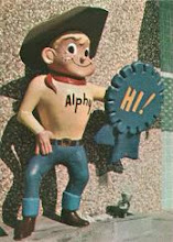
Photos by F.W. Woolworth Co., circa 1948-55.
Lyrics by Meredith (“The Music Man”) Willson, circa 1951.
Bing Crosby vocal imitation by You, circa 2010.

Tuesday, September 22, 2009

Suburban Shopping in the 1970's!

…and now for something completely different! Here’s an overview of the chain retail scene from a single suburban town from the year 1976 – the town in this case being Addison, Illinois, a western suburb of Chicago. Since the majority of the chains shown in this post are (or were) national or at least multi-regional, many of you will probably get a kick out of this. If you’re from the Chicago area, these photos should be a special treat, as nearly all the companies pictured should be familiar, and if you grew up in the Addison area, I suspect the floodgates will open.

These photos are the work of Mr. Joe Archie, longtime Addison resident. Joe and his wife, Jeanette, have put together an incredible photographic record of the area’s history through the years, along with the history of their family. Be sure to check out their wonderful Flickr page to see more of their photos, including some very nice downtown Chicago views. Joe took this set of photos in 1976 as part of a project to document their hometown during America’s Bicentennial year. My utmost gratitude goes to them for allowing us to enjoy these great photos, and for continuing to document these all-too-often overlooked aspects of American life.

Some of these chains have been covered in depth here before, and others I eventually hope to get around to, so we’ll dispense with the hardcore history this time around. Instead, I’ll just toss out a few facts and throw in some memories here and there. As always, I welcome your own memories in the comments section.

Also, we’ll make an exception to the rule here, and expand the site’s normal scope just a bit to include some of the popular chain restaurants of the day. I mean, we have to eat, don’t we?

And we’ll have the radio on as we drive – with any luck there’ll be something decent playing – maybe some Steely Dan or Queen or Boston, or even some 10cc or Wings. Of course, there’s always the likely chance that Dad will pop in his 8-track of Neil Diamond’s “Hot August Night” (1972 double-live album) for the 3,700th time. Oh come on, it’s not like you don’t sing along with every word!

First up is Zayre, a suburban Chicago fixture with 27 stores in the area by that time. The store pictured is the classic early Zayre with the massive glassed storefront and the even more massive signage. I particularly like the Auto Center close-up, with very nice glazed brick and blue flashing (just like the main store) and a simple, clean appearance. As I noted at the beginning of a series of Zayre posts done last year, my family pretty much dropped Zayre like a hot brick when Kmart came around. Seeing these photos years later, with that beautiful row of blue diamonds above the entrance doors (and it also looked great after the 1978 brown-and-orange revamp), I’m sitting here with pangs of regret. Were we too hasty?

Come back Zayre, I’ll let you be my store!!

The Mighty Jewel - then as now, Chicago’s supermarket powerhouse - looking mighty well in classic 70’s aggregate and mixed brick in this location at Addison's Green Meadows Shopping Center. The bold orange signage for this store was rendered in a font that the company had been using for over 40 years by then. The following year, it would be replaced with a new logotype that would eventually grace the Addison store when it was remodeled a few years later. Interestingly, both Jewel and their top competitor Dominick’s would switch from orange to red-orange logos in the 1980’s.

Jewel, pronounced correctly, is a one syllable word – “Jool.” It’s just another one of those fun, idiosyncratic Chicago pronunciations, like “melk” instead of “milk”. (I’m not kidding.) And as noted before, “Jewels” or “The Jewel” are perfectly acceptable forms of usage. Never “The Jewels”, though, lest one risk jumping the shark.
Donimick's Finer Foods (Pronounced Dah-min-ick’s, with heavy emphasis on the first syllable. Typical usage: “Oh, we’re out of melk? Crap, I just got back from Dominick’s!”) was a fairly small chain as recently as the late 60’s, but by 1976 was growing like wildfire, with over 60 supermarkets by then, bypassing such longtime Chicago stalwarts as A&P and (the newly departed) National Food Stores on its way to becoming number two in the market, second only to Jewel, which is still the case today. This very attractive store, located on Army Trail Road in Addison, opened in 1973, and is typical of the stores they were putting up all over Chicagoland. I drove by this store this past January, and sadly it is now closed. The two stores we shopped at were older, one at the Market Place shopping center in Des Plaines on the corner of Elmhurst and Golf Roads, and the other in Rolling Meadows on Kirchoff Road, but they had the same “letterboxed” signage. Nearly all Dominick’s stores flew the orange flags in those days, a great touch.

As said in a previous post, Dominick’s strength was their excellent selection of ethnic foods, and the chain held an Italian food fair for years that always managed to attract lots of customers and press attention. Also mentioned previously were the great Heinemann’s bakeries, with their superb Butter-Ritz cakes and homemade cookies. Ironically, the Heinemann’s line is not available today at Dominick’s, but is at Jewel. I still can’t get used to that.

Guido’s was an independent chain in the Chicago area. We shopped at the Hoffman Estates store once in a while during the year or so we lived in the area. Don’t know a lot about them, other than the fact that they had four stores in the early 70’s - this Addison location, Westchester, Berkeley (honored by Progressive Grocer magazine in the mid-60’s as a “Store of the Month”) and the above-mentioned Hoffman location which was closed due to poor profitability in 1973. I’m assuming that the rest of the chain ceased operation sometime not too long after that.

It’s interesting to note that Guido’s also had the Heinemann’s bakery franchise. The once-mighty (and by 1976, gone) National Food Stores had it as well, but certainly it was associated closest with Dominick’s.

Goldblatt Bros. was a classic, full-line department store with deep Chicago roots. This store, located in the Green Meadows Shopping Center in Addison, opened in the spring of 1962. Like a couple of other Chicago department store institutions, Marshall Field & Company and Wieboldt Stores, Inc., they chose green as their corporate color. Of more substance, perhaps, is the fact that like those other two companies, Goldblatts was early to establish suburban branches, as exemplified by this store and several others, including the one we shopped at in Mt. Prospect Plaza, and other locations such as the Scottsdale Shopping Center near Burbank, Illinois and at Elmwood Plaza in Racine, Wisconsin. In the early 60’s there were 31 Goldblatt’s stores in total.

Since Randhurst Center, with its triple-threat of Wards, Carsons and Wieboldt’s was just down the street from our local Mt. Prospect Goldblatts, our family usually gave them the short shrift, I’m sorry to say. Goldblatt’s seemed to target a slightly lower income demographic than the chains I’ve just named, and for a time the strategy worked very well. In time, it was competition from the discount chains rather than other department stores that caused them the most problems. Pulling out of a bankruptcy in the mid-1980’s, Goldblatts hung on for a long time but never really hit its stride again, finally closing up for good in 2003.

Sporting a nice example of one of my all-time favorite retail logos, the Addison JCPenney Catalog Outlet already had a vintage look by 1976. Unlike Sears and Wards, whose catalogs dated back to days of old, for Penney’s it was a relatively recent venture – a business they entered through acquisition, when they bought out Milwaukee-based General Merchandise Company in 1964. That company’s catalog essentially became the “Penney’s catalog”. Several of these catalog outlet stores were actually attached to the company’s distribution centers. Later on, this store was replaced by a new store at nearby North Park Mall, which itself is now closed.

We’ll talk about Portillo’s, the restaurant to the left of the photo, (Dig that “hot dog” sign! It’s long gone but lives on on all Portillo’s packaging.) in a bit, but for the moment I wanted to focus on the Ace Hardware store. Before the days of the all-inclusive “home center” – currently active firms like Lowe’s, Home Depot and Menards (primarily Midwestern locations) and now-defunct companies such as Grossman’s, Courtesy, Home Quarters, Hechinger’s, Handy Dan, etc., one pretty much bought lumber at a lumber yard and hardware at a hardware store. For us, that hardware store was the Ace Hardware in the Rolling Meadows Shopping Center. My Dad was (and is) the consummate handyman, so it was the rare Saturday morning that we didn’t stop in at Ace at least briefly. The Addison Ace looks to be of 1950’s or very early 60’s vintage.

Anyone who watched much TV in the 1970’s would have to remember the commercials with sultry-voiced actress Connie Stevens singing “Ace is the place with the helpful hardware man”, after which she would put her arm around some guy in a red Ace vest who was trying his best not to smile too broadly. In the early 80’s, Connie was replaced by NFL coaching/broadcasting legend John Madden with a modified slogan suited to fit his regular guy persona – “I gotta tell ya, Ace is the place for me.”

“The old 5 and 10’s” were definitely a dying breed by the mid-70’s, though most of the venerable old names, including the once-great Ben Franklin, were still hanging on by a thread at the time. My own family had long since passed them by in favor of Kmart, The Treasury, Venture and the other much larger discount stores.

It’s interesting to see how the Addison Ben Franklin was by then trying to position itself as a “hobby and craft” niche supplier. In light of the competition, it was probably a wise move. (Notice one of the signs mentions macramé. I remember my family selling a huge macramé wall hanging at a garage sale in the early 80’s, and a lady came up asking “How much for the ‘ma-crayme’?” I thought we were gonna die!)

In truth, I know next to nothing about the Big “R”, but it sure has that wild, kooky discount store look, and probably was a fun place to shop. Close to Addison, this store was actually located in nearby Villa Park, on North Avenue near Addison Road. The earliest newspaper ad I’ve located for the Big “R” dates back to 1962, but the store might well be older than that. Notice the colonial flags (with the famous “Don’t Tread On Me” flag to the far left) – a nice touch for the Bicentennial year. Sadly, the store appears to have been in the proverbial “throes” based on the liquidation signs in the windows. If anyone can fill us in on the Big “R” experience, I’d be glad to update this section. Thanks.
Update 10/6/09 - Several people have written to inform us that the Big "R" property was the birthplace of an important piece of Chicago-area pop culture - Dick Portillo's first hot dog stand, "The Dog House", forerunner to the wildly popular Portillo's chain, was located at the edge of the store's parking lot! Opened in 1963, the hot dog stand, which as mentioned was actually a trailer, didn't even have running water, and actually used a 250' long water hose hooked up to an adjacent building. "The Dog House" is a revered part of the company's heritage, and I believe every modern Portillo's has a picture of it somewhere on their walls. The Big "R"'s place in history is secure, and I, for one, am very relieved!

A sad sight indeed is this vacant, boarded up Topps Department Store on North Avenue in Addison. The original Topps at this location opened (to great fanfare, as was their style) in 1962, but was completely destroyed by fire four years later. The replacement store was built in the updated Topps image. This store closed in 1974 along with the rest of the chain, and so had already sat empty for some time when this photo was taken. Later on, the store became a Syms clothing outlet, which it remains to this day. I shopped there a few times, and remember their commercials featuring company founder Sy Syms with the well-known tagline – “An educated consumer is our best customer”.

Almost forgot this one, because these stores weren’t around long. Robert Hall Village was intended to be a successor to the well-known Robert Hall clothing stores, the retail face of a garment manufacturer called United Merchants and Manufacturers, Inc. Mr. Archie, in his original photo caption sums it up: “Robert Hall was a city chain whose slogans alluded to "Plain pipe racks" and "Low rent". They didn't do so well in the suburbs.” My Dad shared that view (that they carried “low end” clothes), and because of that didn’t shop there much. I personally made one significant purchase at Robert Hall, though - when I was seven years old, I bought Dad an electric yellow pair of golf socks for his birthday. I couldn’t understand why he wouldn’t wear them all the time!

Robert Hall Village was UM&M’s attempt to broaden the appeal of Robert Hall by expanding it into a “total discount store” concept – clothes, sporting goods, automotive, electronics and even groceries. The Chicago Tribune’s George Lazarus explained the rationale: “If Robert Hall can attract milady with an apparel special, the firm stands a good chance of selling her some groceries while she is in the Village.” Several Robert Hall Villages were opened across the country, including five in 1973 in the Chicago area – Downers Grove, Homewood, Crystal Lake, Hoffman Estates and the pictured North Park Mall unit in Villa Park. If they were trying to emulate a Turn-Style, Topps or Korvettes, they did a pretty good job, unfortunately, since those chains were in awful shape by the mid-70’s, and were “tubesville” before decade’s end. “Milady” wasn’t impressed. Upon the chain’s closure in 1977, two of the units, Downers Grove and Villa Park, became Kmarts.

For me, one memory of Robert Hall Village stands out. We visited the Hoffman Estates store during its grand opening (1973), and it’s the first time I remember seeing an electronic digital calculator. These were beautiful desk models, manufactured by the Japanese firm Miida (My-eeda), and were priced heftily at around $200 up to $350 or so. Of course, you can now get the same functionality at Dollar Tree for…well, a dollar!

You’d think that my main interest in this photo would be the great-looking, antebellum style “Type-C” Sears store, with the classic 60’s serif version of the logo. As nice as that is, having grown up in the Chicago area, the “Playback” store to the right (unfortunately much of the sign isn’t visible) is a rare, wonderful sight. For anyone who came of age there in the 70’s and 80’s, Playback, a now defunct stereo/electronics chain, was legendary. Oh, the hours spent there, drooling over $500 Pioneer car stereos and $1200 Blaupunkts, when the car I was driving at the time was worth somewhere between the two! Playback also had one of the most memorable commercial jingles of the day – I wish I could find a copy of it to link to. It was simply the company name and tagline - “Playback – the electronic playground!” sung in a cool layered-harmony, a cappella, stretched out style, sort of like the opening verse of the Kansas song “Carry On, Wayward Son”.

Fayva was a deep-discount shoe store chain, very similar in concept to Payless. As far as I know, my family may have shopped there once or twice, but I only vaguely remember it. Fayva was division of Massachusetts-based Morse Shoe, Inc., which also operated shoe departments in a number of discount chains. (As a kid, I did visit the bizarrely fascinating, long-since closed museum founded by Ira Morse in Warren, New Hampshire. The guy loved to hunt, let’s just say.) Fayva was a major TV advertiser in Chicago, and I assume elsewhere as well.

Next door is a Rexall drug store, sporting a very nice sign with the brand-new ‘70’s Rexall logo. A national institution for decades, Rexall ‘s glory days were by then largely past, and their parent company, Dart and Kraft, was royally ticking off loyal Rexall franchisees around this time by opening up the product line to other chains. Not long afterward, the franchisees were dropped altogether, their contracts cancelled. Ironically, Dart and Kraft “invited” them to continue to keep their Rexall signage installed as a means of promoting Rexall products. Most declined, understandably, although a few drugstores still fly the orange and blue to this day.

Kinney was easily the best known “family shoe store” of the 60’s and 70’s. We shopped there a bit, but most of our shoe bucks went elsewhere, mostly to local family owned shoe stores. They were another mega-TV advertiser.

From 1962 on a division of the F.W. Woolworth Company, Kinney had over 600 stores at its peak, the majority of which were the “roadside” style buildings that looked exactly like the one pictured - an extremely familiar sight for millions of Americans. Family shoe stores, like family restaurants, are largely a thing of the past, and it seems (in all but the luxury shoe market, at least) that the key to success for a shoe store chain is to follow either the sports or discount model. Woolworth themselves realized this some time ago, so by the end of the nineties the Kinney stores were history. From that point all resources were poured into Foot Locker.

You’ve heard of Walgreens, right? Pretty hard to miss ‘em, seeing as they’re popping up on prime street corners everywhere in what has to be the most aggressive real estate strategy in all of retail - one that has all the appearances of a 50-to-100 year plan. It’s interesting to watch as they battle it out with CVS in the drugstore version of “last man standing”, but if the old adage “location, location, location” holds true, it’s hard to see how they can lose.

Even thirty-some years ago Walgreens was a big player, especially in their home market of Chicago. But as you can see they weren’t nearly as picky about locations, even to the point of taking over an existing store in a shopping center that would easily been 10 to 15 years old at the time, as this photo of the “new” store in the Green Meadow Shopping Center in Addison shows. Perhaps they took over one of their old “Walgreen Agency” franchised stores, a category that was being phased out at the time.

“When you run out, run out to White Hen!”, the classic commercial went. White Hen Pantry, the franchised convenience store division of Jewel, had been around 10 years by this time, and had multitudes of locations in Chicagoland, especially in the Northwest and West Suburbs. Home of a basic selection of groceries, newspapers and magazines, a great deli and brownies extraordinaire, these were always a great place to stop.

Looking at the photo, the “Open 6 to 11” sign jumps out at me. Gosh, I wonder whose competitive nose they were trying to tweak? Unfortunately, the competitor eventually won out, and this store, like most all other White Hens in Chicago, is now a 7-Eleven. Somehow “When you run out, run out to the Sev!” just doesn’t have the same ring to it. Many of the New England area White Hens, the chain’s other major market, are still going strong.

Wow, looking at the picture of this Denny’s restaurant, the design is even nicer than I remembered! A worthy successor to the famous first-generation “Googie” Denny’s stores, this is seventies design at its finest. Inside it was all orange and brown, red and purple. The Rolling Meadows, Illinois Denny’s, where we usually went, looked just like this Addison unit.

We ate there a lot in those days, my dad, brother and I, usually for breakfast on Saturdays. Of course, later on in college and my early twenties, I learned just how late (or early) “Always Open” really meant! “Last stop of the night”, so to speak, after a concert or other late night activity. These days, with kids of my own, Denny’s is pretty much back on breakfast duty, at least every now and then. Sure wish our local one looked like this!

Three mainstays of the 1976 fast food scene against a backdrop of cloudy skies. Dunkin’ Donuts (“World’s Finest Coffee- Donuts made fresh every 4 hours” – Awesome!) we’ll talk about them in just a sec. The Burger King, sporting the 70’s sign in the parking lot and the 60’s lettering on the building, needs a bit of shingle work. All that’s visible of the McDonald’s here is the famous “Golden Arches” sign. “10 Billion Served, it reads. Nowadays there are 10 Billion McDonald’s restaurants, aren’t there?

In this day and age, I think it would be really cool if McDonald’s switched to a satellite-fed digital readout for the “Billions Served” portion of the sign. Many of these haven’t been updated in years, or feature the “Billions and Billions Served” copout. The technology isn’t that expensive anymore, and it wouldn’t even have to be updated in real time - weekly or even monthly would suffice. I think it would be a fun gimmick, and the numbers would no doubt be impressive as heck.

(Special note to McDonald’s executives: Information on where to send royalty checks for the aforementioned idea can be obtained by contacting “Dave” at the email address in the Profile section of this website. Thank you.)

Long before America ran on Dunkin’, we still liked it a whole lot. Dunkin’ Donuts is a much revered institution in the Chicago area, possibly just slightly less so than in their native New England, where they’re as common as fire hydrants. This particular prototype brings back such wonderful memories for me. The ones we frequented the most – Des Plaines on Elmhurst Road and Rolling Meadows on Kirchoff – looked just like it. This was another proverbial “Saturday stop”, oftentimes between Ace Hardware and Dominick’s. (The thing I’m really digging about these photos and writing this post is reliving the old routines, and the way they’re coming back to me in such detail, which hopefully I’m not boring you with. Wow, has time flown!) When we were very young, my brother and I would peer through the window where we could watch them make the donuts and occasionally the cook, who didn’t look at all like that little guy on TV, would give us free ones hot off the press (and those suckers were hot, trust me), the chocolate honey-dipped type. Those must’ve been fast sellers, because that’s the only kind we ever saw them make!

In recent years Dunkin’ Donuts has received a good bit of acclaim for their coffee. Long overdue and well-deserved, in my opinion, but of course I’m partial to the stuff. The lack of a mermaid on the coffee cups doesn’t bother me in the least.

Never convenient were these, but we did hit the Jack in the Box once in a while, and the food was decent. They did have a lot of appeal for kids, with cool giveaways and a “kid meal” that predated McDonald’s Happy Meals, if I remember right. And they made Rodney Allen Rippy a star, for a while at least. My apologies to those who can’t get the Jack in the Box jingle out of their heads as a result of reading this.

And the store is very sharp looking, no question about it. The Grand Prix in the foreground reminds me of my second car, a ‘76 GP bought in 1983. With my Pioneer stereo, Audiovox equalizer and Jensen Triax speakers, I could deafen whole blocks. Didn’t even need the Blaupunkt! Today I pretty much just run with whatever factory stereo comes with the cars, though.

One of the coolest aspects of this Pizza Hut for me personally is that the fact it dates from around the first time I ever ate at one. Almost exactly year after this photo was taken, our family - grandparents and aunt and uncle in tow, stopped for dinner at the Mt. Prospect Pizza Hut on Algonquin Road (like this one, long gone) after my eighth grade graduation ceremony in 1977. I don’t remember ever setting foot in one prior to that. I believe that restaurant had the newer logo (as on the folding sign to the lower right). Still like ‘em, although I’ll take a good old Italian mom-and-pop made pizza over any chain’s product every time.

The big news now is that Pizza Hut is floating the idea of simply calling their restaurants “The Hut”, just like Radio Shack is testing out “The Shack” as a new banner for their stores. (Don’t worry, I’ve resisted any temptation to start calling this site “The Blog”. But you’d know what I’m talking about if I did, right?......……………..Hello?)

My prediction, if Pizza Hut’s name change is successful, is that ten years from now we’ll just see the familiar red roof with the word “The” on it.

Another one I don’t have a great deal of personal experience with, but I do remember their TV commercials. Arthur Treacher’s was a division of National Fast Foods, who licensed the famous fish and chips recipe from the British family who created it in the 1860’s, the Malins-of-Bow. They chose distinguished British actor Arthur Treacher as their corporate pitchman (and as he got older, strictly their symbol – he passed away in 1975). Treacher was a distinguished character actor who was very active in the 30’s and 40’s, often playing a sage-like, quip-ready butler. One of his last roles was as the Constable in the 1964 Disney film Mary Poppins.

In the late 1960’s, Fisher Foods, parent of Fazio’s supermarkets in Ohio and Dominick’s Finer Foods in Chicago, bought a major interest in National Fast Food, gaining as part of the deal the franchising rights for Arthur Treacher’s in the Cleveland and Chicago markets.

Ah, the Ponderosa – my family ate Sunday dinner after church here for years on end. The Ponderosa chain was originally started as a knock-off of Bonanza, another steakhouse chain in which one of the original investors was a star of the famous Bonanza TV show - Dan Blocker, who played Hoss Cartwright. For many years now, both chains have been owned by the same company.

The one we went to was in Arlington Heights off of Golf Road (near Kmart), and looked very much like the Addison unit pictured here. You stood in a cafeteria- style line, got your tray with a little plastic number, picked out your side dishes and then ambled over to your seat (with a woodburned “P” on the seatback!), waiting for your steak to arrive on a black plastic and stainless steel plate. (Charles Hathaway, “Romleys” on Flickr, recounts a similar recent experience at a Bonanza restaurant, so obviously the drill hasn’t changed much. I probably haven’t eaten there since the mid-90’s.) Ribeye was my standing order, and was usually good, or at least not beyond “A.1. redemption”, an extreme but sometimes necessary measure. The one thing about Ponderosa that sticks out in my mind above all else is the fact that they charged for extra butter pats! I believe it was either six or twelve cents each, don’t really remember. The strange flipside of this was that Ponderosa was the very first restaurant that I ever remember giving free soft drink refills. Of course it’s now a constitutional right, but up until the early 1980’s (in my frame of reference at least –the Chicago area and the New England states), if you wanted another Coke at a restaurant you had to order a second one. At other restaurants, if the folks were in a good mood and my brother and I hadn’t committed any major infractions, e.g.: blowing straw wrappers in the waitress’s face, etc. (These were less enlightened times, friends.), they would spring for the second Coke. Then there were those rare-as-hen’s-teeth occasions where they would buy us a third one. Of course, my brother and I were thrilled, but all the while would give each other nervous “Have they gone nuts?” looks.

At any rate, that was the great “Ponderosa Paradox”, if you will – you got your fill of drinks, but if you needed any more butter pats, you’d best pony up, Pardner! As Hoss Cartwright would say, “There’s a mess of irony out there, Pa!”

Ok folks, this is it! This is the one. Woo-hoo! At this point (as you may have figured out), my objectivity goes straight out the window. Portillo’s is a Chicago-based chain of restaurants whose main specialties are incredible Vienna Beef hotdogs and classic style Italian Beef sandwiches, and I simply love the place.

From a single hot dog stand (it was actually a trailer) called “The Dog House” which opened in Villa Park in 1963, Dick Portillo’s restaurants had matured to sit-down units like the one pictured by the mid-70’s. Today, with 32 restaurants in the greater Chicago area, plus one in Buena Park and one in Moreno Valley, California, the Portillo’s units are a feast for the eyes as well – they tend to follow one of several themes - a 1920’s “boardwalk” theme , 1930’s gangster theme, 50’s, 60’s,etc.. Of course, many restaurant chains today are into retro artifact decor, with “leaf blowers glued to the wall” (as so aptly put on Dumpy Strip Malls, one of my new favorite sites) and the like, but Portillo’s artifacts are rarer, often larger, more plentiful and more interesting than I’ve seen anywhere else. (And the Niles Portillo’s, with the ‘30’s Prohibition theme, has two killer porcelain A&P signs hanging up – a must see.)

Another great thing about Portillo’s is that it alone provides a great reason to travel to Chicago. Seriously, if a local asks “What brings you here”, all you have to say is “Portillo’s”, and you don’t have to bother with any further explanations, such as: “Oh, I’m here for a conference”, “to visit family”, “to go to a Cubs game”, “to see the museums”, yeah yeah, whatever. Gotta plan my next trip!

Well, I guess that wraps it up, and there are still four songs to go on the Neil Diamond tape. Guess we’ll have to save “Cracklin’ Rosie” for another day (although that one’s almost worth sitting in the car another four minutes for, ice cream notwithstanding). Hope you’ve enjoyed this as much as I have!

Friday, July 31, 2009

Woolco's "Fairly Fresh" New Look!


The early 1970’s found Woolco in serious need of an image makeover. The stores’ appearance had remained more or less static for years (the basic exterior design was now ten years old, and the main elements of the interior package had been in place since day one), despite the sea change in the American sense of style that was taking place.

In 1973, Woolco embarked on a plan to change it all, at least as far as their new stores were concerned. The “discount store look”, so evident in their stores despite the chain’s firmly stated disdain for that term, would be replaced with more upscale décor in an effort to emulate a true department store feel. The standard Woolco prototype was redesigned inside and out, and an attractive new stylized logo took the place of the familiar Woolco script.

The new Woolco stores were of a larger average size than before, up to 150,000 square feet, while the smaller “mid-size market” Woolco format was discontinued altogether. All new company stores that were 100,000 square feet or less would bear the Woolworth’s nameplate, a group which included many of the new mall-based stores, though mall-attached Woolcos would continue to open as well. The new, larger Woolworth’s units were classified as “A” stores, a company designation that was first used in the mid-60’s, one that had long been in use by Sears and Montgomery Ward, among others.

From the standpoint of customers who regularly shopped at the older Woolcos, the changes must have appeared sweeping. A more distinctive exterior design was introduced, with a larger elevated portion to the façade, consisting of beige block ornamented with brown waterfall sections and of course, the new logo. The interior lighting was a major departure from the past as well. The traditional discount store fluorescent strip lighting arrangement – with its “relative harshness...where a single candy wrapper on the floor sticks out like a sore thumb”, as a Chain Store Age article put it, was junked in favor of recessed mercury vapor fixtures, providing a softer and more elegant light, as one would typically see in a department store setting.

The new Woolco stores would make much greater use of carpeting, particularly in the apparel sections. Woolco was now able to carry a much larger amount of (high-profit) apparel, due to increased space and the introduction of “spiral fixtures and multilevel racks which display a large amount of hangware”, the article stated. You know, with the popularity the words “software” and “hardware” as they relate to computers have gained over the last 30 years, I’m surprised that the word “hangware” (I'd never heard of it before reading the abovementioned article) never took off in clothing sales. “Visit Kohl’s for Hot Summer Deals on hangware for the whole family!” Maybe I need to think that one through.

An additional cue from the world of department store design can be seen in the rearrangement of the stores into “boutique” sections, where individual departments were cubed off from the rest of the store via half-height walls, special signage and other design elements. The goal here was to draw customers in and encourage them to stay awhile. The record departments, those beloved cash cows of discounters everywhere, particularly benefited from the new setting. Another aim of the “boutique” arrangement was to bolster Woolco’s furniture/home furnishings business by allowing room groupings of furniture (with coordinated lamps, oriental rugs, etc.) to be displayed.

Woolco’s intention, as a Woolworth executive put it for Chain Store Age in 1974, was to “reduc(e) customer confusion”, as the stores “were too bland and sterile before”. The executive noted that “the décor sought is not elaborate, but fairly fresh-looking”. Now when it comes to retail history, I find a lot of the stuff amusing (guess I’d have to, right?), but that last statement made me laugh when I read it. “Fairly fresh” – Way to swing for the fences, Woolco! It sold the (really very nice) new concept woefully short, in my opinion.

Among the most important upgrades were the changes to Woolco’s Red Grille restaurants, consistently one of the highest grossing and most profitable areas of the store. The objective here was to move away from the cafeteria image (although the serving line would be retained) to more of a restaurant/coffee shop, along the lines of an Alphy’s (owned by L.A.- based Alpha Beta Acme Markets) or a Wag’s (Walgreen’s restaurant operation, with locations in the Chicago, Tampa and Miami areas). The garish red and white-striped awnings were done away with, replaced with a classier looking soffit and a row of white-globed lights along the service line. Comfortable booths were added, adding to an overall more elegant, subdued atmosphere. Red carpeting was laid down, and the entire area was semi-enclosed, giving patrons a “feeling of separation from the store rather than one of a crowd of shoppers hanging over their shoulders while they eat”. Probably the biggest change of all for the Red Grilles was their relocation from their previous location in the back of the store to the front, complete with their own outside entrances. The company’s two new stores in Wichita provided Woolworth top management an excellent basis for comparison – one Woolco had the Red Grille up front, the other in the standard rear location. Although this was unintentional (the plumbing had already been set for a front location in one of the stores and couldn’t be economically moved), the difference in restaurant revenue between the two stores was significant enough to prompt a front-location mandate for Red Grilles in all future Woolcos. Lastly, the Red Grilles of many older Woolco stores, including the company’s first Columbus, Ohio unit, were remodeled to the new image (though for cost reasons most remained in their original location in the store), something that was less frequently the case with other departments.

The company’s new “flagship store” opened in Langhorne (Bucks County), Pennsylvania, in Lincoln Plaza, adjacent to the Oxford Valley Mall in June 1974. This new 155,000 square foot Woolco, the largest in the fleet, was a true showplace - incorporating everything in the company’s new bag of tricks. Ironically, this moment of triumph coincided with Woolco’s startling decision to introduce a new policy dispensing with grand opening festivities of any sort. This did not escape the notice of the local paper, the Courier Times, which headlined the following day’s article “No ceremony, but it’s the biggest”, and led with the following sentence – “There was no ceremony to mark the occasion. No beauty queens (!), bands or politicians. Not even a ribbon cutting”. The (no doubt embarrassed) store manager offered an explanation: “We want to get open to the public rather than delay anything.” It’s a shame the word “meh” wasn’t yet part of the American lexicon – “Welcome to your new store, Ma’am. Meh. Fairly fresh, isn’t it?” In fairness, the article did record the presence of red, white and blue banners and a “Woolco Grand Opening” sign, things that always seem to warm the hearts of readers of this site.

At the end of 1974, there were 242 Woolco stores in 36 states and 86 in Canada, including 14 new catalog(ue) stores , a concept that (for Woolco) was unique to Canada. In Great Britain, whose first Woolco opened in 1967, there were now a total of 9 units. In 1977, Woolco finally surpassed the Woolworth’s stores in gross sales. By the end of 1979, there were 312 Woolco stores in the United States, 114 in Canada and 13 in Great Britain.

By this time Woolco had entered the long overlooked Chicago area, opening their first two area locations in late 1973, in Villa Park and Homewood. Eventually more Chicago area locations would follow, including Niles, Schaumburg, Oak Lawn, Matteson, DeKalb, Wheaton , and Rolling Meadows. This last location was originally opened as a Topps Super City discount store in 1961, and had sat vacant for over 2 ½ years after Topps, a store I fondly remember shopping at, closed down their entire operation. In 1978, expanded and refaced, it reopened as a Woolco, only to close four years later at the chain’s demise. After another long vacancy, it opened yet once more, this time as a Dominick’s Finer Foods store (and as of two years ago at least, the last time I saw it, was vacant again!)

In the mid-70’s, however, Woolco was still entering other new markets as well, opening additional stores in Pennsylvania, New Mexico and Rhode Island in 1975/6, for example. The Rhode Island location, at the brand new Lincoln Mall, is the lone Woolco store I can recall shopping at, having visited there a least once or twice each year during my family visits there, an August ritual for years. We never ate at the Red Grille – the siren song of the Newport Creamery was just too much to resist. This store became a Caldor after Woolco’s demise. One area stands out in my memory above all others, and that is of the record department, completely decked out in posters at one point for Peter Frampton’s “I’m in You” album (1977), his follow-up to the monster-selling double lp “Frampton Comes Alive”, and at another time for (the less remembered) Rex Smith’s “Sooner or Later” album (1979). (Great. Now I’ll be singing “You Take My Breath Away” all night. At least my voice is deep enough now.)

Woolco made a major advance into the metropolitan New York market in 1976, when it took over five former W.T. Grant stores in Suffolk County (Long Island), New York. The individual locations were Bridgehampton, East Patchogue, Lake Ronkonkoma, Riverhead and Rocky Point.

By late 1980, however, despite the continuing profitability of F.W. Woolworth, the parent company, it had become clear that Woolco was slipping. While the combined Woolworth/Woolco stores division was still contributing over half the total company’s sales in 1981, it accounted for only 21 percent of the total profits that year. Taken alone, the Woolco stores would have posted a substantial loss. The first rumblings of store closings began to circulate. That year, Woolco, with $2.1 billion in sales was now in third place beyond its fellow Retail Class of 1962 members Kmart (an astonishing $16.6 billion) and Wal-Mart (an up-and-coming $2.5 billion). Another ’62 class member, Target, was on Woolco’s heels with $2 billion. Still safely behind were Zayre($1.4b), The May Co.’s Venture ($612 million) and Federated’s Gold Circle ($397m) and Richway ($226m), operated as separate divisions at the time.

Of course, the 1974 revamp was stale by this time, and Woolco didn’t have another act waiting in the wings. In their last issue of 1981, Business Week published an article entitled “Is Woolworth too late in upgrading Woolco?” The answer would soon be all too evident.

In a last great effort to turn things around, Woolworth hired themselves an executive with a superb track record, Bruce G. Allbright, president of Dayton-Hudson’s Target division, putting him in charge of the Woolworth/Woolco operation. Allbright, who had played a key role in Target’s rapid ascendancy to the heights of the discounting world, began work on January 1, 1982 with a mandate to fix Woolco as priority one. Ambitious plans were announced, including an “upscale renovation” of the Woolco stores. There would be fundamental changes as well – the reestablishment of separate divisional management and advertising groups for Woolworth and Woolco, in effect correcting a ten-year old mistake.

Sadly, none of this was to be. Although Allbright’s bid to turn Woolco around would be unsuccessful, he did perform an extremely valuable service for Woolworth. His astute analysis of Woolco’s plight and the actions necessary to correct it convinced Woolworth’s board that the process would take far too long, cost far too much, and still possibly fall short. On September 24, 1982, Woolworth announced the closing of all 336 U.S. Woolco stores. The end was at hand. Or was it?

Within a few days after the announcement, the business pages were buzzing with word of interest in the Woolco operation from an unusual source. 29-year-old Sheikh Mohammad al-Fassi of Saudi Arabia announced his intention to buy the failing chain for the expressed purpose of saving the jobs that would otherwise be lost. Preparations for negotiation with the Sheikh, a Miami resident at the time, were put in place. Within a few days, Woolworth lawyers had convinced the Sheikh that it was “in Woolco’s best interest to close the stores”. The end was here. In December 1982 Bruce Allbright returned to Dayton-Hudson, with a year of Woolco war stories under his belt, as vice chairman of Target. Two years later, he would be named Target's chairman and CEO. Allbright would retire in 1989 as president of Dayton-Hudson. The Woolco store buildings were sold off to a “Who’s Who” list of retailers, and many still operate today behind a myriad of nameplates.

The Woolco era would live on for many more years in Canada, coming to an end in January 1994, when Woolworth sold 120 of the 142 stores there to Wal-Mart, providing that company its entrée to the Canadian market. Eventually, the balance of the stores would be sold off to other retailers, including Zellers.

In the years immediately following the Woolco closure, F.W. Woolworth would continue to operate its famous namesake variety stores. By 1993, the Woolworth’s stores were in steep decline, and half of the 800 remaining variety stores were shut down. On July 17, 1997, an American retail epoch came to an end when the remaining U.S. Woolworth’s stores were closed. The British Woolworth stores, one of a rarefied class of American brands (Heinz Foods is another example) that Britons have truly claimed as their own, closed down earlier this year. Since the late 70’s, Woolworth has emphasized its Foot Locker shoe division, which was well positioned to capitalize on the exploding (and to this day, continuing) popularity of sports (and music) celebrity-endorsed athletic shoes. Another brand, Champs Sports, was added in 1989, forming the Woolworth Athletic Group. In 1999, the F.W. Woolworth Co. was renamed Venator Group, and two years later adopted its current name, Foot Locker, Inc., an appropriate moniker for its current business.

The first photo, from 1974, shows an up-close view of the “new” Woolco sign, gleaming in the night. The second shows a daytime shot of the new façade with a family of happy shoppers leaving with their treasures. (Looks like one of them is carrying a “target” – what might the significance of that be?) The third photo depicts a very attractive in-mall Woolco entrance. Next is the lingerie department, followed by the sporting goods section, where another “target” (OK, now I’m convinced it’s Freudian.) can be seen in the background. Lastly, a young man (John Schneider from “The Dukes of Hazzard”? Nah.) shops for TV sets in the store’s electronics department. Below are a series of black-and-white shots from 1974, depicting the Langhorne, Pennsylvania store mentioned above. First is the “new look” Red Grille, complete with front-facing windows. Next are the men’s and boys’ departments, followed by the record department, sporting what I think may be black-light posters displayed above. The last photo shows a living room grouping that would do James Lileks proud. The couch in the foreground defies description. I’ll try anyway, though...how about “Scalloped Florentine”? I sure hope it came with optional clear vinyl slipcovers.

Photos two through five are vintage Woolworth publicity photos. The first color photo and all of the black and white shots are used by permission of Chain Store Age, to whom I extend my sincere thanks!
Steven Swain has pointed out that Woolco did in fact carry out some of the "upscale renovations" referred to above during the last year of their existence. A while back he featured the Woolco location at the Blacksburg, Virginia University Mall on his website, LiveMalls, complete with a couple of great black and white photos.

Monday, July 20, 2009

One Small Step For Woolco

By the end of the 1960’s, Woolco had finally picked up the pace of new store openings, with 33 stores opening in 1969 alone - adding up to 92 Woolco stores in the United States and 33 in Canada at the close of the decade. A few more multiple store markets, so critical for market presence and maximizing advertising dollars, were now part of the mix, including Atlanta and Houston (3 stores each), Indianapolis and Jacksonville, Florida (2 stores each). An even more ambitious program was put in place for 1970 and 1971, with 70 new stores slated, including additional units in Houston, Atlanta, Richmond and Toronto, and multiple stores in new markets Toledo, Miami and Sacramento, the first appearance of the Woolco name in California. Also, Woolco’s first (and only, for a while) store in the New England states would open in Bangor, Maine in 1970.

In 1971, F.W. Woolworth Co., Woolco’s parent company, made the somewhat surprising decision (to me, at least) to eliminate Woolco’s separate division status and consolidate the Woolco operation into the Woolworth variety store regional management structure. While this may have made sense on paper, I can’t help but ponder the psychological effect on Woolco managers – did it lessen their drive, knowing their operation was “lumped in” with the variety store operation, which despite Woolworth’s leadership position was by now widely considered be an antiquated retail concept? Within a few years, the shift in status would even be noticeable on Woolco’s shopping bags, of all things. By the mid-70’s, the bags sported both Woolworth and Woolco logos, with Woolco’s new stylized logo in the subordinate position. Multitudes of products were advertised on TV as being available “at Woolworth and Woolco stores”, in that order. Again, the comparison with S.S. Kresge couldn’t have been more striking, with the near totality of that company’s resources being invested in Kmart, to stunning results. And even Woolworth’s other longtime dime store competitors had jumped in by now – G.C. Murphy with its growing line of Murphy’s Marts and W.T. Grant Company’s 1972 vow to open only large “Grant City” department stores henceforth (sadly, it wouldn’t be enough to save Grants, but more later on that).

Another factor that would take on much more significance as the decade of the 70’s rolled on was Woolworth’s burgeoning specialty store business. In 1962, the Federal Trade Commission invalidated the six year old merger between Brown Shoe Company and the New York City–based G.R. Kinney Corporation (Kinney Shoes), the largest shoe store chain in America at the time, and the following year it was acquired by Woolworth. At the time, Kinney had 584 stores in a mix of locations – some downtown, but a large number in the all-important shopping centers and free-standing “roadside” sites in high-traffic areas. By 1971, as Kinney Shoe Corporation, a wholly-owned Woolworth subsidiary, the chain had grown to over 900 locations, with many of the new ones in enclosed shopping malls. Two successful nameplates (among a few less than successful ones) that were launched under the Kinney umbrella were Susie’s Casuals (1968), a fixture of 70’s-era malls, and Foot Locker (1974), which would be the eventual successor to the entire Woolworth organization. In 1968, Woolworth acquired Cleveland-based Richman Brothers, a 245-store men’s apparel chain. In line with a common practice of the day, both the Kinney and Richman operations had in-house manufacturing capacity, which allowed a higher degree of control over styles, manufacturing quality and pricing. Richman also operated men’s stores under two main banners (Woolworth would add a third called “Adams-Row”) beside its own – Stein Stores, a chain of southern apparel stores that it had acquired in 1959, and Anderson-Little, a Fall River, Massachusetts-based chain bought in 1966. My grandparents hauled my brother and me off to Anderson-Little at least once a year on our summer visits there, usually the Walnut Hill Plaza store in Woonsocket, RI or the one at the Auburn (Mass.) Mall. When I was fourteen, they bought us leisure suits there - brown for my brother, and a startling powder blue for mine. I’ve never been so anxious for a growth spurt in my life. Unfortunately, that suit was followed up with a forest green one (with a vest!) from JC Penney.

It would eventually become clear to most observers where Woolworth’s corporate priorities stood, and Woolco was not atop the list, nor was it in second place. As a Business Week article would later put it, “The (Woolco) discount unit slipped as specialty retailing got the principal attention”. The opportunity to profit from the immense volume the Woolco stores could have produced with a stronger effort, potentially multiples of what a successful chain of shoe stores or menswear shops would ever yield, was slowly allowed to slip away.

Nevertheless, at the beginning of the seventies, the arrival of a new Woolco store was happy event for any community they entered, with sizable crowds and the type of Grand Opening hoopla joyfully described on this site time and time again. Woolco’s slogan at the time was “a new fashion in modern retailing”, and the emphasis continued to be on apparel, which in light of the sister businesses described above isn’t surprising.

The photos above are circa 1968-70. The first one is a night exterior view of the Northtowne Plaza Woolco in Claymont (Wilmington), Delaware, which opened in 1968, followed by a daytime exterior of an unknown location (possibly the Town and Country Shopping Center Woolco in Marietta, Georgia, thanks to J.T. for mentioning that possibility) on its 1969 opening day, complete with a crowd, outdoor sale items, pennant streamers, a Wise Potato Chips truck, and a parking lot full of iron and not much plastic. The majority of the other shots depict the Asbury Park, New Jersey store (sorry, no Springsteen sightings) at its grand opening in 1970, including the main aisle crowd shots, the cosmetics department, the “Sweater Shack”, the (definitely analog) watch display, and the final photo, a peek under the “cheerful red-striped awning” of the Red Grille cafeteria. Five of the photos – the wide view of the front of the store, the checkout line (from those proud days when Woolco had “exclusive” shopping bags), "Miss Credit" (these people were big on beauty queens, weren't they?), the auto center view and the “University Shop” shirt section are of unknown locations.