Showing posts with label SoCal. Show all posts

Sunday, September 13, 2015

Fighting Inflation at Alpha Beta


Here’s a wonderful set of photos featuring two stores from one of Southern California’s most fondly remembered supermarket chains – the late, lamented Alpha Beta. The photos were taken in the early 70’s by Werner Weiss, webmaster of the Yesterland website, a superb tribute to the early years of Disneyland. Yesterland, one of the most celebrated and influential nostalgia sites on the web, marked its 20th anniversary online last year. Though Alpha Beta had stores all over SoCal (and several in other regions as well), these were both located in “The O.C.” – Orange County, Alpha Beta’s home turf.

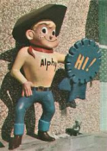
What can you say about the store in the first photo, other than it was a stone cold 1950’s classic? Opened in June, 1958 in the Hillview section of Santa Ana, at 17th Street and Tustin Avenue, this store, with its massive pylon and iconic “Alphy” sign, perfectly exuded the optimism, excitement and humor of the “anything is possible” postwar Southern California. The store didn’t seem much worse for wear sixteen years later, in 1974, when this photo was shot, but you’d have to think it looked more natural with a parking lot full of tailfins.

The rest of the photos are interior shots from the Alpha Beta store in Huntington Beach, at the corner of Brookhurst Street and Hamilton Avenue. I haven’t been able to verify the exact opening year of this store (Alpha Beta’s “No. 126”), but according to Werner, who worked there in college and took these photos in the fall of 1972, it was a new store then. The store sports the “ranch style” roofline that Alpha Beta had favored since the mid-sixties.

What strikes me the most about these photos, even the one of the older store, is how reflective the scenes are of 1972-74 American life, due to the overwhelming presence of one word - “discount” – plastered all over the interior of the store, and in huge letters across the storefront windows.

These were the years when new words and phrases began to creep their way into dinner table conversations across the country: “inflation”, “cost of living” and “Consumer Price Index”, for example, because these things were directly affecting what was on the dinner table. It was an era of rampant, unprecedented inflation, when consumer dollars seemed to shrink by the week. Despite some fairly extreme governmental steps taken to stem the tide (a wage-price freeze, dollar devaluation, etc.), it continued for years.

The scene that evokes this strongest for me personally is in the fifth photo down, the “new ideas” display, with boxes of Tuna Helper, in three glorious flavors, clearly visible on the second shelf. My family ate so much of this stuff (and its sister meal enhancer, Hamburger Helper) in those years that I still feel General Mills should have awarded us a walnut plaque with a golden Betty Crocker spoon mounted to it.

In response to the situation, the major supermarket chains, including such Western-based heavyweights as Safeway, welterweights such as Albertsons, and more regionalized operations like Alpha Beta (then a division of a middleweight, Philly-based Acme Markets) practically fell over themselves trying to attach the word “discount” to their storied names. Certainly this was a national trend, however, with appended names galore - Acme “Super Saver” stores, Food Fair’s accelerated conversion to “Pantry Pride Discount Foods”, and numerous others. Then there was A&P’s disastrous WEO (“Where Economy Originates”) program, but that’s a saga unto itself.

But there had been a precedent for this not that many years before, however. The early 70’s weren’t the first time the major food chains were forced to respond to an economic pinch. There was a dry run of sorts in the fall of 1966, when consumer complaints about supermarket pricing galvanized into a national movement, with boycotts occurring at stores across the country. Numerous press photos exist of bouffanted housewives carrying protest signs, a scene that led some in the press to coin the unfortunate term “girlcott” (Ugh.) to describe the situation.

The 1966 boycotts were short-lived, but in their aftermath, a number of chains experimented with standalone discount formats. Alpha Beta was one of them, with their experimental “Fad” (“food at discount” – nifty, right?) stores. Concerned about price competitiveness but unwilling to risk the Alpha Beta name on a discount venture, the first Fad store, a converted Alpha Beta unit, was opened in Costa Mesa in April 1967.

The location was chosen for its very close proximity to another Alpha Beta store, allowing the company to compare shopping patterns at the two stores and to answer the following questions, as outlined in Esther Cramer’s great book The Alpha Beta Story: “Would the housewife change her shopping habits if operating hours were reduced and games and giveaways were eliminated? Would the volume of sales increase to the necessary level if prices were lowered?” The answers, as it turned out, were “yes”.

As a result, three additional Fad stores were opened that year, followed by yet three more in 1968. Most importantly, it led to a change in pricing policy for the main Alpha Beta stores, which was rolled out in two phases – discounting of all health and beauty items effective in September 1967, and discounting across the entire store effective New Year’s Day 1968. Trading stamps and other promotional gimmicks were dropped, and even the famous tagline on their signs was changed, from “First in Foods” to “Best for Less”. In September 1971, having applied the lessons learned, the Fad name was discontinued and the (by then 11) Fad stores were converted to garden variety Alpha Betas.

So bargain-based grocery shopping turned out to be anything but a fad.

My thanks again to Werner Weiss for letting me know about his wonderful photos, and to the Orange County Archives for making them available. And for those who are curious about what the Fad stores looked like, here’s a typical example from a circa 1967 Alpha Beta Acme Markets promotional photo. 


Friday, May 3, 2013

The Modern Side of J.C. Penney


“Picked at random, a single J.C. Penney Co. store can be a remarkably unimpressive establishment.” So went the opening line of a long and generally laudatory September 1950 Fortune magazine article about the then nearly 50-year old retailer. The statement was true enough of the majority of J.C. Penney stores of the day. While certainly not unpleasant, a “low-key handsomeness” was about the most one could credit to the typical Penney store design.

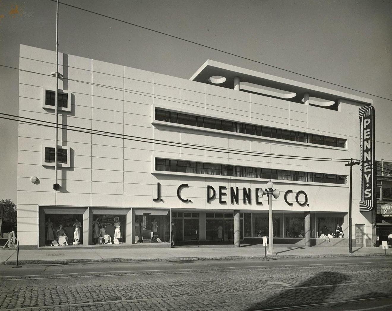
But scattered among their 1,600-plus stores at the time were a number of bonafide architectural gems –fine examples of deco and moderne styling that undoubtedly stood out from their respective city blocks at the time. A fortunate few of these buildings, including the two pictured above, survive today – though neither one has housed a J.C. Penney for years. One thrives as part of a major specialty retail chain, while the future of the other is less assured. In the first photo, the rented searchlight (note the name of the company, “Film Ad Co.” – with all the movie premieres in town, these were probably fairly easy to come by in the L.A. area) is on site and ready to go for the grand opening of the new Penney store at the corner of 3rd Street and Wilshire Boulevard in Santa Monica, California, which opened in 1949.

This store was designed by Milton L. Anderson, a little-known Los Angeles-based architect, who also designed fine-looking Penney stores in San Bernardino and Burbank around the same time. Like his more renowned counterpart, Stiles Clements (the store directly faced a Clements-designed Ralphs grocery store across the street), Anderson designed in the Spanish Colonial Revival style in the late 1920’s, a popular Southern California architectural motif in the era just prior to the advent of art deco/streamline moderne, which he later embraced.

The specific style of this building, according to a 2006 City of Santa Monica Landmark Assessment and Evaluation report, is classified as Late Moderne, a school that “borrowed the horizontality, curved canopies, and curved corners from the Streamline Moderne style, and the flat roof, window bands, and boxy form of the International Style… Broad cantilevered rectilinear or curved canopies were also a character-defining feature… (as were) soaring sign pylons that dominated (a) building’s facade.” The report underscores the store’s most notable design feature, the “cylindrical fluted tower on the building’s northeast corner that rises above the roofline to form a prominent anchor to the retail store building as seen from Wilshire Boulevard and 3rd Street.”

The store (which replaced J.C. Penney’s original 1930’s-vintage Santa Monica unit at 1328 3rd Street, just up the block) both predated and survived Penney’s “full-line era”, roughly the early 1960’s through the early 1980’s, when the company sold large appliances, sporting goods, automotive and other assorted hard goods in addition to the Penney staples of clothing, linens, towels and the like. In all likelihood, the Santa Monica store, due to its location and relatively small size, never ventured far beyond the company’s traditional soft goods offerings.

In 1965 a three-block area of 3rd Street, encompassing the Penney store and other retailers, was closed off for conversion to a pedestrian mall. Known since then as the “3rd Street Promenade”, it remains successful today, no doubt owing to its limited scope, successfully avoiding the pitfalls of overreach that have doomed conversions like it in other cities.

The store survived under the Penney flag into the mid-1990’s, a point when the vast majority of these had long since been supplanted by large, regional mall-based stores. (Amazingly, a similar store hung in there all the way until last summer.) Since 1998, the store has been a prominent location for Banana Republic, the upscale banner of Gap Inc. The famous façade has been preserved (sans the Penney signage, of course), and $7 million worth of interior renovations were carried out. As of this writing, it looks like The Gap is putting this one up for sublease. Perhaps another supplier of high-end khakis will show some interest in this beautiful building.

Even more striking, perhaps, is the second store pictured, which opened the same year at 5930 Easton Avenue (later renamed Dr. Martin Luther King Drive) in St. Louis, Missouri, in an area of town known as the Wellston Loop. Once again, Penney engaged the services of a local architect, William P. McMahon & Sons, and once again a stunningly-designed building resulted.

McMahon, a St. Louis native, had already enjoyed a long career at that point, having designed homes, churches and various commercial buildings around town beginning in 1907. By the 1930’s he was working in partnership with his son, Bernard, a recent architectural school graduate who favored Modernism and would spend time in California, where streamlined design reigned supreme. By the time the Penney project rolled around, Bernard had long since mastered the form. Not to be outdone, the elder McMahon brought his own Modernist sensibilities to the job, honed through aerodynamic design work he did for a military aircraft manufacturer during World War II, when building design commissions were slow in coming.

The Wellston J.C. Penney store is considered a prime example of the International Style of Modernism, according to a 2006 report submitted to the National Register of Historic Places. It “typifies (the International style) through its rejection of ornamentation, incorporation of horizontal ribbon windows with cantilevered surrounds and dependence on regularity to organize the primary façade rather than axial symmetry.” (The difference between ‘regularity’ and ‘symmetry’ being “lots of windows or other structural features placed at regular intervals” as opposed to “the strict symmetry of a Greek temple”, the historical precept upon which much architecture was, and is, based. This excellent series of articles explains the concept better than I could ever hope to.) The building’s crowning feature, literally and figuratively, is its floating partial canopy, with cutouts that “frame views of the sky.”

Penney had opened their first St. Louis store two decades earlier, in 1928, at 2604 North 14th Street, and two others quickly followed – at the corner of Morganford and Gravois in 1929, then at 5976 Easton Avenue (doors away from the featured store) in 1930. This gave the company locations “north, south and west of downtown” respectively, according to the NHRP report.

Interestingly, “Unlike St. Louis’s three largest department stores, Stix Baer & Fuller, Scruggs-Vandervoort Barney and Famous Barr, J.C. Penney chose not to build a central store downtown. Instead, Penney’s focused on a decentralized model of retailing along the lines of Woolworth’s and other national chains by locating multiple in neighborhoods where its customers lived”, the report says. (This wasn’t necessarily true of Woolworth’s or Penney’s in other large cities, though, as both chains had a number of major downtown flagship stores by this time. But St. Louis was an exception.)

The Wellston store’s location enabled it to capitalize on the migration of St. Louisans to the suburbs while continuing to draw a fair amount of business from city dwellers. (Penney opened a second very successful neighborhood location the following year, 1950, at the Hampton Village Shopping Center, with the polar opposite architectural theme – a “Colonial Williamsburg” motif. That store remains open today.)

As late as 1967, the Wellston store still qualified as a key link in the Penney chain, and as such it was approved for an extensive “New Image” makeover that year, putting it in league with their new mall-based showplaces at Northwest Plaza and South County Center. By 1976, however, things had changed. In the report’s words, “the trends that enabled the Wellston store to be successful through the 1950s and 60s propelled shoppers even further westward; changing neighborhood demographics hastened the company’s departure.” That year, the Wellston J.C. Penney store closed. For the last 37 years it has stood vacant.

The building has been the subject of controversy in recent years, and nearly met its demise a few years ago when the local alderman withdrew his previous support for its preservation. Fortunately, St. Louis is blessed with a preservation community that’s second to none, and with a disproportionate number of great mid-century architectural blogs that tend to put the word out about such things. The best of the bunch, in my opinion, is B.E.L.T. – “The Built Environment in Layman’s Terms”, written by Toby Weiss (who also sings in a band called The Remodels – how great is that?). She recently informed me that the building has indeed been added to the National Register of Historic Places, and that the referenced alderman “has backed off on wanting to tear it down.” Other than that, all is quiet.

Of course, the key to survival of any historic retail building is a viable tenant. Maybe someone offering mid-priced khakis will give it a go.

As always, my special thanks to the J.C. Penney Archives at Southern Methodist University’s DeGolyer Library for the use of these great photos.

Wednesday, September 26, 2012

Bring Back the San Fernando Penney's!

You know, there must be some people who read this site regularly and wonder – “Dave, you’re a blogger. Why don’t you ever take a stand on anything? You never weigh in on the big issues of our time. You’re always on the fence. Asleep at the wheel. Out to lunch. AWOL!”

Well, friends, I want you to know that I hear you, and today I’m answering the call! And the issue I herewith weigh in on is one that is, or should be, near and dear to our classic retail-loving hearts. It can be summed up in one phrase:

Bring back the San Fernando J.C. Penney.

When a national retail chain closes shop in a long-standing location, it’s typically news – in the local area, that is, and not far outside it. But this summer, when J.C. Penney ended an 80-year tenure in San Fernando, California (the city of San Fernando, specifically, which lies within the San Fernando Valley, part of Greater L.A.), it set off a furor that popped in and out of national headlines for weeks.

On Saturday, July 28th, despite rallies in the local community, online petitions, celebrity pleas, tons of local news stories and national coverage from the likes of the Huffington Post, the public radio show Marketplace, Bloomberg Businessweek (Plain old “Business Week” was much more concise, right? But hey, it’s his magazine now!) among others, J.C. Penney shuttered the San Fernando store, which had existed in its current location since February 1953.

Official comment from JCP on the matter has been terse, putting it charitably. “We would not have moved forward with this difficult decision if we did not believe it was absolutely necessary for the future growth of our company”, the company’s press response read.

Speculations behind the closing have been raised (and shot down) from several angles, with some alleging the closing was part of an effort to trim costs in light of huge losses JCP has experienced this year as a consequence of its controversial rebranding/repositioning efforts.  Others contend the small store (60,000 square feet with just over half of that space devoted to selling, three floors, no escalators), long an anomaly for Penney, is a poor fit for the rebranding concept. Still others claim the San Fernando location itself has been unprofitable for years.

It’s easy to understand why San Fernando residents are upset about losing their Penney store, an obvious point of pride for the community. The store has been an anchor for their downtown at a time when most big-name retailers long ago abandoned downtown locations for the “wide open spaces” we refer to today as malls and shopping centers. Certainly it was handy – while Penney has no shortage of huge stores in The Valley, it’s hard to beat “down the block” for convenience, even though selections were limited compared to standard Penney stores. There’s the longevity factor – the San Fernando location far outlasted the hundreds of downtown Penney stores built through the decades up until the late 50’s. Indeed, had JCP opted to close it down in 1970 or 1980, the uproar might never have materialized.

Lastly, the store’s timeless deco-influenced facades, front and rear, remain a thing of beauty. Most late 1940’s/early 1950’s Penney stores across the country were very plain in appearance, while the San Fernando unit exemplifies the extra effort that many national retailers poured into their California locations. Just two years ago, the building’s owner, Ashkenazy Development, spent some $350,000, including the services of a historian, to restore the facades and the “Penney’s” blade sign, which reportedly hadn’t worked for nearly forty years. 

The story took a nasty turn on the second night after the store’s closing, when residents discovered sign crews (after dark, with the company name on their truck covered up) pulling the “J.C. Penney Co.” lettering off the back of the building and one worker preparing to go after the neon blade sign with a torch, all in violation of an order to leave them alone pending a historical preservation hearing. The removed letters were reinstalled the next day.

At this late date, it seems unlikely that J.C. Penney will reopen the store, but you have to admit it would be a great public relations gesture and would serve to counteract some of the negative publicity the company has received in recent months. The “Save San Fernando’s JCPenney” site features a couple of interesting concepts for expansion, should JCP reverse their decision. At any rate, the store’s designation as a historic site appears to be assured. Rightfully so.

Our goal here, of course, is to depict great stores like this in their heyday, and once again I thank the J.C. Penney Archives at the DeGolyer Library at Southern Methodist University for their invaluable cooperation in supplying these photos – festooned in Grand Opening glory, followed by an interior view, then front and rear facade views from after the festivities cooled down.

As a postscript, here’s a sidenote from the “Basic Data Sheet”, a centrally-maintained dossier of sorts, for this store, last updated in 1971 and now part of the JCP archives. It’s interesting to note who Penney’s regarded as competition in those days -within a four-mile radius, there were department stores: Ohrbach’s, The Broadway, Robinson’s, a small Sears “hard-lines” store, discounters White Front, Kmart, Gemco and Cal Stores (sister division of Baza’r stores). “Fantastic Fair” one of my ultra-faves, is also listed, but I’m pretty sure they were gone by that time. (I’ll have to do a 10-part series on that one someday.)There were also the variety stores Grants and Newberrys, and apparel stores Scotts, the Melody Shop and Sally Dresses. The Penney’s unit outlasted them all.


Monday, February 6, 2012

Shopping in Los Angeles - The 1950's

There’s a ritual I never fail to observe when traveling to Los Angeles on business. I’ve done it for years now. Once I land, usually at LAX, grab my rental car and hit the road, I call home to let everyone know I arrived safely (transcontinental flight, you know), and at some point in the conversation I exclaim “I love L.A.!” in my best, most frazzled Randy Newman voice. It’s the title line from his 1983 hit song, and sometimes I’ll throw it in more than once. It’s an old shtick, but my wife still humors me each time.

And I really do love it. Not because I’m driving a convertible (just an “intermediate” car, which is rental car company language for “yogurt cup on wheels”) or wearing a Hawaiian shirt (“business casual” isn’t that casual, I’m afraid) or accompanied by bikini-clad women (the call home would be awkward to say the least), but because of all of the great-looking old retail buildings there: Spanish-style, mid-century modern, bizarre and uncategorizable, you name it. Sure, scads of them have been torn down over the years, but there’s still a lot to see - simply because so many were built there in the first place.

Thankfully, much of this is well-documented in still photographs, but I can’t help but wonder what it all must have looked like from the windshield perspective in its heyday. The amazing film clip above, from 1954 (sincere thanks to Julie for bringing it to my attention) is the closest thing I’ve found to that. Only 1:50 long, it provides a great, if fleeting, full-color snapshot of the City of Angels at an exciting point in the early postwar era.

I don’t know the origin of this particular clip, but it was likely made for a commercial purpose of some type. It’s a nice example of a genre known today as “ephemeral films” – educational films for classroom use or promotional movies produced for tourism bureaus, trade associations or corporations. They were glowing salutes to The American Way - progress and prosperity, the natural result of virtue, ingenuity and hard work. These films provide a fascinating, if not complete, slice of life from those times. And they always seemed to feature bouncy, optimistic soundtracks with plucking strings and insanely peppy woodwinds. I’m tempted to think that music like this just played in the air in those days, and could be heard whenever you stepped outside. (Someone, please tell me this was true!)

The local icons are well represented here - starting out with the approach to downtown L.A., we see the famous City Hall in a perfect “Dragnet establishing shot”, followed by the Angels Flight inclined railway in the Bunker Hill area of town. Then on to some of the main drags, including South Broadway in downtown L.A., Wilshire Boulevard and Hollywood Boulevard, where a crowd is lined up outside Grauman’s Chinese Theatre (only the side of the building is shown – the Kodak theatre now sits in that spot next door, square atop the intersection of Hollywood and Orchid) for a showing of “The Robe”, one of those films the late movie palace historian Ben Hall would have called “the latest version of the Bible according to Cinemascope”.

And then (you knew we’d get around to this, didn’t you?) comes the really fun stuff, as far as those who regularly visit this site are concerned. In addition to the “postcard scenes” described above, the film depicts some of the L.A. area’s most noteworthy retail properties of the day, which by default means some of the most noteworthy anywhere. A few notes:

First up is a great pan shot of the Broadway-Crenshaw Center, opened in late 1947 in southwest Los Angeles and sporting subtleties of color one wouldn’t imagine based on the many period black and white photos that exist of the place. Interestingly, the facades seen here facing the parking lot were virtually duplicated on the opposite side of the shopping center, which lined the sidewalk along Crenshaw Boulevard.

Two years earlier the intersection of Crenshaw and Santa Barbara Avenue (renamed Martin Luther King Jr. Blvd in the 1980’s) was home to only trees, grass and assorted wildlife, but the nearby population was beginning to boom. When The May Company announced plans to build a large branch store there, the Broadway reciprocated with plans for a huge Crenshaw location of its own, with a strip of some 15 supporting stores in tow, right across the street. Among the other tenants were Woolworth’s, Lerner Shops, Owl Rexall Drugs, Silverwoods (a downtown L.A.-based men’s clothing store) and a detached Von’s supermarket.

The design of the center was the work of architect Albert B. Gardner, who also had a hand in designing the circa-1928 City Hall seen at the beginning of the clip. One of the very largest shopping centers in the country at the time it opened, Broadway-Crenshaw yielded some important lessons for future retail development. I’ve summarized a few of them from Richard Longstreth’s great book “City Center to Regional Mall: Architecture, the Automobile, and Retailing in Los Angeles, 1920-1950” which devotes several pages to the center: For one, the head-to-head competition that both May Co. and The Broadway were dreading turned out to be a net plus, an early example of the drawing power of multiple large department stores in close proximity. Secondly, there was no need for the “duplicate storefronts” along the street line. Most customers drove to the center and used the parking lot, so “sidewalk shoppers” accounted for a low percentage of sales. Future shopping centers like this, for the most part, were slid to the middle of the parking lot. Third, Broadway-Crenshaw really needed a second large anchor to balance the traffic flow to the other stores. (The May Co. store didn’t count in that regard, of course.) This helped lead to the opposite ends or “dumbbell” configuration for 2-anchor malls seen countless times in the ensuing years. It also became clear that anchor department stores of this type could handle, and really needed, far more than 15 supporting stores.

The shopping center is now known as Baldwin Hills Crenshaw Plaza, which encompasses both the former Broadway and May Company properties. The Broadway store building still exists as the best-looking Walmart that will ever be, while the May Co. store is now a Macy’s. The smaller stores were torn down and replaced years ago. The photo above (same pic, two different “zoom levels”) is from the 1951 book “Shopping Centers – Design and Operation” by Geoffrey Baker and Bruno Funaro, a vital early text on the subject.The Von’s (apostrophe long since dropped) supermarket at Crenshaw Center was not designed by Mr. Gardner, but by another L.A.-based architectural heavyweight, Stiles Clements. Mr. Clements had already done a great deal of work for Ralphs, one of Von’s main competitors, with designs ranging from exquisite Spanish-styled markets to some of the most striking streamlined buildings ever seen in retail. In later years, Clements played a key role in refining Sears’ distinctive “West Coast look”.

Lauded in an August 24, 1950 Los Angeles Times article as being “Rated the World’s Largest Grocery”, the store was indeed huge for the times at over 58,000 square feet (roughly half of that selling space), and it featured a mural depicting scenes of California history along the entire back wall, painted by artist Bert Makos. This photo also comes from the Baker and Funaro book cited above. Note the windmill on the corner - the beloved trademark of Van de Kamp’s, operator of supermarket bakery departments all over SoCal as well as their own coffee/bakery shops. Then, a brief glimpse of an early fifties Safeway store from an unidentified location. (I first assumed it was the nearby 39th and Crenshaw location that opened in 1952, but an opening day photo in the Los Angeles Times proved otherwise.) This store is typical of those Safeway was opening in many locations at that time, before the yellow-pyloned exteriors of the mid-fifties and the Marina family of designs launched at decade’s end. With over 10,000 feet of selling space, these stores must have seemed immense compared to the small, white-painted masonry units the company favored (note the first photo here) just a few years earlier.

The similarly-designed store pictured above was located in Lancaster, California. This photo appears here by the kind courtesy of Jacques Gautreaux, and is part of his great collection of retail photos from northern L.A. County’s Antelope Valley, taken in 1966.
The legendary Westwood Village Ralphs market appears next, a subject already covered in some depth here. Many thanks to “vieilles_annonces” (check out her astounding collection of vintage slides and magazine articles here) for use of the photo above. It predates the film clip by more than a decade, but offers a wonderful color view of the approach into town on Westwood Boulevard. Among other iconic structures are the Ralphs store to the right, Westwood’s unique Sears store in the middle, and the A&P (only the spire is visible) to the left.

A relatively minor entry in the SoCal retail history books is long-gone independent supermarket chain McDaniel’s Markets, which featured a jaunty Scotsman as their mascot and a tartan pattern as a key design element in their ads and on stores. By mid-1957, McDaniel’s had six stores, located in North Hollywood, Beverly Hills, East L.A. (famous as the birthplace of Cheech Marin), Maywood and Baldwin Park, according to the Los Angeles Times. That year, McDaniel’s bought out the six-store Walker’s Market chain, and between those stores and additional units built over the years, the company eventually grew to almost 25 stores.

In the early 60’s McDaniel’s went bankrupt, selling their choicest locations to Food Giant Markets. I wonder if some creative sloganeering would helped, like “Visit the Plaid Pylon, where we pile on the deals!” or “More buying power under the Tartan Tower!” (Or maybe it would have hastened their demise, you say.) The photo above, an artist’s rendering of the Oxnard, California location, appears here courtesy of the Los Angeles Public Library.
After that comes the sleek, curved facade of the Owl Rexall Drug at the corner of Beverly and La Cienega Boulevards (near the border of West Hollywood and Beverly Hills), which opened in the fall of 1947 and is shown here in a publicity photo taken shortly thereafter. The huge, ultramodern drugstore was only the (curved) tip of the iceberg in this case, as it was attached to the new world headquarters of United-Rexall Drug Inc., which relocated there from Boston. The move was the brainchild of company president Justin Dart, a dashing, enigmatic former Walgreen executive (and former Walgreen son-in-law) who came to United in 1941 and wasted no time casting the company in his own image. Indeed, the firm would eventually be known as Dart Industries, with interests that ranged far beyond drugstores.

Owl, Rexall’s major west coast banner, was closely controlled by the parent company, as was its eastern counterpart Liggett, and hundreds of Rexall drug stores were operated under these two names. While neither Owl nor Liggett were strictly confined to the coasts, most Rexall stores in between (in what hipsters like you and I call “flyover country”) were more likely to sport one of multitudes of franchisee names on the familiar orange-and-blue signs.

The four-day grand opening kicked off on September 15, 1947 and at the podium, along with Dart himself, was California Governor Earl Warren (this was six years before he was appointed Chief Justice of the U.S. Supreme Court and had better things to do, like reshaping American life), Wisconsin Governor Oscar Rennebohm (Because he owned 14 Rexall drugstores in Madison, that’s why!), the mayor and the sheriff of Los Angeles, executives from Eastman Kodak, Coca-Cola and Lambert Pharmacal (later known as Warner-Lambert) and other dignitaries too numerous to name here.

And there were celebrities galore, owing to Rexall’s prominence as a national sponsor and advertiser in those years when radio was the undisputed media king and many people went to the movies every single week – Jimmy Durante emceed each of the four days, and there were appearances by Dorothy Lamour, Red Skelton, Mickey Rooney, Peter Lawford, Pat O’Brien, Alan Young of future “Mister Ed” TV fame, Lynn Bari - a beautiful 20th Century Fox contract actress who deserved greater fame, and legendary newspaper gossip columnist Hedda Hopper. (Gosh, you’d think they would’ve put some more thought into this. I mean, drugstores don’t open every day, you know.)

Today the location is home to a CVS Pharmacy, Marshalls and a number of other retail tenants. The corner facade is still curved, leading me to believe the building shell may be original, but I don’t know that for a fact.
Another drugstore icon immediately follows. We see the Thrifty Drug location at the corner of Rodeo Road and La Brea Avenue in the Baldwin Hills area of Los Angeles, just a mile and a half from Crenshaw Center. By this time Thrifty, a fixture of the L.A. retail scene for decades, was well underway with a program to open larger stores in shopping center settings versus the traditional smaller streetfront units, although the latter type still made up the bulk of Thrifty’s then 100-plus stores.

Thrifty’s largest store yet, it was part of a shopping center developed by the company that also boasted a new Alpha Beta supermarket as a key tenant. As with the Owl Rexall store above, the store was built in conjunction with a new home office for the company (Thrifty was the third largest drug chain in America at that time) on the property.

The Baldwin Hills Thrifty attained instant landmark status due to its massive sign tower, affectionately named the “Trilon”. At 65 feet tall with three 15 by 35 foot faces (Weighing in at 12 tons, according to the Los Angeles Times. Did somebody throw this thing on a scale?) and a unique, funky steel structure design that brings to (my) mind some of Alexander Calder’s “stabile” sculpture pieces, the Trilon certainly served its purpose as an attention-getter for Thrifty.

The shopping center’s “premiere” (I just thought of that. Nice, huh?) took place on November 13, 1952 with actress Anne Baxter performing the ceremonial duties, an experience I’m sure she ranked right up there with her recent Oscar nomination for “All About Eve”. (Well, kinda sure, that is…) The next evening, singer/actor Tony Martin performed live at the Thrifty store. Mr. Martin, still kicking at age 99 and performing as recently as 2010, is one of the last survivors among America’s great crooners. He was married to Cyd Charisse, the great star of such classic MGM musicals as Singin’ in the Rain, The Band Wagon and Silk Stockings, (shown all the time on TCM – if you haven’t seen them, you should) for 60 years until her passing in 2008.

The sign, which survived the infamous 1963 Baldwin Hills dam break and flood, still stands while the accompanying building bears scant resemblance to the original. It now sports the name of Rite Aid, Thrifty’s successor. The picture above is a detail from the store’s grand opening ad.
Last is an interesting curiosity - the Big Owl Market, or as the sign reads, “The Market of Tomorrow”. This venture by Owl Drug (United-Rexall) was a very early, largely forgotten attempt at a supermarket-drugstore combination, a format that would catch on big in the following decade, and indeed remains the template for the industry today.

Tested out on a smaller basis in Ontario, California a few months previously, the Big Owl opened on November 1, 1951 at the corner of Laurel Canyon Boulevard and Kittredge Street in North Hollywood, just a couple of blocks up from the giant new Sears store on Victory Boulevard. The opening-day celebrity here was Lorraine Cugat, singer and (soon to be ex-) wife of bandleader Xavier Cugat. The store really did foreshadow some key elements of the combination store/superstore idea, with “a See’s candy shop (Is it legal to leave the State of California without a box of See’s candy? I don’t want to find out.), Van de Kamp’s bakery, dry cleaning shop, a liquor, tobacco, pen and camera room (all you need, right?), a gift shop and a 12-chair barber shop with a jet fire engine chair for the youngsters”, along with “a watch and jewelry repair shop, a check-cash service, a bill-paying service and a soda fountain grill.”, according to a pre-opening write-up in the Los Angeles Times. To my knowledge, they never opened another one.

The clip’s closing scenes reinforce the “America, land of plenty” theme, starting with a really nice shot of a grocery store checkout lane in action. It’s interesting to note the still-familiar brand names as they whizz past the wood grain-painted metal cash register. What’s striking is how small the package sizes were in that era before “economy size” became the rule. Ironically, with manufacturers reducing package sizes as a response to the current economy, we just might be trending that way again.

From there, there’s a glimpse of the Ford Assembly Plant in Long Beach, followed by one of its General Motors counterpart in Van Nuys, two important cogs in the economic engine that helped make all of this prosperity possible. Both have long since closed, and sadly we won’t be trending that way again. Then it’s back on the open road, a fine place to be indeed.

I think next time I’m out that way I’ll try to whistle a few bars of the “insanely peppy woodwinds” theme. I’ve been practicing. Or maybe I should just stick with Randy Newman.

Monday, July 19, 2010

Wards in Huntington Beach, 1966

The circa 1965 artist’s rendering above shows the Montgomery Ward store that opened the following year at Huntington Center, an indoor shopping mall located in Huntington Beach, California, at the intersection of Edinger Avenue and Beach Boulevard, near the San Diego Freeway. Huntington Beach, located in Orange County, is officially nicknamed “Surf City USA”, a nod to its 8.5 mile long beachfront on the Pacific Coast.

Now I’ve never been handy with a surfboard (by virtue of the fact that you actually have to stand up on the things), and every time I’ve set foot in Pacific waters they’ve been freezing, but I do like to explore old stores. And to the best of my knowledge, unless something’s changed recently, this baby still exists! Abandoned, boarded up and likely falling apart, but still standing.

Things were very bright in the early 1960’s, though, when shopping centers were popping up all over the country, and as mentioned with ridiculous frequency on this site, nowhere was the action more…uh, active than in Southern California. All the conditions were right for phenomenal growth – exploding population, youth-dominated culture, growing middle-class affluence (with thousands of aerospace and defense-worker families in the area) – and that’s exactly what took place.

By the mid-sixties, Montgomery Ward had designated SoCal as the centerpiece of its expansion strategy. In a speech before the Los Angeles Chamber of Commerce in May 1966, at which point new Wards stores had recently opened in Covina, Ventura and Fullerton, and would be soon forthcoming in Huntington Beach, Norwalk and Rosemead, Wards president Ed Donnell declared the company’s intention to make the greater L.A. area its “largest metropolitan district”. Going forward, one out of five new Wards stores would be opened there. At the time there were 7 full-line retail stores and 12 catalog stores in the area, while the company’s largest district, Chicago, had 12 full-line stores and 27 catalog outlets.

I have to think that beyond the obvious appeal of the dynamic Southern California market, there was another possible reason behind this. Prior to his tenure at Wards, Donnell was Sears, Roebuck and Co.’s Los Angeles district manager, part of that company’s “Far West” territory. The Sears stores in SoCal were in a class by themselves – much larger average size, often very striking architecturally, and a strong first place in sales. As a result, that region was by far the most important in power and influence within Sears. To go head-to-head with his former company in their best area would have been an extremely hard thing to resist. (A great read for those interested in retail history is “The Big Store” by Donald Katz, a history of Sears that emphasizes the 70’s-mid 80’s. The book’s opening story, about the demotion of a Sears executive from the hallowed West Coast top spot to the same but far less prestigious job in Chicago, is told in a riveting fashion. Seriously, who needs James Patterson when you can read this stuff?)

In April 1964, two months after the Beatles’ three consecutive appearances on the Ed Sullivan show, the Long Beach Press-Telegram announced plans for a new shopping center in Huntington Beach, to be anchored by The Broadway, a well-known local department store chain, J.C. Penney and Montgomery Ward. Initially slated to open in the fall of 1965, only The Broadway’s store ended up being ready at that time. The rest of the center would open a year later. Huntington Center’s official grand opening festivities kicked off on November 16, 1966, at which time the Beatles were all growing moustaches and had begun work on their Sgt. Pepper album. (Ok, I’ll can the Beatles references from here out.)

Beatles. (Sorry!) Early press reports had mentioned the Wards unit would be Huntington Center’s largest store, but as it turned out, the Penneys store surpassed it slightly, with The Broadway coming in a not-too-distant third in the square footage sweepstakes. All three anchors had freestanding auto centers. Some of the other notable tenants at Huntington Center included women’s specialty shops such as Lerner Shops and Mode O’Day, men’s retailers Harris and Frank and Bond Clothes, the legendary See’s Candies (I literally cannot pass one of their stores without buying something), local mainstay Thrifty Drugs and Food Fair, a major player in the supermarket world up and down the East Coast but still a relative newcomer to California.

And so it continued for the next 30 years or so. A new wing was added in 1986, including a fourth anchor, Mervyn’s. But time and the myriad changes in retail would eventually take their toll on the mall and of course, on Wards itself. In 1992, J.C. Penney left for the greener pastures of nearby Westminster Mall, taking over the J.W. Robinson space left vacant by the Robinsons-May Company merger. A 1996 merger brought about the closure of The Broadway, when parent Broadway Stores (formerly Carter Hawley Hale) was bought out by Federated Department Stores, who would convert the Fashion Island Broadway store in nearby Newport Beach to a Bloomingdale’s.

In early 2001, Montgomery Ward, the last original anchor at Huntington Center, closed down when the chain itself ceased operations. In 2004, a massive redeveloping of the mall took place, in which most of the enclosed mall was torn down. In its place rose a new, upscale open-air “lifestyle center” now known as Bella Terra Mall. The one original structure to be reused was The Broadway store, now a Kohl’s with a three-toned paint job over the store’s funky 60’s textured walls.

The Wards store, now detached from the mall, sits to the side, abandoned and unloved - except by fans of old retail, that is. This website has some great photos taken in 2006. Since then, the signage has been removed but the labelscars are still visible, and of course the unique bas-relief “MW” logos still exist.

See it while you can – on the way to the beach, of course!

Pictured below, just for fun, is the Wards store in Ventura, another attractive store which featured the same architectural style (including the simple, elegant pendant lighting) as the Huntington Beach location. This store opened at the Buenaventura Shopping Center six months before the HB store, on March 2, 1966.

Chris Jepsen of the great O.C. History Roundup website informs us that plans are afoot to build a Costco on the Wards side of the former Huntington Center. So if you want to see it, you'd best "carpe the diem, seize the carp", or something like that!

Thursday, June 24, 2010

Wards Strikes Up the Band

The weather couldn’t have been better on this sunny, sparkling Southern California afternoon. Excitement was in the air as the crowds gathered in. A speakers’ platform was in place, replete with the American flag and a group of men in suits, ties, carnations and broad smiles, beginning to take their seats near the dais. Soon the customary civic welcomes and corporate pledges would take place. And there would be special entertainment that day - the Disneyland Band was there! The whole unit, looking sharp in their bright orange uniforms, on a rare five-mile trek outside the gates of the Happiest Place on Earth. The real star of the show was the brand new Montgomery Ward store behind the stage – sporting a smart, modern look with a textured façade, three-toned sign and zig-zag awning. For a few hours that afternoon, it had to be the happiest store on earth. The date was August 11, 1960, and the place was the Honer Plaza Shopping Center, located at the corner of 17th and Bristol, in Santa Ana, California.

The opening of this store marked the five-year point of a complete reinvention of Wards’ image, which began with the forced resignation of longtime company chairman Sewell Avery. Cash-rich but moribund from a retail standpoint in 1955, the company’s leadership change became evident to the buying public two years later when Wards, whose store base had long consisted of aging urban and rural downtown units, began to open large, modern stores in the country’s storied suburban shopping centers.

Driving this expansion was Montgomery Ward chairman John Andrew Barr, who took the company reins after Avery’s ouster. Barr, a 20-plus year Wards veteran, came up through the ranks of the company’s legal department and was a rare individual in that he was neither fired nor driven away by Avery’s dictatorial manner, in a company notorious for massive turnover of upper management ranks. Author Booton Herndon, in his lively book “Satisfaction Guaranteed”, a 1972 history (and then-current portrait) of Wards, notes that company executives in the bad years seemed to profess a certain pride in the dubious honor that Wards had “trained” many of their competitors’ top people.

By any measure, Wards’ new store program was ambitious – according to a November 1960 Fortune magazine article, five new stores were opened in 1958, twelve more in 1959 and twenty-one more in 1960, mostly large, shopping center-based units. The article also sheds light on Wards’ store location strategy, which centered on locating stores in clusters within a specific market area, in order to be able to service the stores from centrally-located distribution centers (with the important additional benefit of maximizing the effectiveness of TV and newspaper advertising).

The market areas cited in the Fortune article were: “Detroit, Kansas City, San Francisco, San Diego, Phoenix, St.Petersburg-Tampa, Houston (and) Dallas-Fort Worth”. A carefully-selected set of markets that left many regions untouched, to be sure, but fleeing time and limited resources forced Wards to pick their targets carefully. Noticeably missing from this list is Wards’ home market of Chicago, where instead of opening new stores, Barr opted for an acquisition instead – In 1957, Montgomery Ward bought out The Fair, an old-line department store chain with a downtown State Street flagship and three suburban locations. Nonetheless, those fortunate enough to live in one of Wards’ chosen expansion areas were likely thrilled to have the gleaming new stores as a shopping option.

Five years of the “New Wards Era” and nearly three years of new store openings brought things to that August 1960 opening at Honer Plaza, where the light atmosphere became very heavy, for a while at least. The previous night, at a dinner held in Santa Ana for Wards stockholders and other dignitaries, Chairman Barr dropped a bomb. He announced, as Fortune later put it, “that the earnings prospects for the full fiscal year 1960 (to the end of January, 1961) were for a new low in the company’s postwar history”. The herculean effort, the new attitude and image, the beautiful new stores all appeared not to be paying off. (At this point in the evening, I would have said “Allriiiiight, waddaya say we bring the Disneyland Band out here? C’mon, everybody dance!! But that’s just me.)

To his credit, Barr had long realized the need for an infusion of top retail talent into Wards’ decimated ranks. For some odd, unexplained reason, the company’s board of directors had forbidden Barr to look to the one place that matched Wards’ business most closely – Sears, Roebuck and Company. (Although J.C. Penney had already surpassed Wards in sales by 1961, it would be a few more years before their business model fully lined up with Wards’, as Penney yet had no catalog operation and still sold mostly soft goods in their stores. By late 1963, Penney was in the catalog business as well and had also begun to open full line stores, complete with appliance sales and auto centers.) The Honer Plaza news was enough to get the Wards board to drop the needless restriction, though, so to Sears’ executives, current and former, Barr went a-calling.

Amidst all of this, rumors of a merger began to fly. In the fall of 1961, news accounts began to carry the story of a marriage between Montgomery Ward and Interstate Department Stores, Inc. as having all the earmarks of a done deal. Interstate, headed by Sol Cantor, was white-hot at the time - a formerly staid department store operator that was scoring big with newly-acquired discount chains on both coasts – White Front in Southern California and Topps in the East and more recently, Chicago. As quickly as it came about, however, talk of a Wards/Interstate merger fizzled. One reason for this, as Time magazine related after the fact, was that Cantor was miffed at being left out of the selection process of Wards’ new president.

In early November 1961, Barr announced he had chosen Robert E. “Tom” Brooker, a former Sears executive and since 1958, chairman of Whirlpool, the appliance manufacturing giant. Brooker, a one-time protégé (and according to author Herndon, bridge-playing partner) of legendary Sears head General Robert E. Wood, had been Sears’ vice president of manufacturing. This position didn’t even exist at Wards, marking a key difference between the two companies. Sears routinely held large investment stakes in their manufacturing suppliers as a means of implementing changes they desired, or shoring up weak operations. Oftentimes Sears would keep majority ownership of a manufacturer for years on end. (A popular business topic of modern times concerns the power that a certain well-known mass retailer wields over its manufacturing suppliers. In my opinion, Sears’ power back in the day was every bit as great, if not more so.) The Whirlpool Corporation, as it existed at the time, was largely the result of mergers engineered by Brooker from behind his desk at Sears. Montgomery Ward, by comparison, very rarely took an ownership stake in their suppliers.

Beyond Brooker’s years of high-level experience with Sears and his peerless ability to deal with suppliers, he projected an air of exceptional confidence that would prove essential to Wards’ survival. Indeed, immediately upon taking office, Brooker purchased a million dollars’ worth of Montgomery Ward stock, making him the company’s largest individual shareholder. Brooker accepted the Montgomery Ward presidency with the understanding that he would be in charge, and that was the case almost immediately, although initial press reports, including Time magazine’s, characterized the relationship between Brooker and chairman Barr as “on a par”. John Barr would stay on as Montgomery Ward chairman until 1965, when he resigned to take the reins of Northwestern University’s business school. There, Barr made the controversial decision to close down Northwestern’s undergraduate business program in order to focus the school’s resources on their graduate business school, which he also opened to women for the first time in its history. Under Barr’s tenure, the program (now called the Kellogg School of Management) became one of the most prestigious in its category, a distinction it continues to enjoy today.

Tom Brooker, of course, had his hands full keeping Wards on the road to recovery. To aid in the battle, he wooed a number of key people from Sears, none more important that Edward S. Donnell, who ran Sears’ Los Angeles territory, their hottest market area by a wide margin. Donnell, who himself had a reasonable shot at reaching Sears’ "mahogany row" within a few years was convinced by Brooker’s enthusiasm to forsake the ideal climes of SoCal and move to Baltimore to run Wards’ entire East Coast region. Within a couple of years, Donnell moved to Chicago, promoted to the number-two spot in the company. More Sears faces would appear at Montgomery Ward headquarters over the next several years. The aggressive building program would continue, with the sails trimmed back just a bit.

Would things get better for Wards? Yes, they would. But there would be times when they probably wished the Disneyland Band was waiting in the wings.

The pictures are Montgomery Ward publicity photos unless otherwise noted. The first store pictured was located in San Antonio, Texas, at the Wonderland Shopping Center (not to be confused with the Livonia, MI-based mall of the same name), and opened in 1963. Known in recent years as “Crossroads Mall”, it reverted to the Wonderland name earlier this year. Second up the Wards store at Houston’s Northline Shopping Center, which opened in 1960 and predated the mall itself by a couple of years. Third, a 1961 American Olean tile advertising photo which only identifies the store as a “Houston, Texas location”, which I believe to be the free-standing unit that was located across the street from the Palm Center shopping complex. Fourth, from 1962 and again from San Antonio, the new McCreless Shopping Center, complete with Photoshopped cars in the parking lot. (Wait, we‘re talking about 1962, right? I should have said “pasted-up cars” instead.) Fifth, from a 1963 Plexiglas ad, the famous Apache Plaza location, St. Anthony Village (Minneapolis), Minnesota. Lastly, the Honer Plaza location as it appeared on that exciting/exasperating 1960 summer day.

Sunday, April 25, 2010

Ralphs Granada Hills Reloaded, 1965

I think most people would agree that where movies are concerned, sequels are rarely better than the original. Oftentimes they aren’t nearly as good. They tend to do well at the box office, however, because they usually feature well-loved characters and/or tried-and-true themes. Once in a while, though, a sequel will rise above the norm by adding a new, exciting dimension to the familiar.

Perhaps this analogy can be applied to supermarkets. (Read this site enough, you'd think any analogy would, right?) The “original” in this case was a unit of the Ralphs Grocery Company, a major Southern California supermarket chain with 47 stores at the time, that opened in 1959 in Granada Hills, California. The “sequel” was a very significant remodeling of the store six years later. The store was featured on this post a year and a half back, and for our own “sequel” here, we’ve switched to color! (When all else fails.) These photos were taken circa June 1965 for a Progressive Grocer magazine article that appeared the following year.

From a retail history standpoint, it’s hard to envision a more exciting, dynamic time and place than Southern California in the 1960’s. This was the era of the California Dream, as extolled in the movies and pop music of the day, and people responded by moving there in droves, or so it seemed at least. To accommodate the transplanted throngs (to say nothing of the area’s impressive homegrown baby-boom output), new malls and shopping centers were opening at a rapid rate – well outpacing every other major market in the country. Among the hottest of SoCal retail hotspots was the San Fernando Valley, home in 1965 to a brand-spanking new mall, Topanga Plaza, and to the still shiny-and-new Fallbrook Center, along with a host of smaller strip shopping centers.

Continuing to do its part was the Ralphs supermarket in the Valley’s Granada Hills, its funky 60–foot tall sign standing proudly at the corner of Chatsworth and Balboa since the store’s 1959 opening. The sign and the building’s red and white diamond-patterned Arizona rock roof had stood the test of time – a bulwark for those (like the fine readers of this site) who valued good taste. The apple-hued interior, however, was definitely showing its age by this time. A major revamp was in order.

Ralphs’ management realized that a run-of-the-mill redo wouldn’t cut it, as noted in the Progressive Grocer article - “...we were faced with a fiendishly competitive situation (in Granada Hills). On three sides of our unit there, and within a two-block area, are big shopping centers, each with a super market exerting the fullest pressure on the trading area.” It was determined that this particular remodeling would have to be something special. On top of that, Ralphs would use the Granada Hills makeover as an opportunity to address a longstanding problem.

“Surveys show that the woman shopping in the super market is often a woman totally confused”, said Ralphs’ general manager. (Lots of responses to that comment are reeling through my head at this point. I think that’s where they’ll stay.) “Yet the same woman who retraces her steps back and forth across our stores seeking out merchandising owes her confusion not to a lack of wit on her part…” (Uh-oh.) “…but to a lack of logic on ours.” (Whew! Glad you put that in context there, my friend.) “She may feel that vanilla extract might surely be located by going to the flour gondola – how is she to know that it is with spices strung out over one of the freezers – or in a separate spice cabinet of its own on the end of table 14? She has little logic to guide her, only memory, and all stores lay out their dry groceries according to their own ideas – and those ideas are constantly changing.” (Let’s try to stay away from the thin ice there, guy. Ok?)

And so was born the “shop-at-a-glance” concept. In essence, the standard supermarket layout was scrapped in favor of “family groupings” – or “centers”, to use Ralphs’ terminology. The “Breakfast Center”, for example, featured cereals, juices and coffee, three categories of product that are normally found in very different locations. “Like shopping in your own kitchen!”, Ralphs’ ads proclaimed. (Provided one kept the cereals, juices and coffee in the same location.) The traditional perimeter departments – meats, dairy and produce – remained in those locations. The “centers” were identified by large, colorful three or four-sided signs hung above their respective areas. To give customers a clear line of sight around the store, the shelving units, known as “gondolas” in the business, were cut down to a maximum height of 5 feet, which also had the curious effect of reducing inventory capacity by as much as 25% in some departments - not a minor issue.

The store’s “grand reopening” took place over three days in early June 1965, with ads proclaiming the specially-crafted promotional tagline: “America’s First Completely Departmentalized Supermarket!” That claim is debatable, of course – Grand Union, for example, had been experimenting with departmentalized merchandising formulas for a good ten years by then, most notably in their East Paterson, New Jersey flagship store. Perhaps it was the first of its kind on the West Coast, however.

Beyond the new layout itself, a big part of the remodeled Granada Hills store’s appeal was its striking new decor. The colorful, classy new look was the work of Brand-Worth and Associates, a Los Angeles-based firm that specialized in retail interior design. The new and remodeled Ralphs supermarkets of the 1960’s were among the most elegant of the era (Or any previous era, in my opinion. Or any subsequent one.), largely owing to Brand-Worth’s stunning designs and meticulous attention to detail.

For the departmental signs, they developed a set of cartoon drawings to be used as identifiers “without a line of copy, not a word”–the frozen foods section, for example, featured an Eskimo. Interestingly, the colors Brand-Worth used for these signs actually corresponded to the “color wheel” – in sequence! (I love 50’s and 60’s advertising psychology!)The meat, dairy and liquor departments featured colorful, wonderfully stylized cutout signs, again with unmistakable symbols in lieu of text. In this respect, Ralphs was definitely ahead of its time. There was one exception to this – the store directory sign above the checkout area, but even this featured the added twist of color coding.

As appropriate as their company moniker sounded, “Brand-Worth” was actually a conjunction of its owners’ last names, Bill Brand and Freddie Worth, who founded the firm in 1954. Among their clients were The May Co. (the gourmet food sections of May’s Southern California department stores were a precursor to Brand-Worth’s work for Ralphs), and regional department store chains such as Phoenix-based Goldwater’s and Omaha’s Brandeis.

Undoubtedly the new decor was a hit, but history is silent (i.e.: I couldn’t find any more articles) as to whether or not the Granada Hills store’s new departmentalized layout was a success. I’d have to think that in the grand scheme of things, it probably wasn’t. One thing is evident – it didn’t end up starting a trend. The average supermarket of today is laid out pretty much like those of fifty years ago – standard end-of-aisle signs, and nothing but lighting overhead.

Which is to say “totally confusing”, I guess!

The photos are pretty much self-explanatory (just follow the symbols on the overhead signs!), but a couple of things are worth pointing out – in the produce department, note the sombrero-ed Fred Flintstone, star of TV’s first prime-time animated cartoon show, standing guard over the cantaloupes. One would have to have been there in the early and mid-1960’s to appreciate the huge cultural phenomenon the Flintstones were at the time, a fact that has been largely forgotten. In those years they were everywhere, and not only on “kids stuff” - lunch boxes, clothes, a syndicated comic strip and all manner of toys and games – but in commercials (Welch’s Grape Juice, Alka-Seltzer and *gulp* Winston Cigarettes), unusual store appearances (a woman costumed as Wilma Flintstone, handing out promotional brochures at the downtown Chicago Wieboldt’s department store), and occasional references on other popular TV shows of the day. A few months after this photo was taken, “The Flintstones” would begin its sixth and final prime-time season on ABC, later showing up on local TV stations, then cable, and finally on DVD.

Lastly, notice the cartons of cigarettes in the liquor department and near the checkstands. It’s a sharp contrast to today, when cigarettes are almost handled like a controlled substance. At that time they were more or less treated like any other product, except for the age restriction, of course. Well into the 1980’s, individual cigarette packs were routinely displayed at each checkout lane, within easy reach, right next to the Rolaids and Dentyne. In the 60’s and early 70’s, things were even more lax, to the point that in some instances parents, if so inclined, could send their grade-school aged children to the store to buy cigarettes with a note: “Dear (insert name of complicit supermarket) Checkout Lady: Please sell Rocco two packs of Marlboros. Thank you. Signed, Rocco’s Dad”

Thankfully that doesn’t happen anymore. But then, neither does sending one’s kids alone to the supermarket.